


We’re thrilled to announce that Glorify is officially partnering with Contra! This collaboration opens up exciting opportunities for designers, marketers, and creators in the Glorify community.
14 Best Ecommerce Website Designs To Inspire You in 2023

1. Nike
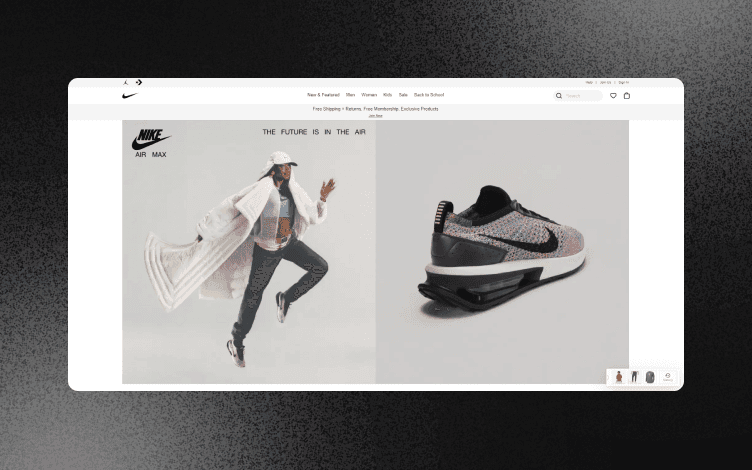
Nike is one of the most successful brands in the world, and they know how to use their brand power to their advantage. One of the best examples of this is their eCommerce website design which keeps things simple but still manages to make a big statement.
The homepage starts with a full-screen product image and then leads into a large hero shot of another product. This is followed by a section showcasing Nike’s latest products with more hero images, short descriptions, and links to buy each item.
The rest of the page is broken up into smaller sections focused on different types of products, such as footwear or apparel.
Each section has its own color scheme, so it’s easy for shoppers to navigate through all the different options available to them without getting confused or overwhelmed by too much information at once.
The website design of Nike is quite simple and minimalist, but it still looks beautiful to customers.
The website is responsive and works on all devices, including mobile phones, tablets, and desktop computers. This is important because it means that Nike can reach their customers no matter where they are or what device they are using.
Nike's eCommerce website design uses high-quality images that showcase their products well.
These images are also displayed on their product pages, making them look even more appealing than just looking at pictures online.
The main focus of this site is to sell products rather than create an engaging experience, but it does achieve both of these things quite well!
2. Ikea

Ikea is one of the most successful eCommerce websites in the world. It has a clean and easy-to-use interface, with a lot of white space that makes it easy to navigate.
The home page features a large image of their products and links to new arrivals, sales, deals and more. In addition, they have a separate page for each product category and subcategory so you can find exactly what you are looking for.
Ikea also has an excellent mobile app that allows you to browse their website on your phone or tablet easily. It has all the same functionality as the desktop version with simple navigation, clear images, and easy checkout options.
The product descriptions are short and sweet, with no unnecessary information getting in the way of what you want to know: how much something costs.
Ikea's site also offers a fun way for users to interact with each other by creating virtual rooms and sharing them with friends via social media.
In addition to being an excellent example of a well-designed eCommerce site, it also stands out as a perfect example of how retailers can use technology to create memorable experiences that keep people coming back for more.
3. Chanel

Chanel is one of the most popular fashion brands in the world. The brand has a long history and is known for its classic and elegant style.
They have maintained their position as a luxury designer brand by offering high-quality products and services to their customers at all times.
The Chanel ecommerce website design has a unique design and layout that makes it stand out from the crowd.
The main image is of the iconic logo for Chanel, which is also shown on their products around the world. This is one of the reasons why people know who they are when they see it!
There are tabs at the top of each page showing how many products are available in each category and how many are left.
This makes it easy for shoppers to find what they want quickly without having to search through hundreds of products in each category.
The product page itself is simple and easy to navigate. Some tabs along the top allow you to switch between categories or search for items by type or color if needed.
Each item has its own tab where you can view details about size, fit, etc., and read customer reviews before making a purchase decision.
4. Warby Parker
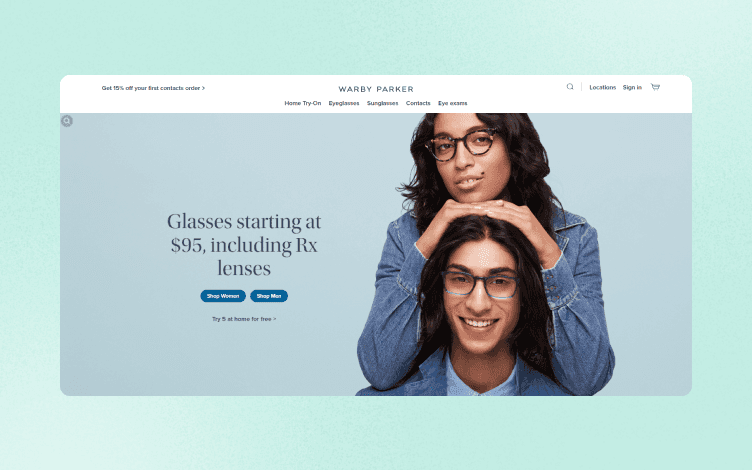
Warby Parker is another example of an eCommerce website that puts user experience first — and it works!
Its website is simple yet stylish, with many products available for purchase.
And remember those glasses you've been wanting but couldn't find anywhere? You'll probably find them on Warby Parker's site!
Warby Parker's eCommerce website is clean and simple. It uses bright colors and simple lines to create a modern look that appeals to younger customers.
The design is based on the grid layout, which has become a popular choice for many eCommerce websites because it allows easy navigation and helps customers focus on product photos instead of text-heavy content.
The homepage features large thumbnails of stylish glasses with a single line of text describing each model. The other sections on the site are similarly minimalistic, with simple typography and white backgrounds for maximum readability.
The home page also has an interactive feature called "Home Try On" that allows visitors to virtually try on different pairs of glasses before making any purchases.
5. Casper
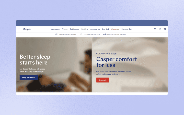
Casper is a brand that has been around for some time, but their eCommerce website design still remains one of the best.
The website is simple and easy to use.
There’s also an option to shop through Facebook Messenger, which shows how important it is for brands to make things easy for their customers.
Casper's website design is minimalistic and uncluttered. It uses a lot of white space to make the product images stand out. The images are also large and high-quality, which is important for eCommerce sites that sell products that need to be viewed in detail.
The brand also uses this simplicity to highlight its products and make them stand out from the crowd.
The logo and navigation are both simple, using only a handful of colors each.
Casper's website also has a blog section, which is always a good idea for an ecommerce site because it allows you to promote your products without being too salesy.
You can use this space to write content that educates your visitors or even just share exciting stories about what you do as a company.
The Casper website also uses vertical scrolling to show off its products, which is becoming more common among online retailers.
Vertical scrolling can be more engaging for shoppers because it allows them to scroll through multiple images simultaneously instead of clicking through each one individually.
Casper uses a lot of imagery on its homepage, which helps break up the content and make it more visually appealing.
It also helps tell the story of each product without having to read about it in detail — something that can be helpful if you're in a hurry or just want to browse through options quickly.
Overall, Casper's website design is simple enough so that anyone can use it (even on mobile), but it still manages to look modern and stylish at the same time.
6. Verishop

Verishop is an online store that sells health and beauty products, as well as accessories. The website has a beautiful clean design and is easy to navigate. The color scheme is also really nice, with purple and white being a great combination.
Verishop has many great features that make it easy for customers to quickly find what they're looking for.
For example, an excellent search function allows you to search by category or product name.
This makes it easy for customers to find exactly what they want without going through many other products first.
The product pages themselves are also very well designed and easy to use.
There's plenty of space on each page, so there's no need to scroll down the page just to see all the information about a product (which can be frustrating).
The website also has a responsive design, which means you can access it on any device with a browser. This makes it easier for customers who want to buy something online but don’t have access to desktop computers or laptops.
The product images are easy on the eye and allow shoppers to see what they are buying without zooming in or out. The image gallery also features additional information about each product such as its price, weight, size, color, and more.
7. Fjällräven
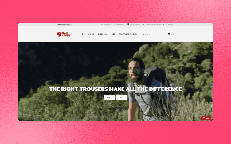
Fjällräven is a Swedish outdoor brand that’s been around since 1960.
The company has been known for its iconic Kånken backpacks but also offers a wide range of products such as ski jackets, hiking boots, and even clothing lines for men and women.
The company’s website is minimalistic, with only a few images on the homepage.
Fjällräven's website uses a combination of full-screen photography, short video content, and minimal text to tell their story.
This approach is effective because it allows Fjällräven to showcase their products in a way that doesn't feel cluttered or overwhelming to visitors.
You can also browse through the website by looking at their products or reading about the company’s history, which is interesting for anyone who wants to learn more about this brand.
8. Pura Vida Bracelets

Pura Vida Bracelets is a well-known brand in the world of fashion and jewelry. The company was founded in 2012, and since then it has gained much popularity.
Pura Vida Bracelets is a good ecommerce website design for several reasons. First, it is a good example of how to make your customers feel like they are shopping in a store.
The home page has a lot of different product categories with multiple images and descriptions similar to those you would find in a brick-and-mortar store.
The site also uses beautiful photos and videos to help sell their products. In addition, they have an entire section dedicated to customer reviews and testimonials that helps build trust with potential customers.
The checkout process is very simple and easy to understand. And finally, the site makes use of social media channels to reach out to their target market.
9. Stray Rats
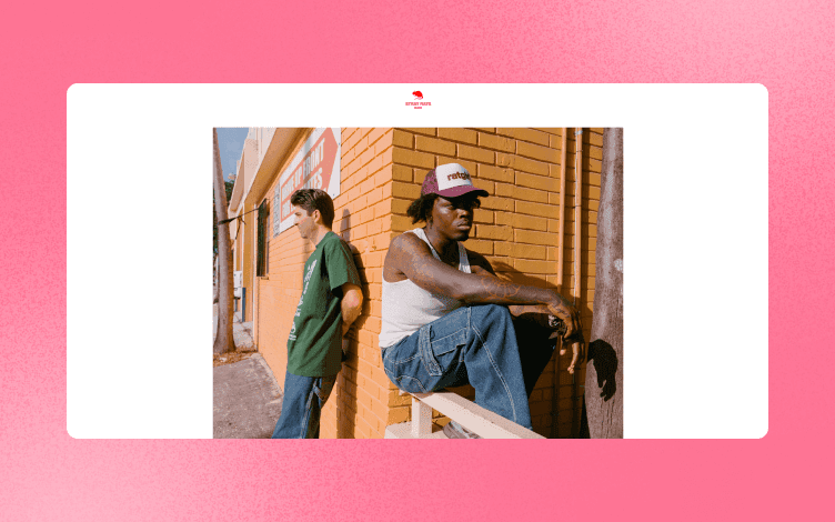
Stray Rats is a clothing brand that sells streetwear for both men and women. They have an excellent website that showcases their products and also allows customers to shop online.
The website is easy to navigate, with all the information clearly visible on the homepage.
The website also has a blog that keeps visitors up-to-date on new products, sales, and other important information. The blog is easy to read and gives visitors more incentive to shop at Stray Rats!
Their product pages have large images visible without having to scroll down or click through to another page.
The product pages are also very beautiful, with clean and simple illustrations.
10. Apple Store
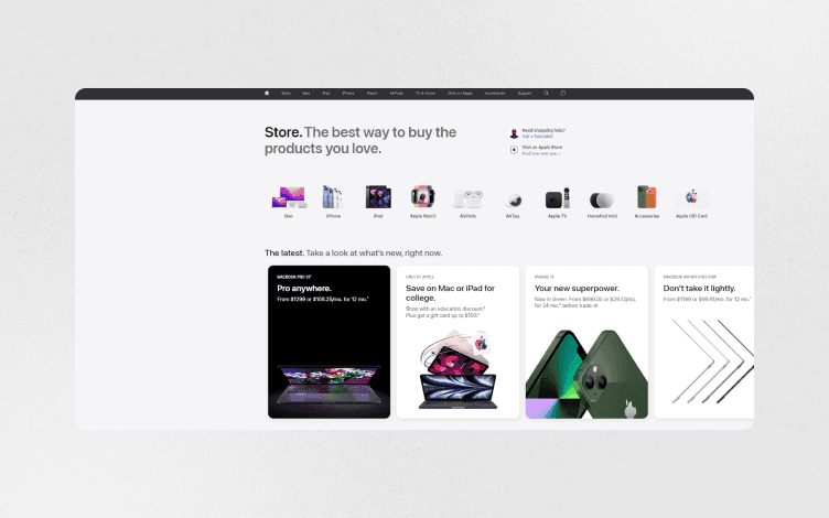
Apple is a brand that's known for its luxurious and simple designs. The Apple Store website is no different. It has a minimalistic design with clean lines and no clutter.
The site's layout is also quite simple and easy to navigate, making it an excellent example of Ecommerce design.
The navigation bar is at the top, which makes it easy to locate. The layout is also organized, with different categories of products easily accessible.
The Apple Store also has an area where you can browse by type or category and filter down further based on specific criteria. There are also filters to narrow down your search to find exactly what you're looking for.
Each section of the navigation menu has its own color scheme to make it easy for visitors to find what they're looking for.
The main content area contains product images, descriptions, and reviews from previous buyers. Below this area are calls-to-action that encourage customers to add products to their cart or continue browsing other items in their category.
This is where Apple shines because it uses images instead of text descriptions to help shoppers understand what they're buying before purchasing anything!
Another great feature of the Apple Store website is its use of video content.
Video content lets visitors better understand what it feels like to use a product before they commit to buying it.
The best thing about this website is that it doesn’t have too many distractions or unnecessary elements on the page. Instead, the focus here is on showcasing their products in the best possible way.
11. ASOS
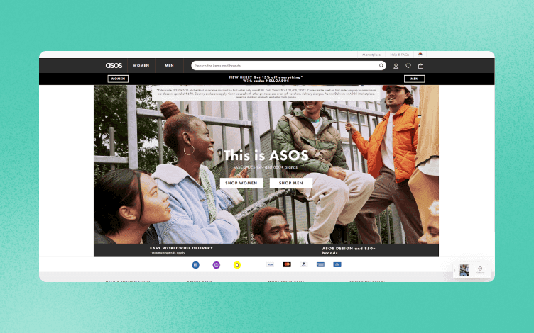
ASOS has always been ahead of its game when it comes to web design. The brand has been using bright colors and bold fonts since its launch in 2000 and continues to do so today.
ASOS uses a combination of white space, large images, and minimal text to make their products really stand out on their site.
ASOS' homepage features a strong image at the top of the page as well as a simple navigation bar and search bar at the top. The rest of the page is dominated by white space, which helps create an immersive experience for visitors.
Asos' homepage uses a bold color scheme with plenty of imagery to showcase the latest trends in fashion and lifestyle.
The product pages are also well designed, making it easy for shoppers to find what they're looking for quickly and easily.
12. Burberry
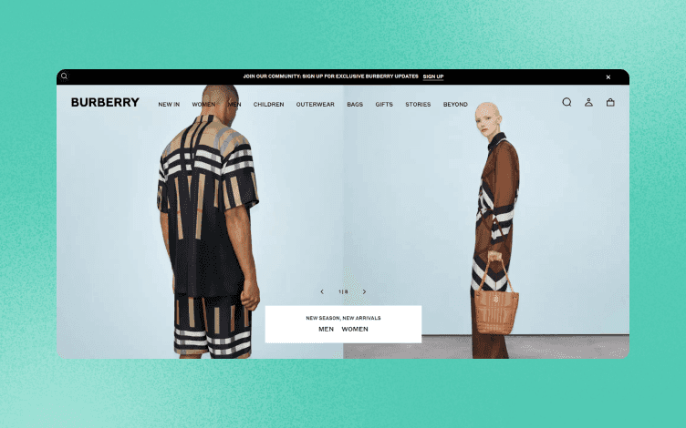
Burberry is one of the most well-known luxury brands in the world. The brand has been around for over 100 years, and its website is designed to reflect this heritage.
The Burberry website design is simple and elegant, focusing on showcasing products and offering information about the brand's history, collections, and events.
The Burberry website is one of the most beautiful ecommerce websites in the world. Clearly, the brand understands its target audience, and they have created a website that caters to them perfectly.
The homepage features a large photo that captures the essence of Burberry's DNA: British heritage and classic styling.
The rest of the page consists of smaller photos of products from different collections and links to other site sections.
The product overlay includes a product description, along with some key stats and pricing information.
Several other product categories are listed on this page, including bags, shoes, and accessories.
Each category has its own hero image that features multiple products in various colors and styles.
This creates an excellent visual experience for users who are shopping for clothing items or accessories.
Burberry also has an excellent mobile version of its site, which makes sense considering that ecommerce research shows most people now shop on their phones.
One of their best features is their seasonal collections page, where you can choose what season you want to see (Spring, Summer, or Autumn, Winter) and then choose your favorite piece from that collection.
This makes it easy for users to browse through all seasons at once rather than having to search through every season individually.
13. Dollar Shave Club

Dollar Shave Club is a subscription-based online razor blade and skincare store. The company was founded by Mark Levine, Michael Dubin, and Jeff Raider in 2011.
The product category pages have been designed to look like an old-school barbershop mirror, which gives them a vintage feel.
Dollar Shave Club's website design is a perfect example of how you can create a simple yet effective ecommerce site.
It uses minimalistic designs and bright colors to draw attention to the product and its features.
The navigation menu is located at the top right corner of the page, where visitors can easily see it when they're scrolling through pages or looking for something specific on your site.
The site uses bright colors and white space to make it easy for the eyes to read through the pages. In addition, the layout is simple and thematic, so it looks like one whole piece instead of many separate sections.
14. Crate & Barrel
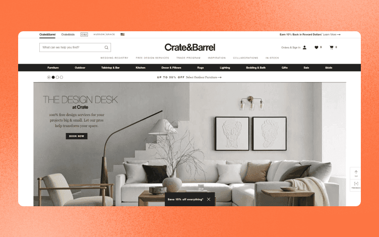
Crate & Barrel is a premier retailer of home furnishings and accessories.
The Crate & Barrel website has been redesigned recently to be more user-friendly, with simple navigation and a responsive layout that adapts to different screen sizes.
The site features product categories for various rooms in the home, including bathrooms, kitchens, dining rooms, and living rooms.
Each category has subcategories to help shoppers narrow down their options by size, color, and more.
They have a great product page design that shows off their products beautifully with large images, descriptions, and prices.
They use neutral colors but have enough color to make the site feel bright and welcoming.
When you click on one of those products, it takes you to a full-screen view with even more detailed information about that item.
This website design has several built-in benefits:
It's easy to navigate. This design uses arrows and buttons that clearly show where you're going next — there's no guesswork involved.
You know exactly what each button does and where it leads. In addition, the layout is consistent throughout the site so finding what you want is always easy (which means less time spent looking for things).
It's visually appealing. The images are large and beautiful, which makes them appealing even if they don't sell anything (which they do). Also, the white space draws your eye around the page without distracting from the main focus — which is the product or service!
Conclusion
When it comes to creating a beautiful eCommerce website that provides a good buying experience, design is one of the most important things store owners need to have in mind.
Your visitors can form an opinion about your business after just 50 milliseconds of watching your website because the first impression matters.
We hope these examples and tips will help you notice and apply things that will improve your website and make your business unique.
As you already know, content matters the most, whether textual or visual.
But having poor images will drive away your customers.
That’s why we created Glorify.
Glorify is a design tool that allows you to create beautiful, professional-looking designs without prior experience.
With Glorify, you can easily create stunning graphics, logos, infographics, and more in just a few clicks.
Glorify offers pre-made templates and tools that make it easy to create high-quality designs. You can also upload your photos and videos and add your own text to create custom designs.
There is a wide range of customization options, so you can easily change the colors, fonts, and other design elements to match your brand.
Sign up for free, and start transforming your visuals to make your eCommerce store more beautiful and better converting!


Features
Alternatives


© 2019-2024 Glorify App - All rights reserved.