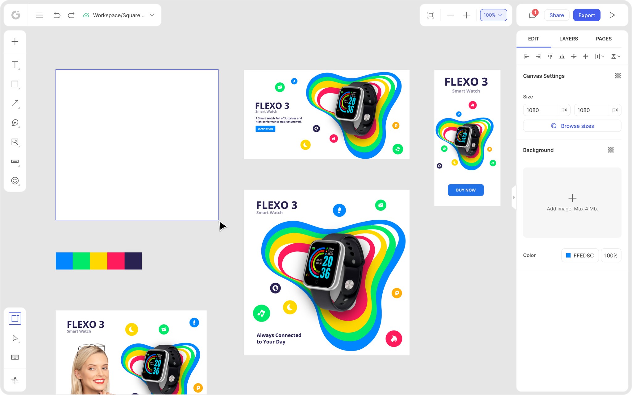
We’re thrilled to announce that Glorify is officially partnering with Contra! This collaboration opens up exciting opportunities for designers, marketers, and creators in the Glorify community.
Posted Nov 9, 2022
•
11 min read

Graphic design, Marketing

Create beautiful marketing graphics at scale.
25 Creative Poster Ideas to Create a Buzz for your Next Event

25 Unique and Creative Poster Ideas to Promote your Event
Promotion through posters is conventional. Posters, when designed uniquely and creatively, take brand promotion to the next level. Appropriate placement of the poster content, selection of layout that allows the elements to breathe, color choice aligned with the type and purpose of the event, and the design you use, encourage people to look at the poster and intrigue them into the event to a considerable extent.

You’ve got several ways through which you can publicize your event. But, the success of the event’s publicity depends on how correctly, and relevantly you leverage all the said factors. Of course, you may always come up with your own ideas and use them rightly to popularize your event. However, if you don’t have one right now, take a look at 25 creative event promotion poster ideas to make like a bit simpler for you.
1. Create a Visual Order
Posters must be short and sweet for readers to glance through them quickly. However, at times, you try your best to edit the event content, and still cannot shorten it enough. In such a situation, you don’t have to delete a vital element of the content, but place it in a way that creates a visual order.
One of the most creative poster ideas, a visual order is the most significant part of the content comes first and is written in the largest font size. Then comes the information that is second to the most important one, and then the third one, and then so on. It will help your viewers organize their views and get a complete idea of the event’s details.
2. Use Typography – Cool poster ideas

Using typography is one of the most effective ways to engage your event’s target audience. For example, if you’ve got a food festival, you may create typography through the use of the foodstuffs involved, such as vegetables, etc. It helps you do two things at once. First, you enhance the visual effect of the poster, and second, people looking at the poster get an idea of what the event is, without pondering a lot about it.
3. Optimize the Use of Colors and Alphabets

One of the best poster design ideas, vibrant colors, and the size and font of the alphabet to optimize the poster’s effect. For instance, if you’ve got a product launch, you may highlight the words like new, improved, upgraded, latest, etc. to catch the target audience’s attention and arrange the rest of the information engagingly. Do not forget to give the poster a lovely and lively background effect. The more vibrant your event poster, the more attention it grabs.
4. Express More through Less – Poster Ideas

It is here that you put your poster designing skills to the test. Say if you have an official event poster to make, you may engage lesser colors, and keep the content to the point, which may only include the event time, date, and a brief purpose of the event, perhaps, in not more than a couple of lines. By doing so, you keep the layout clean and yet express everything vital from the viewer’s perspective.
For any additional information you would like to convey, you can use PDF QR Codes that will allow people to save a PDF containing all the required information on their mobile phones. This offers added convenience to your target audience as well as helps you maintain a clean poster design.
5. Use Black and White Spaces Prudently
The use of black and white space is another among the most effective poster design ideas. Here, you may use black space everywhere, except the object of focus – for instance, the event’s name, and the event details to let the viewer focus on what’s vital, rather than distracting him with other unnecessary elements on the design.
6. Improve the Visual Effect with Overlapping Images

Using overlapping shapes is one of the most creative event poster ideas. If you’ve got too many elements to showcase, you may leverage the overlapping effect. For example, if you’ve got a tourism event, and think that showing the Eiffel Tower alone will not suffice, you may use a few other images of tourist spots, and overlap them, using a soothing color, and a simple text that lets the onlooker focus on every critical aspect of the poster.
7. Vertical and Horizontal Placement of the Poster Text

If you are too tight on the poster’s dimensions, vertical and horizontal placement as a part of the poster ideas helps create a visual effect and also helps you convey all the details, despite the condensed space. But, ensure that you use the right background and font colours to ensure optimal visual impact and viewing convenience.
8. Create a Focus Point on the Poster Design Ideas

Creating a focus point proves helpful and informative, as it conveys the highlight of the event, and lets the viewer focus on that single point rather than looking at the entire poster. For example, suppose it is a technology event with a focus on Robotics and automation. In that case, you may create a poster that places a robot at the center, develop a design and content that focus on it.
9. Smart and Wise of the Available Space – Poster Design Ideas
Creating an exciting event poster design is about using the space wisely, and giving the placement of elements a considerable thought. Sometimes, you may not have a lot of content to talk about. But then, that does not mean you keep the rest of the space unutilized. You may fill the remaining space with an exciting design, or a vibrant color. You may show people running towards the event or show an essential element of the event.
10. Make Graphics the Hero
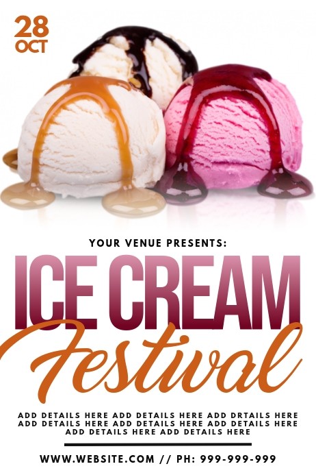
Sometimes content doesn’t have a significant role to play, other than conveying the information. In such a situation, poster ideas including graphics make the event more engaging. Use an attractive and eye-catching graphic that drives people towards the poster, and further intrigues them. For example, if you’ve got an ice cream festival, show some mouth-watering and colourful ice cream graphics that let people drool!
11. Use Humorous Sentences and Taglines – Poster Design Ideas
Using humorous sentences and taglines is another way of leveraging creativity to attract people and create an ever-lasting memory. People remember taglines more than the logo or infographic. Hence, a catchy, humorous, and relevant tagline that relates to the purpose of the main theme of the event proves memorable. However, ensure that the tagline isn’t offensive, or hurts emotions, or appears incorrect in any sense.
12. Leverage the Image of an Influencer – Poster Design Ideas

Having an influencer talk about, or urging people to go to an event proves useful, as the face of the influencer catches attention. Next, because he is an influencer, people look up to his recommendations and endorsements. Nevertheless, use an influencer who is well established as an authority in the area of the event. For example, if the event is about music, let a local music sensation endorse your event.
13. Think Out of the Box

Sometimes, those conventional designs, fonts, and being logical doesn’t work. If your event is an exclusive program and requires you to be unique and unusually creative, use different fonts, font sizes, alphabets, colors, designs, patterns, etc. to generate curiosity about the event and increase engagement.
14. Use Vibrant Colors – Poster Design Ideas

The use of vibrant colors works well with events such as a beach event, forest camp event, etc. wherein you use a lot of natural colors, and use darker, more prominent fonts to attract people towards the event. For instance, if it is a beach event, you may use a beach, sea, sun theme, colors such as sky blue, yellow, orange, etc. to give the poster an authentic, lively look, and ensure optimal attention.
15. Let the Informative Content Prominently Seen – Poster Design Ideas

A critical event requires immediate attention and requires a poster that people can read and understand from a long distance as well. To do so, make sure you use large fonts, and prominent colors to highlight the event info.
16. Play with Designs, Dimensions, and Colors and Shapes – Poster Ideas
Make your event poster lively through the use of various colors, shapes, designs, and color combinations. For example, if it is a nightclub event, you can use colors such as purple, blue, and black to signify the event. But make sure you don’t let the design overpower the text and the message. In this case, every element of the poster is necessary to ensure maximum engagement.
17. Use Contrasting Colors – Cool Poster Ideas
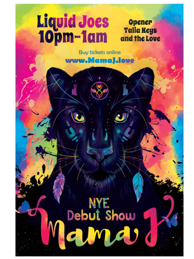
Extreme contrast is one way of pulling people towards your events. Based on the event type, and its overall objective, use contrasting colors such as blue and orange, etc. You may also use thin fonts with dramatic and bold ones, and use louder pictures with soothing colors. But while doing so, ensure that the poster doesn’t lose the purpose of the event, or goes overboard with contrast – more than the event itself.
When it comes to attracting people, black and white still go a long way! Using black and white creates an entirely different effect. However, ensure that the black and white theme goes well with the event. Using a black and white theme for a tech product launch may not necessarily go well with the purpose of the event. On the other hand, for a music festival featuring vintage music, black and white can enhance the poster’s effect.
19. Incorporate your Product into the Event Poster – Poster Design Ideas
If you are dealing with a product launch event, understand the product well, and create a poster that integrates the product image with the event poster text. Doing so not only looks impressive but also saves space, and creativity can trigger interest in the event in the target audience’s mind.
20. Use Minimal Design and Text – Poster Design Ideas
Precisely, the term is known as minimalist design. The design doesn’t contain text, or a heavy infographic, or a tagline. It talks more through a single element, and the logo of the brand. For example, if a food chain launches a new burger, you may show an image of the new tantalizing burger, with a single word NEW on top of it. Now, that’s just an idea. You can use your creativity to make the image more interesting and expressive.
21. Split the Poster into Two – Poster Design Ideas

Splitting the poster into two parts is another effective way of creating the required effect. For example, suppose the event is about a customer-meet of a particular company that offers 24/7 customer service. In that case, you can split the image into two or three, showing the customer representatives working from dawn to dusk and throughout the night to serve their customers. A fantastic tagline can prove an icing on the cake.
22. Use an Emotion – Poster Ideas
A single word representing anger, sadness, love, happiness, etc. can evoke emotion in the viewer’s mind. Besides, you may also use an image to signify a feeling, such as an angry boy, a child crying, a poor man, etc. to trigger the right emotion and engage with the event’s target audience.
23. Play with Layers to Develop Dimension and Depth – Poster Design Ideas – Poster Design Ideas
Layering images, words, and colors develop depth and dimension to the event poster. For instance, for an event of a construction company, or a real estate event, you can create layers showing clouds, mountains, and home to denote a home nestled amidst nature.
24. Focus on Specific Elements to Generate Emotions and Energy – Poster Design Ideas

If your poster’s image is the highlight, make sure you focus on it to generate the right emotions and energy within the target audience. On the other hand, if your focus is on the text or the tagline, ensure that you highlight it in a way that catches the viewer’s attention, and people get what you want to convey through the element.
25. Leverage Image Balance on the Poster – Poster Design Ideas
Symmetry creates a balanced effect. You can create a symmetrical effect with the colors, shapes, layers, text, etc. to create the visual balance that connects with the event’s intended audience.

Creating an event poster is about leveraging your creativity in the right way and aligning it with the event’s objective and mood. By now, we hope you’ve visualized your event poster with any of the above ideas, or perhaps, an amazing one of your own! GlorifyApp has a range of ready, and customizable event poster ideas for creating a lovely and intriguing poster design for your event.
FAQs: 25 Creative Poster Ideas to Create a Buzz for your Next Event
1) How to make a good event poster?
It isn’t as challenging to make a good event poster. Begin with an interesting background color, use a large and bold font for the title, add a simple call to action, add exciting infographics, or images, and ensure the correct color combinations to make an intriguing event poster.
2) What are the characteristics of a good event poster?
Some of the characteristics of a good event poster include readability, great colors, eye-catching images, and content, prudent utilization of space, and an encouraging call to action.
3) What are the basic elements of a good event poster?
Some of the essential elements of a good event poster include imagery, color, text, and fonts. Besides, an event poster must convey the information properly, and should be aligned with the expectations of the target audience.
Features
Alternatives
© 2019-2024 Glorify App - All rights reserved.


