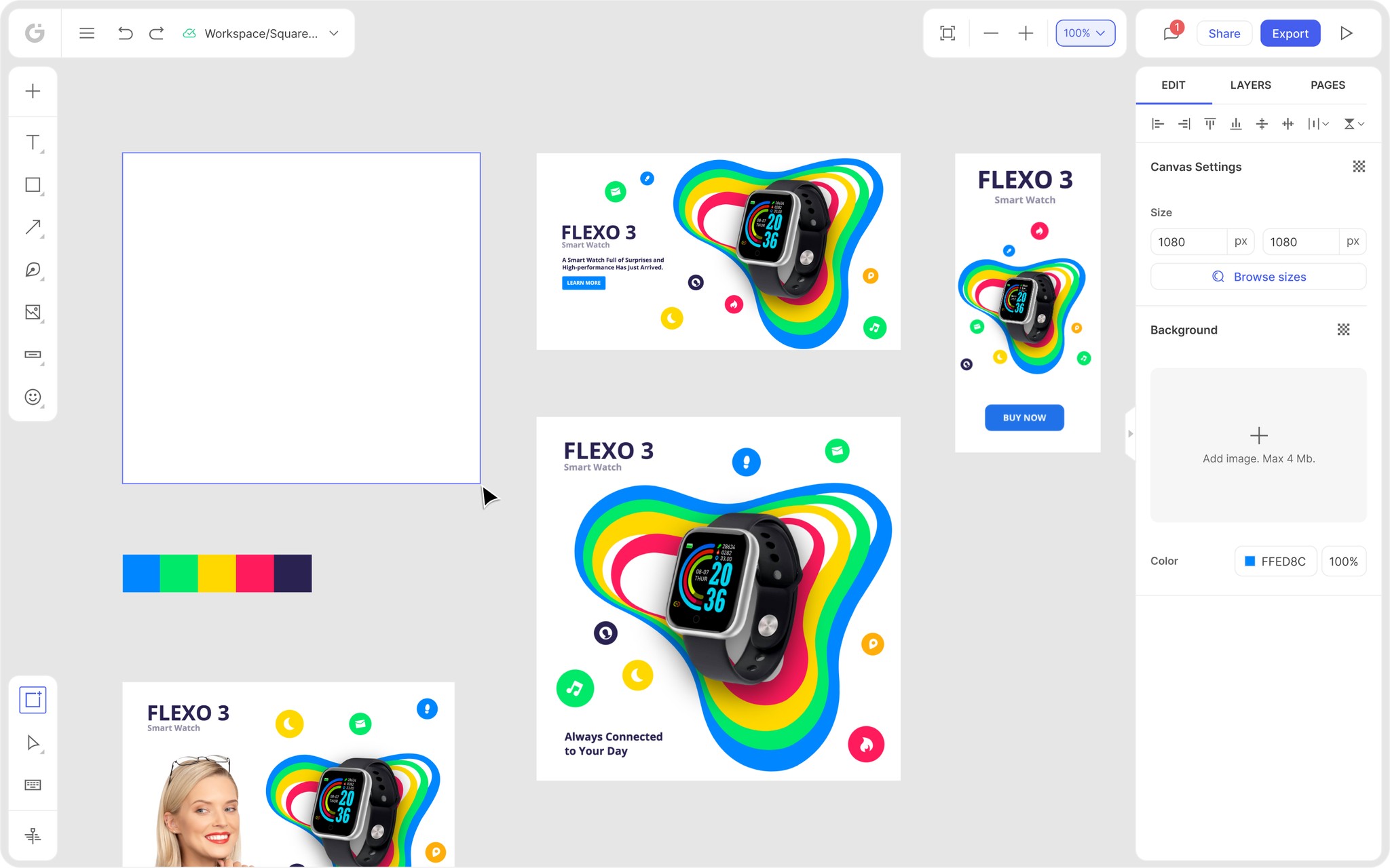
We’re thrilled to announce that Glorify is officially partnering with Contra! This collaboration opens up exciting opportunities for designers, marketers, and creators in the Glorify community.
10 Best Blog Design Examples To Increase Visitors in 2023

What Makes The Blog Design Stand Out?
Well, the first thing is high-quality content. You can write about almost anything, and there will be someone who will read it. But how to draw users' attention to your blog and, more importantly, make them come back over and over again?
Ideally, you should aim to make a blog with good design because it is simpler to read, more engaging, and will produce better SEO results consecutively.
1. Dazzling Homepage
Your homepage is usually the first thing a user sees when entering your website. So you have one chance of making a great first impression.
A well-designed first page should attract visitors' attention, inform them about your business, and persuade them to view additional pages.
Fast Company is the top progressive business media brand in the world. It has a distinctive editorial emphasis on technological innovation, leadership, game-changing concepts, and design.
Their homepage represents their company vision. The style they use shows a goal to inspire readers to think outside the box, start dialogues, and shape the future of business.

What to take from this design:
Use a minimalist header – in this example, they use a black background with a font that stands out.
The newest articles on the bottom against the white background immediately catch attention.
Design a stunning cover photo – Bright colors pop against solid charcoal color.
2. User-friendly Interface
A good and user-friendly interface is essential because it promotes interactions between the user and your blog and additionally converts potential visitors into buyers.
When deciding on blog design, keep these things in mind:
Blog navigation should be easy and intuitive.
Avoid cluttering your page with content and unnecessary buttons.
Keep it simple, and don't underestimate the use of white space.
Marie Kondo is a famous tidying expert who helps people organize their homes.
Looking at her page, you can see her business model represented – clean and minimalist, with lots of white space.

What to take from this design:
Color scheme – To ensure uniform styling across the website, stick to the same color palette. Her blog is in neutral, calming colors that are soothing to the eyes.
As you can see below, muted, earthy colors of products are well-incorporated into the blog's theme.
Since she prefers neutral colors, the background is not the usual white. Instead, gentle baby blue is used as a contrast to better highlight the product.

Also, adding ground shadow makes these images more realistic and compelling to buyers.
3. Readability
When you already have someone on your blog, you want them to have a pleasant experience reading your content.
They will leave the page if they need to zoom in on every word to read an article or have trouble reading the font.
Larger font sizes can help with usability, meaning the difference between converting your users and getting upset and leaving. They also hold more visual weight to catch the eye. Additionally, mixing more than three fonts is not a good idea.
Some of the most popular fonts are Arial, Georgia, and Verdana.
Likewise, be aware that your content must also look good on mobile devices.
That’s why heading hierarchy and contrast are important. That means that headings must distinguish from body content and other heading ranks.
For body text, use at least 14 px to 16 px for legibility.
For headings, use between 18 px to 21 px. (To establish a proper contrast, the headers should be approximately 1.3 times larger than the body text).
Subheadings should be smaller than headings but still bigger than the body text.
There are some differences between a website and mobile device requirements, so it is best to test some font sizes and see what works best for you.

What to take from this design:
The Economist separates each category of blog articles from one another on their site using a variety of font weights, sizes, and colors.
Before reading the articles, themes, or titles in each tag, attention is drawn to them first by the prominence and hierarchy of terms like "Weekly edition."
Also, in the header, they use icons to distinguish different themes like "Summer reads."
4. The Golden Rule of Thirds
An image is essential to a blog post, and you should never post content without one. Visuals convey your ideas far more quickly than any written word can.
The best pictures adhere to the rule of thirds, which states that crucial compositional elements should be placed along these lines or at their intersections.
For example, imagine an image divided into nine pieces by two equally separated horizontal lines and two equally spaced vertical lines.
Most frequently, it serves as a guide for positioning images and icons, aligning text, and arranging items in a way that makes sense to the user.
The Phoblographer is a popular blog that mixes psychology with photography.
It is a community of professionals and photography enthusiasts dedicated to spreading the love for tech and art combined.
In this article, an eye-catching, vivid photo makes you interested and eager to read the whole interview.

What to take from this design:
A visually stunning lead image immediately captures a reader's attention.
The text that follows the image is spaced with a font big enough to read comfortably.
The design is not cluttered yet provides the necessary information relevant to users.
5. Include CTA And Social Media Buttons
Most people won't buy anything on their first visit. So, instead, you should try to make them come back and gradually turn them into loyal customers.
Try to:
Add a subscription button.
Attract them to sign up for your mailing list.
Ask them to follow your other social media accounts.
Another way to attract customers to your blog is to make your images shareable.
Sincerely Jules is a lifestyle and fashion blog packed with beautiful images.

Her main homepage image changes every time she posts new content. Nevertheless, it is an attractive choice to keep readers interested and coming back to see what’s new.
What to take from this design:
Users can directly share this image on Instagram, Twitter, and Pinterest.
Colors that go well together – Light gray color serves as a backdrop that enhances the bright colors of her outfit.
Mix and match the fonts to create an interesting visual.
Bonus: Best Blog Design Examples
1.The House That Lars Built
The House That Lars Built is a DIY and craft blog focusing on creative living. It demonstrates how to create lovely projects for your house's interiors and celebrations.
The first thing you’ll notice is a color scheme. A combination of pastels and vivid colors creates a bubbly and joyful atmosphere.

Content is divided into categories for a crafty audience looking for bright, creative images and inspiration.

2. Emotional Storytelling
Emotional Storytelling is a personal blog that educates photographers worldwide on emotional photography.
As you see, the header is a beautiful collage that shows the blog's aesthetic on the homepage.
Also, different effects on pictures, shadows, and elements create a stunning piece.

Different fonts in the About me section are mixed to convey the author's message better.
A CTA in specific font leads to subscription options, highlighted with colors that blend well with the rest of the page.

3. Magnum photos
Magnum Photos is a photography blog with a strong passion for narrative. They use strong photographs as their primary blog style layout.
Posts are displayed with eye-catching graphics and top-notch photos.
You’ll first notice a large cover photo when you open the blog. And just below the image is a link that leads to the article.

Next, the page is divided into sections with smaller images with lots of white space.
This layout is particularly suitable for image-oriented blogs.

4. Recipes – Flourist
Recipes – Flourist was founded in 2013 to sell fresh, chemical-free flour online through a Shopify store.
Additionally, they have a lovely blog that provides well-written and presented recipes.
The minimalistic, clutter-free design puts gorgeous photos in the viewer's focus.

The layout is simple, utilizing white space with rich and expressive colors.

5. The Dowse Art Museum
This blog design is a unique, intriguing, and unconventional way of displaying information.
Bold background colors combined with contrasting blue and white make an attractive visual solution.

By clicking on a tab, the background changes and reveals more information before switching to the blog post.

Using Glorify For Improving Your Blog Design
As you know, high-quality images are vital for excellent blog design.
So, we've gathered some incredible images and blog design examples and, hopefully, got you inspired to create something by yourself.
Glorify is the best tool that will help you with that.
It is a straightforward design app that is easy to use even if you don't have previous design knowledge.
Its intuitive interface allows you to simply drag and drop elements into place.
With its numerous features, it is equally suitable for beginners and professionals.
Let’s look at how Glorify can help you create captivating images and improve your blog design.
1. Photo Editor
Use Image adjustment to edit Contrast, Brightness, Hue, or Blur.
Enhance your image by adding Text, Icons, Background, or other elements.
Use shadows and reflections to give your pictures a more realistic feel.

Alter each element's transparency, opacity, and color until you have the desired effect.
Save time by using predefined Color palettes. These are combinations of colors that go well together.

By selecting the text, Text settings appear on the right. Easily change the font style, size, line height, and letter spacing. Glorify offers more than 100 fonts and allows you to upload your own.
2. Easily Remove Background in just one click.
The Remove background tool will appear in the right panel by clicking the element in the picture.

3. Brand It tool
A vital part of a good blog design is to use stunning images to increase brand visibility and recognition.
Using the Brand it tool, create tailored kits while maintaining consistency throughout all campaigns and designs.

First, select your brand's colors by clicking on the Add colors tab.

Then, name the palette and add your brand colors.

Next, choose a font from the library or Upload the font. You can edit the selected font's style, spacing, size, and capacity.

Lastly, upload the image of your logo, with a maximum size of 20 MB.

Once you are satisfied with your brand kit, save the design or edit it later.
Then, you should create branded marketing materials for your campaign.
Utilizing your selected template on various social media and marketing platforms will make your brand more recognizable. In addition, it will lead to more engagement from your audience.
Glorify is constantly developing and adding new features and templates.
Try out the new Glorify 3.0 beta version now and start creating gorgeous designs.

Features
Alternatives
© 2019-2024 Glorify App - All rights reserved.


