We’re thrilled to announce that Glorify is officially partnering with Contra! This collaboration opens up exciting opportunities for designers, marketers, and creators in the Glorify community.
15 Best LinkedIn Banner Examples To Get You Inspired [+ Bonus Tip]

What Are The Benefits Of Using LinkedIn Banners?
While a profile photo and summary deserve the utmost attention, you shouldn't forget about the banner or background photo. A well-chosen banner can connect the whole profile into a cohesive whole and make a powerful first impression.
Follow these simple tips to choose the best LinkedIn banner:
Your LinkedIn banner photo should aesthetically support the text on your profile and emphasize who you are.
Choose a picture that describes what your job is or what service you provide.
Be professional. Choose a high-quality and well-designed image to complement your profile.
What Is The Best Size For LinkedIn Banner?
The recommended size for a LinkedIn banner is:
For company profiles - 1536 x 768 pixels
For personal profiles - 1584 x 396 pixels
The format for the banner should be JPEG (photos) or PNG (illustrations).
Make sure your background image is aligned with your profile image, making a coherent whole.
Let’s jump into the best examples that will surely inspire you.
15 Best LinkedIn Banner Examples
1. Airbnb

Airbnb is a platform that connects hosts with people who are looking for vacation spots — all over the world.
Their LinkedIn banner shows a person in a relatable, cozy setting. It could be someone working from home, renting an apartment, or looking for one.
This banner is an excellent example of a real-life situation relevant to their customers.
2. Netflix

Netflix, a famous streaming platform, chose not to advertise a particular TV show using its banner. Instead, it depicts the idea of people spending their time together.
Since they are actively hiring, the idea is to show that this company has a friendly and open environment for its future employees.
3. Spotify

Spotify is a digital music, podcast, and video service. It gives access to millions of songs and other pieces of content from authors all around the world.
This profile summary humorously invites people to "Join their band''.
So, this retro-looking image shows musicians, maybe caught in moments between band rehearsals.
Vintage and retro aesthetics are still strong, so Spotify successfully rides on this trend.
4. Amazon

Amazon, the world's leading digital retailer, has over a million employees.
They decided to honor all their hard work and the effort they put into this company with this photo collage.
You can also see that, according to LinkedIn, Amazon was voted the #1 top company in the U.S. for 2022.
5. Wholefoods

Whole Foods Market is the largest supermarket chain in the United States that focuses on natural and organic foods. Their signature color is green, representing their eco-friendly, organic, and sustainable company vision.
This banner is one of the best Linkedin examples for background images.
The center of the image shows their slogan, "Bring your Whole Self to work," which stands out in this white and green combination.
Other photographs show their employees' different jobs, from a florist to a baker.
Whole Foods Market managed to capture the essence of its business into a Linkedin banner with positivity and grace.
6. Target

Target is a general merchandise retailer in the U.S. The curiosity is that
75% of the U.S. population lives within 10 miles of a Target store.
Looking at this banner, you can see the cohesiveness between the profile photo and the background photo.
Bright yellow, pink, and purple tie with their signature red.
The full banner looks optimistic and friendly, which is a great choice for a store next door.
7. Starbucks

Starbucks is a multinational chain of coffeehouses found in almost every country.
This simple LinkedIn banner invites potential hires to apply for the job at this company.
Minimalistic design, with two colors only, still looks stylish and refined.
8. Burger King

Burger King is a well-known chain of fast-food restaurants.
While the profile picture shows their logo, they opted to promote some of their loving and bestselling products.
Their brand colors are well incorporated, and when you see this LinkedIn banner, you can immediately recognize the brand behind it.
9. Jo Malone

Jo Malone London is a British fragrance and lifestyle brand that sells perfume and scented candles.
In contrast to a serious and unembellished profile picture, the banner behind it is full of vivid colors. You can see their famous cologne in the center of the image, decorated with a bouquet of fresh flowers.
This background image is one of the best LinkedIn banner examples because it shows that everything doesn't need to be uniform to match.
10. Aesop

Aesop offers formulations for skin, hair, and body care and scents for the home and body.
Their whole aesthetic is based on neutral, earthy tones, which also translates to their banner picture.
The natural texture of wood and apples create a warm atmosphere. Therefore, their product is almost inseparable from this installation, yet the focus is on it.
11. Lush

Fresh ingredients, like organic fruits and vegetables, are essential to Lush. The company also opposes animal experimentation and overpackaging. Lush offers "naked" products or products without any packaging.
This black and white LinkedIn banner has written messages all over it. Those are some of the vital information Lush wants to spread.
This banner is an excellent example of how to be creative and spread your message using unique designs.
12. Patagonia

Patagonia is a designer of outdoor clothing and gear climbing. And other sports like surfing, skiing, snowboarding, fly fishing, and trail running.
This LinkedIn banner shows how to use their products. In addition, it features an image of a female climber using their gear. It is a perfect combination of nature and a product in action.
13. Microsoft

Microsoft is the world's largest provider of computer software.
Their famous logo, in recognizable colors, is also incorporated into a Linkedin banner.
Since Microsoft is all about connecting people, they show people enjoying their everyday activities.
Representing work, family gatherings, or Skype calls, this banner is relatable to almost anyone anywhere in the world.
14. Oracle

Oracle is a multi-model relational database management system.
This banner differs from the others because it has a clear CTA (Register now).
It raises brand awareness while promoting a new feature from Oracle.
15. IMDb

IMDb is an online database that contains data and facts on movies, TV shows, video games, actors, directors, and other members of the film business.
This LinkedIn banner is a compilation of characters from various TV shows and movies.
It is a fun way to promote your business while showing what your job is.
Bonus Tip — Hacks For Perfect Linkedin Banner
To sum it up, here are secrets that make a perfect LinkedIn banner:
Be creative! If you are using more than one social media, you don't have to match your profile and cover image for each account. Change it up instead of simply utilizing the same image on all platforms.
Connect your profession to your LinkedIn cover photo. Use a picture that relates to your job or describes it. For example, photos of books, magazines, newspapers, or pens are a good choice if you are a writer.
Tell a story using images. A LinkedIn banner should visually depict your career in your LinkedIn cover photo. Because it is a very noticeable section of your profile page, you must ensure that it accurately represents you.
Conclusion
One of the more significant and eye-catching components you may add to your LinkedIn profile or page is your LinkedIn banner.
When executed well, it has the power to establish a favorable first impression that people will remember. It can strengthen your brand and make you stand out in your field.
Hopefully, these examples of the best LinkedIn banners inspired you to change that default blue image. Whatsmore, choose a photo that will accurately represent you and your business.
If you want to stand out, don't use generic images downloaded from Google.
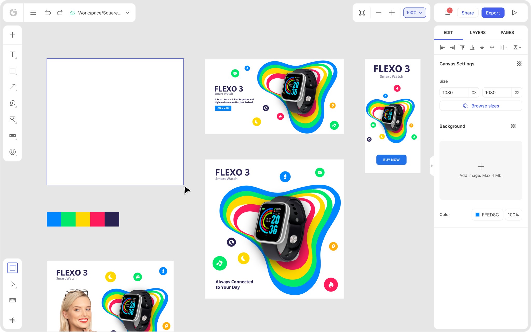
Instead, try Glorify, a powerful online tool that lets you create stunning banners from scratch or using a template.
The process is relatively straightforward:
1. Select "LinkedIn Profile BG" from your dashboard's Headers and Covers menu.

2. This will open a Template library, with 250 templates available at the moment.

3.Choose the template you like and edit it to your liking. Or Select the element on the template and click "Replace" in the right panel to swap out the template's image for your own.

The maximum size of the image you want to upload is 4Mb.
4. If you wish to add your logo, brand colors, or custom font, choose the Brand It feature from the left panel. Be creative and find the perfect combination to make your banner stand out.

Glorify is the best option for professionals or absolute beginners. Glorify's easy-to-use interface will meet all of your design requirements.
The ever-growing library of templates, and features like Smart Resize, Background Remover, and more are all available in the newly released 3.0 Beta version.
Explore Glorify right away and create an outstanding LinkedIn banner for your brand today.
Features
Alternatives
© 2019-2024 Glorify App - All rights reserved.


