


We’re thrilled to announce that Glorify is officially partnering with Contra! This collaboration opens up exciting opportunities for designers, marketers, and creators in the Glorify community.
6 Best Product Image Design Examples To Implement in 2023

Why Are Product Pages So Important?
Buying online has many advantages when compared to physical stores.
Some of the most frequent reasons people like to buy online are:
Cost and time savings,
Ease and convenience,
Variety of choices,
Free shipping,
At-home delivery.
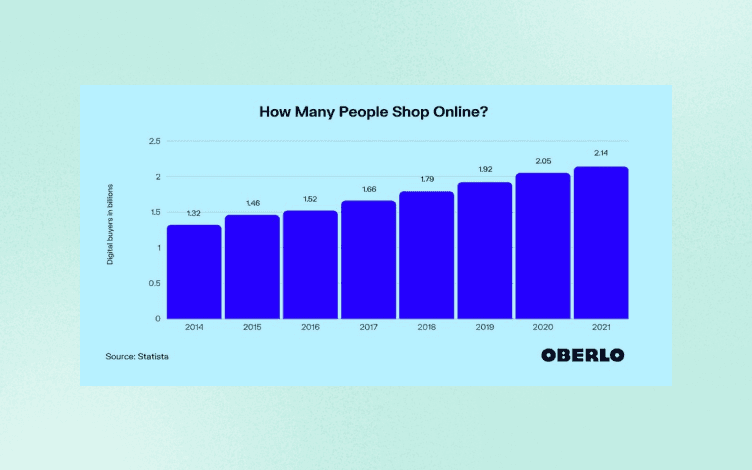
More than 2.14 billion people worldwide used online purchases up to 2021.
Building great product pages for eCommerce is an important factor for success in today's digital market.
Your product pages should provide potential customers all the information they need to make an informed purchasing decision while doing it concisely and effectively.
How to do that?
A well-made product page should include the following :
The product characteristics,
Instruction on how to use a product,
Why does someone need that product,
Incredible images of the product from several angles,
The price of the product, including deals, offers, or coupons
Shipping information,
Return policy,
Customer ratings and feedback.
Call-to-Action.
The product page can also include FAQs (answers to the most asked questions ) to help customers if they have any doubts or queries about the product.
Making a good product page is vital because it should convince the customers to click the Buy button.
Why Are Product Images Important?
Possibly the most significant design element of any eCommerce store is product photography.
Like we said, potential buyers can only interact with products through photos. Since they cannot touch, hold, smell, or taste the product, the product image should paint a picture for them.
In the end, customers will feel more confident about buying from you, and your conversion rate will be higher if you make your product appealing.
Even though almost any product can look fantastic in a photo, don't deceive your customers. Be aware that your images should complement your website's overall design and your business's reputation. Your goal is to build a base of loyal and returning customers.
Now, let's move to a few excellent examples of how online retailers have included top-notch product photographs on their websites.
6 Best Product Image Design Examples
1. Thomann
Thomann uses unique elements on this page to sell their Fender bass guitar.
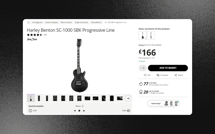
Buying an instrument online is not as satisfying as trying it out in the store.
But, on this page, they've incorporated everything you'll need to know before making a purchase.
What makes it great?
Sound samples – You can hear how this bass guitar sounds in different styles, including Metal, Rock, Slap, or Soundcheck.
There are 16 images to show every aspect of the instrument, with a Zoom option.
The background is clean and white, allowing the product to stand out.
Prominent warranty – 30-Day Money-Back Guarantee and 3-Year Thomann Warranty. If you offer a guarantee and return policy, ensure it's visible on the first page since 67% of customers check the return policy page before buying a product.
Included customer reviews, what are other customers' choices, and an option to compare products.
Repair service - the Service Centre is linked from the first page, showing that they put their customers' needs first.

Minimal design: Since the product is complex, Thomann's product page is simple yet well designed. You can also switch between available variations of the product and hear the guitar's actual sound.
All the essential information is presented without the page being cluttered.
This layout builds trust in the product and company.
2. Dyson
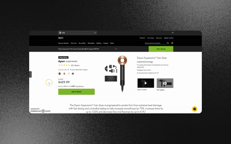
Dyson has a simplistic design oriented towards user experience.
What makes it great?
Dyson offers a never-been-seen, revolutionary hair styling product. Hence, the explanatory video is something that immediately catches attention.
The product description is simple and brief.
Styling guides – A whole section is dedicated to tutorials and advice on using this product for different hairstyles.
CTA – The call-to-action is clearly visible, grabbing attention in rich green color.
FAQ – Find the answers to the most asked questions.

Simple design: This design is not very exciting but aims to direct a customer to the Add to basket button.
3. Balenciaga
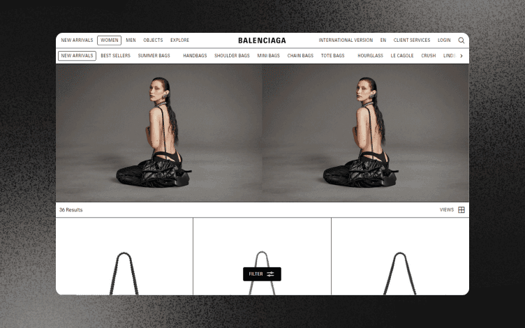
When it comes to representing clothes, you can get more creative. Here, Balenciaga uses a massive background to draw users' attention.
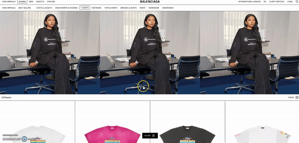
What makes it great?
Despite being shown by a model, the focus is on the T-shirt.
The product description is short and concise.
The page is not busy, but it shows all the relevant information.
Being a luxury brand, the price is not included in the description.
4. Lululemon
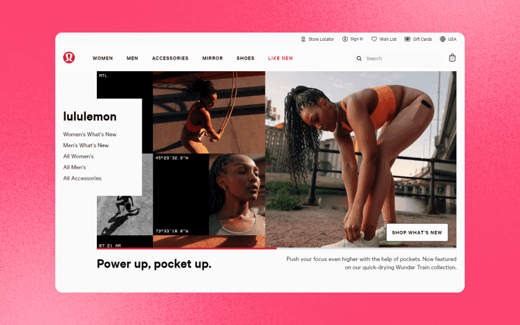
Lululemon makes athletic clothes for running, yoga, and other sports activities.
Therefore, their product page is filled with lifestyle images that represent people in real-life situations wearing their models.
What makes it great:
Using graphics and iconography to make the product image more exciting and represent the idea of how the company is still relevant from the founding moment.
Using bold colors in the image to showcase their products as vivid and playful, ideally suited for leisure wear.

You can filter products by many different categories, size, gender, color, season, product feature, or material. This makes the search easier and quicker.
Hovering over an image will show you all the available color options without leaving the main page.
You can also find blog posts inserted between the images of available products. That gives customers more guidance, and it is a subtle Call-to-action.
Models are photographed in front of a clean background, drawing attention to the garments.
5. The sixty-nine
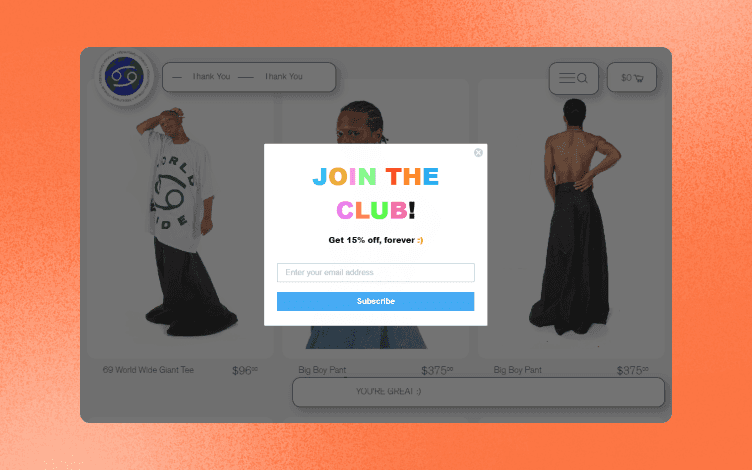
This brand offers distinctive, unisex, and all-inclusive clothing.
Since their brand is quite unique, their product page represents that.
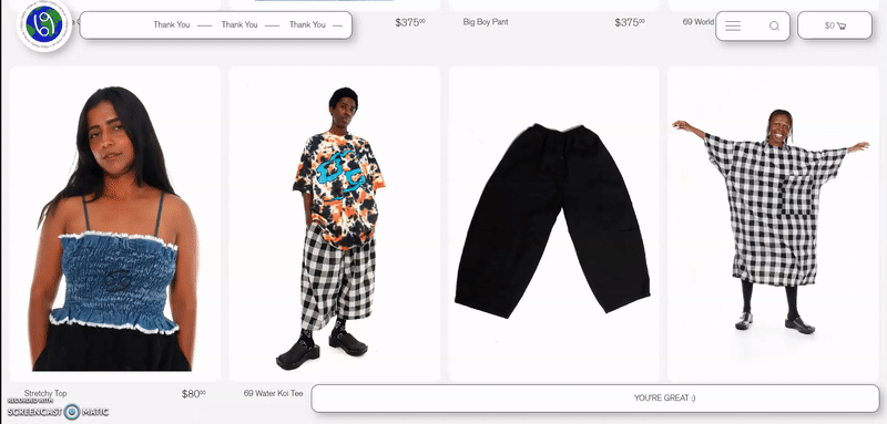
What makes it great:
Animated images are a fun and creative way to show garments.
The animation switches to an interactive page with a simple design and plenty of white space after you click on a specific product.

Motivational messages float across the screen, matching the brand's aesthetics and vision.
Add to cart button is in a different color, making a direct CTA.
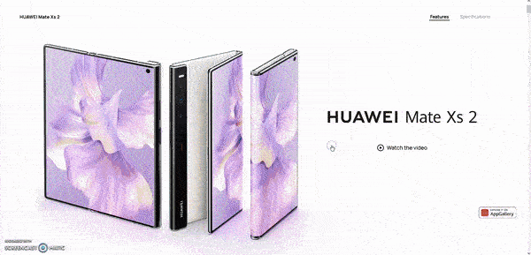
6. Huawei
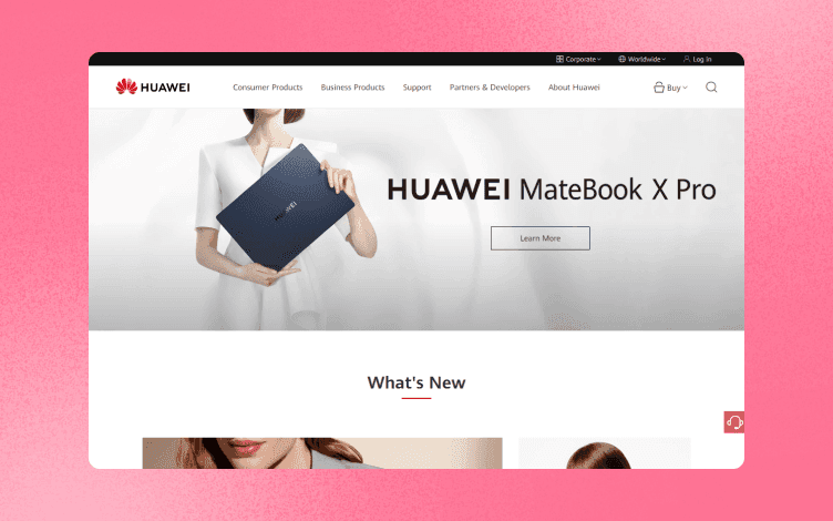
Huawei is one of the leading tech companies that, among other products, offers smart devices and mobile phones.
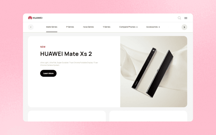
What makes it great:
Their crisp and clean photos make you want to own this phone.
Huawei relies on visuals rather than long, descriptive texts to inspire customers to buy their products. Stunning images and videos show an example of what you can do with this device.
Tips on How To Make Best Product Image Designs
Now that you have seen some great examples let's narrow it down even more!
By following these tips to make stunning product design images using Glorify can save you a lot of time.
1. Image quality has a significant impact on eCommerce conversions.
The image must be well-lit, in focus, preferably on a white background.
Using Glorify, click on the image you want to edit, select Remove background, and see the final result with clean and sharp edges within seconds.

2. Have the adequate size – Different websites require different image sizes. Suppose you want to market your product on different platforms. In that case, it is essential to be consistent with your images without compromising on the quality of photography.
Smart resize is an easy tool that allows you just that. Choose the desired image, and simply Select one of the templates available. There are many to choose from, from social media to eCommerce websites, each offering every size you'll need.

3. Use iconography to quickly showcase essential product features.
On the left panel, choose between basic Icons, Noun Project or Icon8, and select the one that is the most suitable for your image.

4. If using a white background is optional, go creative with different colors, textures, or effects.

Common Mistakes To Avoid
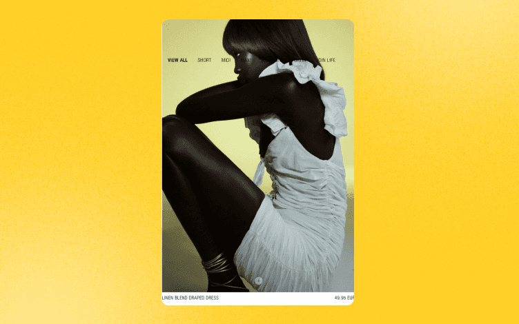
1. Having only one image of the product. Too much is not good because the page will look cluttered. Think about between 3-5, from several angles.
2. Don't get overly creative with angles when shooting the product.
Although it is a visually attractive solution, a customer still wants to see the product features, or in this case, how the dress actually looks on a model.
3. Blurry or low-resolution images – No matter how good your product is, you won't make sales if you don't use high-quality photos. In addition, it can make your product look cheap and your store unprofessional.
To Wrap it Up
Product pages, a crucial point of interaction for a customer, typically offer the best possibilities for making a sale.
To increase your chances of conversion when a customer arrives at a product page, store owners must offer the relevant details, including descriptions, reviews, and photographs.
You've undoubtedly realized by now that attractive design increases sales.
Does this imply that you must spend years perfecting Photoshop?
No, not really.
Glorify is a beginner-friendly app, perfect for eCommerce store owners who want to improve their sales and create beautiful designs hassle-free.
Give it a go and produce appealing product photographs that draw in potential buyers and eventually increase sales.


Features
Alternatives


© 2019-2024 Glorify App - All rights reserved.