We’re thrilled to announce that Glorify is officially partnering with Contra! This collaboration opens up exciting opportunities for designers, marketers, and creators in the Glorify community.
10 Brochure Design Best Practices To Apply Instantly

What Is A Brochure
A brochure is a printed or digital document with informational or promotional purposes. And it is typically used primarily as a marketing tool by businesses to advertise their products and services.

Types Of Brochures
As we said, there are printed or digital brochures. Additionally, they can be divided into the following categories:
Half-fold
Tri-fold
Z-fold
3-panel gatefold
Roll fold
4-panel accordion fold.

Benefits of Using Brochures
You may think that using brochures for advertising is outdated. However, numerous benefits make this kind of marketing still highly relevant.
A carefully designed brochure can do the following:
Add value to your business by making your branding unique.
Shows that your business is professional and that you are coherent with your message to your customers.
Is cost-effective and relatively simple to make using various online design tools.
Lets you connect with your customers and show off your creative side.
It is versatile. Because brochures can be digital and print, their distribution is broader than one channel. Besides accessing your brochure online (through email, as a newsletter, etc.), customers can receive all the information via conferences, trade fairs, newspapers, etc.
To sum it up, a brochure is an effective marketing tool that offers a thorough overview of your brand and the products or services you offer.
Important Things To Consider Before Brochure Designing
Before going into the design itself, you'll need to define some key points first.
1. Define the purpose of your brochure
Identifying a brochure's purpose is the first step in producing an effective one.
For example, do you wish to advertise a specific service or a new product?
Or Show some of your bestselling items?
The brochure's goal will steer you in the appropriate route.
2. Know your target audience
Another important question is, who is your brochure designed for? The second, very important one, is what is the distribution channel you will be using?
Feel free to check your competition, and see what kind of design they use.

For example, this Disney World brochure is aimed at parents and kids equally. It is highly informative but still cute and beautifully designed, so it's appealing to a younger audience too.
3. Create content
You should be aware of the proper placement of each piece of information while producing a brochure. They vary in size, but they always have a similar structure.
In the case of a tri-fold brochure:
• Include the brand's name and the headline on the cover.
• The inner flap should include all the information about the product, service, event, etc.
• The cover should have contact information and a call to action.
• The outside flap should offer the reader a perk: discounts, freebies, advice, etc.
Also, the components that each brochure needs are as follows:
Branding elements: a logo, colors, and fonts.
A memorable title.
Visually divided parts with headings, subheadings, and body content.
Relevant information, like website, email, social media contact information, QR code, etc.
Exciting and appropriate visuals.
10 Brochure Design Best Practices + Examples
Now, let's go into detail with brochure design best practices for each segment and what to take from them.
1. Be concise
Avoid the urge to go into detail about all of your brand's accomplishments or history.
Try to focus on one thing that matters the most at the given time.
A brochure's message will be diluted if it contains too much information and will only confuse the audience.
Instead, concentrate on what will instantly grab the attention.
The maxim that simplicity is better still holds true.
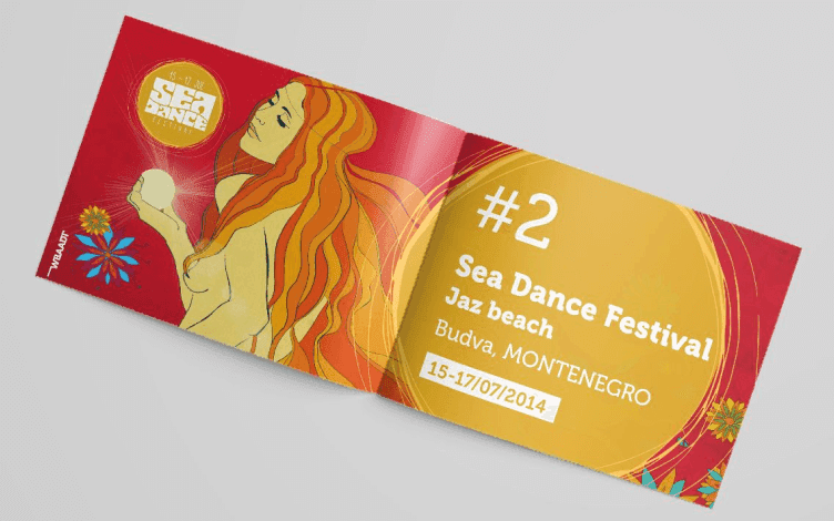
Always keep your readers and the message you want to convey in mind. A user-friendly brochure is always the main objective when talking about brochure design best practices.
2. Don't go overboard with fonts
Seeing a brochure in several different typefaces may be fun, but it is not a good idea.
Overly decorative or fonts that don’t go well together will attract all the wrong attention.
If your brand already has a custom font, start from there.
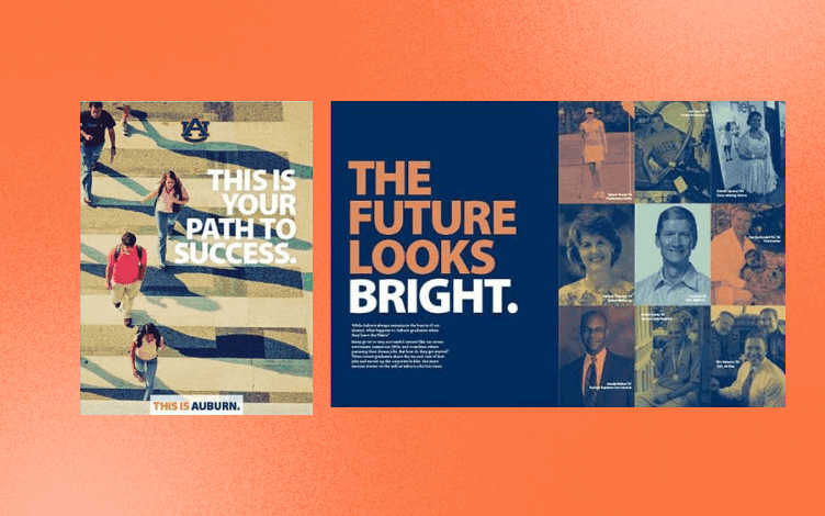
You can use that font throughout the brochure or add one or two additional to make it look more attractive. But, still, be sure fonts pair nicely.
3. Use simple language
Stay away from complicated, academic words and complex sentences. You'll want your brochure to be easily understandable to anyone, regardless of their education.
Use short, concise sentences in simple English to quickly convey your message.

4. Choose colors carefully
Colors have various effects on people. Some people immediately dislike a certain hue, while others would pick up a brochure based only on its color scheme.
For example:
Red is one of the most eye-catching colors, often used to indicate passion, alertness, and strength.

Blue is one of the colors that are equally popular among men and women. It evokes peacefulness, tranquility, and comfort. That's why it is often used in ad campaigns for financial institutions.
Green is associated with the environment and everything nature-related. So, it is a good choice for natural cosmetics, for example.
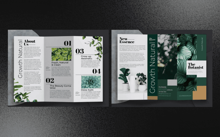
Black is a bold color in printed marketing because it creates strong contrast and makes your message stand out.

White, similar to black, is used to create contrast. But, if you go with too stark or bright white, it can leave a sterile, artificial feeling. You can opt for more saturated, off-white hues instead.
One of the brochure design best practices is to start with your brand colors and tones that go along. But don't go overboard. Sticking to two or three main colors is more than enough.
5. Use appropriate images
Humans are visual beings. And if we're gazing at something lovely, engaging, or entertaining, we tend to be more drawn to it.
The brochure's cover image and headline both serve as attention-getters.

You should carefully select visuals accompanying the text to make your brochure appealing.
They need to be related to the brochure's core theme to make the design more reader-friendly.
Also, you should only use high-quality and original images.
While photo sessions may not be accessible to everyone, using brochure templates are a great shortcut. Since they are highly customizable, you can turn a premade template into an original work of art.
6. Include CTA and contact information
Ensure that your brand's name, website, phone number, and email are prominently shown in the brochure.
Include your brand's social media accounts as well.
Including a QR code is another smart move to benefit your readers.

This is a great way to ensure your readers and potential clients can reach you through different platforms and learn more about your brand.
In addition, a strong call to action instructs the audience on what to do and provides the necessary inspiration. Finally, consider it a chance for customers to try out your products or services.
For example, for a pet shelter, an appropriate message would be "Adopt a pet today!" or something similar.
7. Make sure to have enough white space
For the reader to scan the text and get a sense of the broader picture, the elements on a brochure design require some space around them.
Separate headlines from body material, use margins to keep the text from contacting the edges and allow adequate space between contact data for easier reading.

8. Be brand consistent
Since a brand's logo serves as its public face, you should include it prominently in your brochure.
A logo that can accurately represent the company in all contexts is necessary for successful brochure design.
However, branding is more than simply the logo. It also refers to how you convey a particular message.

Brands usually have the whole package – a logo, custom fonts, and colors. Combined with all these elements, it strengthens the brand's visual identity.
9. Be unique and creative
Even though it is a good idea to look at what your competition is doing, ensure you are not plagiarizing anything. Since a brochure represents your brand, create something inspiring, unique, and authentic.

You can make several versions of the same designs and combine colors, fonts, elements, etc., until you figure out which works best for you.
10. Proofread the copy
And lastly, proofread and thoroughly check that everything is aligned and that there are no grammar mistakes.
It may not seem like a big deal, but a grammatically correct copy will only contribute to the brand's professionalism.
Conclusion
From this article, you learned that a brochure is a powerful marketing tool and brochure design best practices to apply immediately. So, let’s put them to the test using Glorify.
Once you’ve selected the template, use one of the many available features and tools to customize it and make it unique.
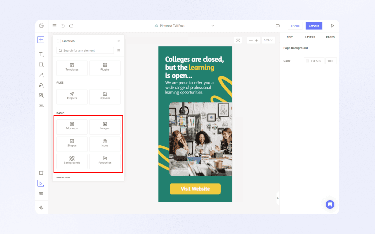
From the left panel, access Library, add or change the background, and add Shapes, Images, or Icons.
With a single click, you can personalize your design using the Brand kit feature.

Select an option to apply your logo or custom color palette.

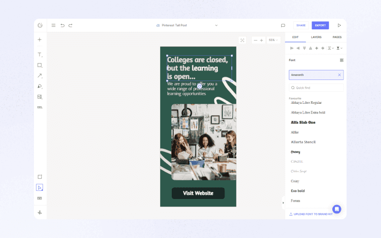
Then, click on the text to change the font (by using one of the many available fonts from the library) or upload your own.
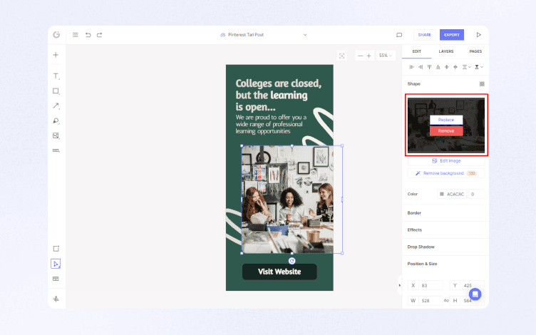
Add Shadows and reflections, Effects, or Borders to make your design appear more realistic.

Or, remove the background in a single click using the powerful Background remover.
Play around with Icons, Illustrations, Annotate tool, and Stock images to create a stunning design.
Once you are happy with the final result, you can save it in multiple formats or share it using email or a link.
Additionally, you can invite your team members to collaborate and brainstorm your ideas using Infinite canvas.
So, start your creative journey with Glorify today and create a memorable brochure that stands out!
Features
Alternatives
© 2019-2024 Glorify App - All rights reserved.


