We’re thrilled to announce that Glorify is officially partnering with Contra! This collaboration opens up exciting opportunities for designers, marketers, and creators in the Glorify community.
Posted Nov 9, 2022
•
10 min read

Design, Graphic Design

Create beautiful marketing graphics at scale.
Let's Talk About Circles In Design

The psychology and meaning behind circles
When including circles in images, designers often appeal to the psychology of viewers. Circles represent unity, integration and wholeness. They give a sense of completion, confidence and harmony. Circles have no beginning or end, and they don’t have awkward angles. This makes the circle a powerful yet safe, soft and mild element to use in your designs.
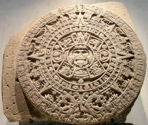
As for symbolism, since the dawn of time, circles have been associated with cosmic objects such as the sun, moon and earth. They represent magic, imagination, and mystery. A historic example of circles in art is the great Aztec Sun Stone.
Using circles in design
Circles have various uses in design. For instance, in logo design, they are the most common and widely used shape or background outline for logos. In web design, they are mostly used as buttons and small icons.
So what is it about these regular shapes that make them so appealing in designs? Why do we see so many circles used as accessory shapes in websites, graphics and even infographics?
Because circles are very noticeable and quite powerful.
Let’s take into consideration the power of a circle and how it can affect your creative images. Circles in design represent constant movement such as spinning or rolling. Their outline can serve as a band or ring representing a cycle or continuing action. They can represent holes punched into a page. With a subtle shadow effect, you can give stickers or buttons a 3D effect to make them look like they've been placed over the rest of the design.
How to make the most of circles in design
We have put together some of the most important tips on how you can strategically use circles to make your images stand out. We’ve analyzed some popular posters and graphics to show how a simple element like the circle can give meaning to your work.
Always remember, less is more! Let’s go!
1. Highlight the subject
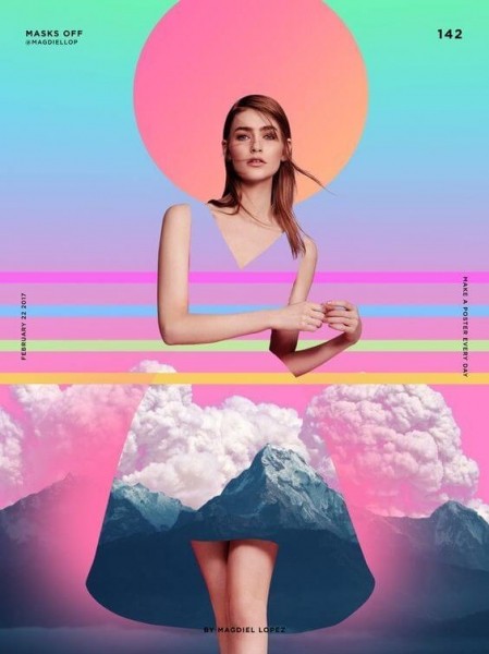
To showcase the most crucial part of your design, you can simply draw a circle around it. This technique of using a circle to highlight a face or a character has been around since forever. It can be found in religious iconography as well.
This gives your image a sense of mystery and compositional unity. Magdiel Lopez, a graphic designer, often uses circles in designs along with bold colors and futuristic shapes that give a sense of mystery, magic and poetry to posters.
2. Go for the minimalist approach
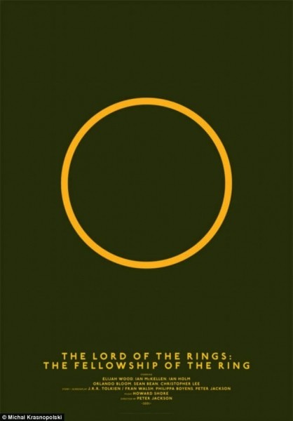
A circle in design can have many different meanings, and it’s up to you as a designer to use it in the most significant way. If your subject is well-known, a minimalist approach can go a long way and you can let the ad copy help the audience decode the meaning.
The Lord Of The Rings trilogy is an excellent example of how a simple circle can be a great reminder of a story.
3. Use circles as symbols
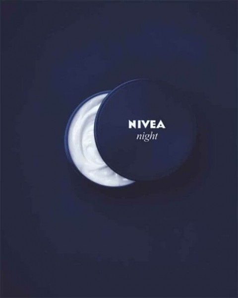
Circles have a cosmic significance and you can use this symbolism to talk about your product. For instance, Nivea did a great job of advertising their night cream. The packaging was used to illustrate the half-moon which emphasized when the product should be applied.
4. Don't forget semi circles
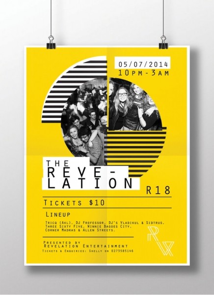
Circles in design don’t have to be complete to look great. Using semi or partial circles in design can help your visuals stand out even more.
In certain situations, a semi-circle can be more dynamic and vivid than the complete circle. With this, the significance also changes because a half-circle leaves the viewers curious, engaged and wanting more.
5. Add color to your circles
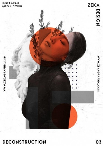
If you feel like your design looks a bit plain, just go for a pop of color. While keeping everything else black and white, choose a bright color for the circle.
You can never go wrong with this combo. This eye-catching contrast gives you a clean aesthetic look that keeps the focus on what’s important. The Zeka Design poster is a great example of this strategy.
6. Use multiple circles
When you use multiple circles of the same size in a design you can create a beautiful pattern, a sense of order, or a touch of mystery. You can always experiment with transparency and color to give depth to your image.

7. Emphasize on the message
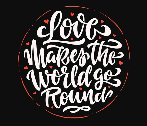
If you are trying to make your message pop, you can always add the text within a circle. If you pair that with a hand-lettering font that has round edges, it creates consistency in the visual. The lettering and shape complete the message while giving a sense of unity to the entire design.
6 Amazing examples of how to use circles to advertise
If used correctly, circles can be used to showcase a product, highlight a feature, or symbolize a concept in an advertisement. Let’s take a look at some examples of effective advertisements that use circles to stand out.
1. Highlight your offer like NatureBox
This works great when you don’t want to add too much text, yet want to draw attention to the offer. The best way to do this is by adding the main focus of your advertisement in a circle that pops. Just take a look at NatureBox announcing a free trial. You can also add your CTA in a circle to prompt viewers to take action.

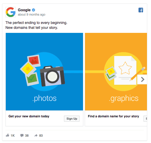
2. Focus on illustrations like Google
Circles in advertising can also bring together your illustrations as it gives a sense of unity.
For example, Google uses circles in its design to complete the illustrations for its carousel ad. Considering how Google’s logo and entire visual strategy rely on circles, it makes sense for them to integrate this concept into their ads, too.
3. Draw attention to a person like HubSpot
HubSpot uses various circles in their designs and advertisements to highlight the main character. This circle suggests good communication and confidence. If your ad has a portrait, you might want to consider adding a circle around the person’s head as this attracts attention and maximizes impact.

4. Use frames like Omniconvert
Have you ever wondered why most testimonials or team web pages use circles to frame photos of people? Framing headshots as done by Omniconvert gives the people in the photos more prominence, which helps build trust in viewers. You can use this great idea to boost ads and web pages such as the Testimonial, Team or About Us page.

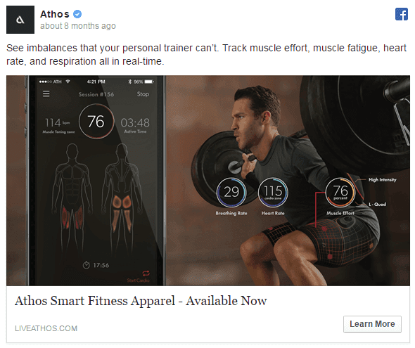
5. Display progress measures like Athos
If you want to emphasize evolution, growth, or progress of any kind like Athos, you can use circular and semicircular graphics as progress measures. Circles can also be used to display percentages, time, level of completion or any other measurable statistic.
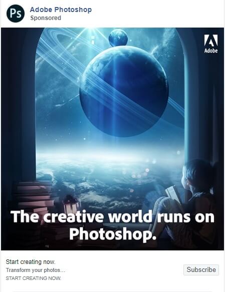
6. Portray cosmic symbols like Photoshop
Is your ad talking about creativity? Then the possibilities are endless. Use circles to make your audience dream and make them feel like they can do anything with the power of imagination. For instance, a great ad from Adobe Photoshop illustrates the power of circles through the depiction of cosmic symbols.
6 Circle design templates you can customize
After learning in depth about circles in design, we're sure you can't wait to try them out yourself. To help you get started, we have brought together 6 Glorify templates featuring circles. All templates are fully customizable and can be found in Glorify's template library. Let's take a look.
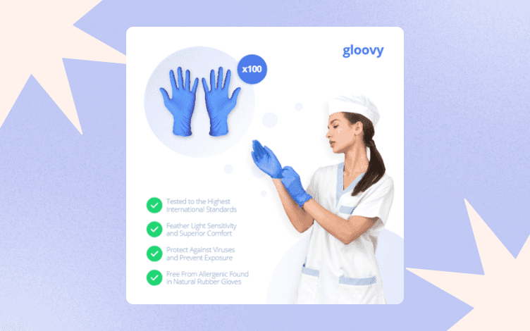
1. Medical template
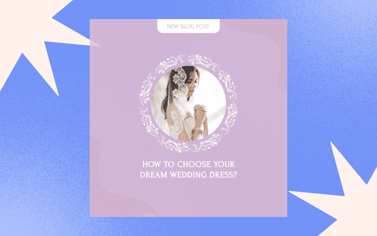
This circular frame talks about care, confidence and love. When you are promoting a medical facility or medical services, you might want to use this template.
2. Circular frames
You can promote all kinds of services using circular frames as it gives a sense of community. You’ll be able to emphasize the core values of your business or product through this template.
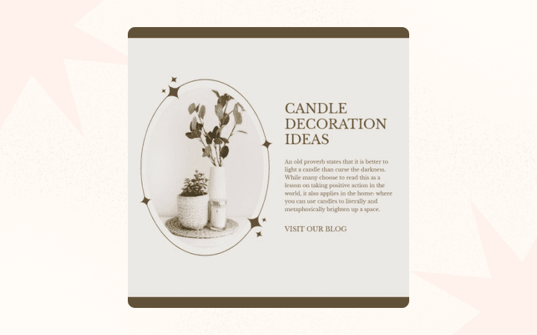
3. Concentric circles
You can use concentric circles in design to organize giveaways, promotions, events or contests. They attract the attention of viewers and make them want to take action or reach the relevant goal.
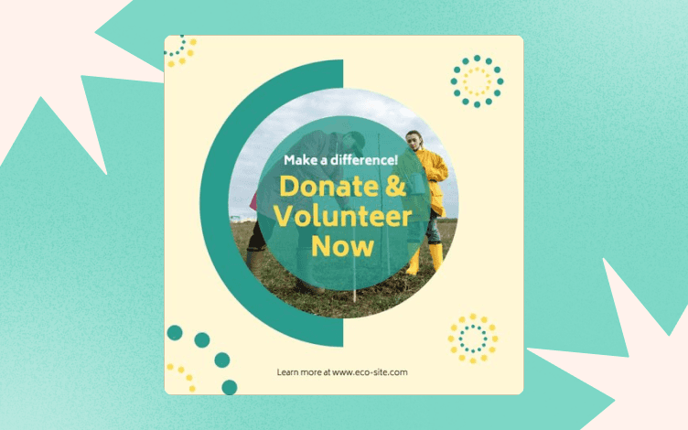
4. Rounded shapes
Nothing says health and nature better than round shapes. So, give your banner design a makeover and round-up it up with softer shapes and arcs.
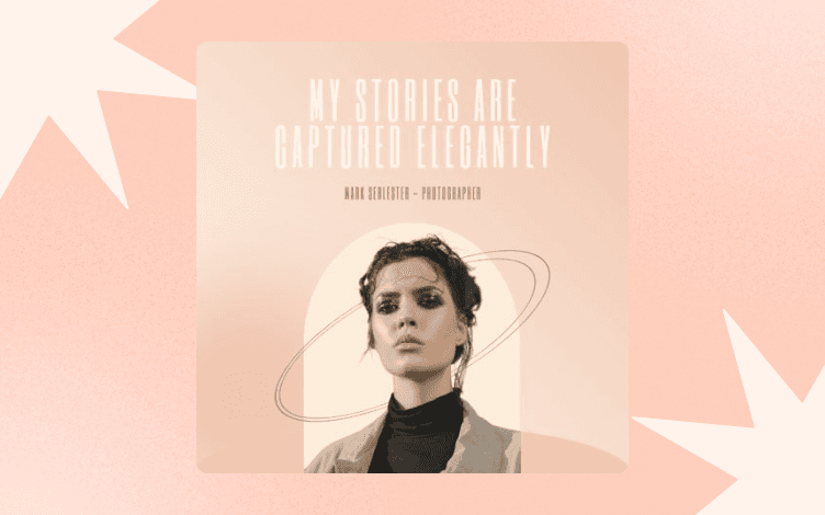
5. Bold colors and semi-circles
These work great for businesses in the creative industry like music or fashion. They are fun and imaginative and really make your brand voice heard.
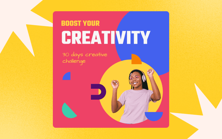
6. Circle frame with a white background
This gives your food and lifestyle blog a fresh, clean look. Do give it a try!
Stay on-brand with shapes
When using shapes to create graphics, you need to keep one thing in mind: Always stay on brand.
When you are creating a visual style guide, establish a selection of shapes that are going to be used for all brand graphics. Try not to use random shapes every time you create a new graphic. For instance, if your squares and rectangles always have rounded corners, make sure to keep them that way. Consistency is key to staying true to your visual identity!
To know more about advertising designs and hacks, take a look at these 30 advertisement design tips that turn heads.
Conclusion
Now that you're in the loop (no pun intended) about using circles in design, it's time to start experimenting with your own ideas. Whether you need a bit of inspiration from pre-designed templates, or want to create your own from scratch, head over to Glorify and get started!
Happy designing!
Let's talk about circles in design - FAQs
1. What are the three basic design shapes?
Square, triangle and circle. All other shapes are originated from these 3.
2. How do circles make you feel?
Circles are warm, comforting, and give us a sense of sensuality and love. Their movement suggests energy and power, whereas the completeness suggests infinity, unity and harmony.
3. Why are circles so important?
Circles in design, digital media graphics or print are still symbolically important as they are often used to depict harmony and unity. For example, the Olympic symbol has five interlocking rings of different colors, which represents the five major continents of the world united by the spirit of healthy competition.
4. How do you put a design in a circle?
Incorporating an images into a circle can easily be done in a few clicks using Glorify's editor. You can also create your own shapes and customize them to give character to your designs.
5. What is a circle in design?
A circle is a versatile shape that can be used for a variety of purposes. Apart from its symbolism, circles can be used to bring out a designer's creative side and make images fun and attractive.
6. Why do designers use circles?
Circles add character to a design. They can be used in product images and advertisements to highlight important features of such as offers or CTAs. Designers also use circles because of their strong symbolism and aesthetic appeal.
7. How do you draw a picture in a circle?
Images can easily be added to circles using Glorify's balanced editor. You can also experiment with various other features to enhance your designs and create aesthetic images that convert.
Features
Alternatives
© 2019-2024 Glorify App - All rights reserved.


