We’re thrilled to announce that Glorify is officially partnering with Contra! This collaboration opens up exciting opportunities for designers, marketers, and creators in the Glorify community.
Top Ecommerce Brands You Should Keep an Eye On

1. Then I Met You
This skincare company is inspired by the Korean concept of philosophy, a deep and meaningful connection that one can develop for people, places and things.
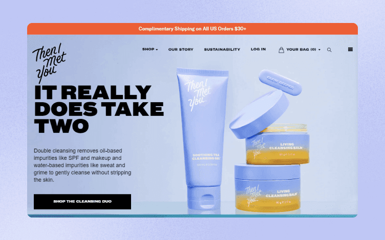
When you look at the Then I Met You website, you can see that:
Pastel colors create a soothing and clean effect.
There is a subtle transition between the website's various sections thanks to the simple design that changes colors as you scroll.
There is a short How-To Video showing how to use products.
With the simple CTA – Show us how you Glow deeper – they use UGC in their favor.
Product pages that are well-structured and present useful information in an understandable manner.

Their Instagram profile shares the same aesthetics and color scheme as their website, which makes the brand easily recognizable.
While the website offers in-depth information about products, the Instagram page is more audience-oriented, with UGC content and packed with lifestyle images.
What to take from Then I Met You?
Be visually consistent across all media platforms.
Stories highlights are divided into functional categories, with cute icons matching the brand's colors.
2. Rent The Runway
Rent the Runway is revolutionizing how modern women dress and changing the fashion industry by enabling women to rent and buy used clothing.

When you look at Rent The Runway's website, you can see that:
They use a bold color as a background and red to alert customers to an ongoing sale.
They utilize white space to distinguish between the header image and the other sections.
The whole section is dedicated to user reviews and UGC content.
The banner ad invites customers to a Labor Day Sale.

Their Instagram profile is playful and full of vivid colors.
It is a mix of professionally taken images and pictures of real people wearing their garments.
What to take from Rent The Runway?
Use well-edited images to showcase your product.
Don't clutter your feed with similar photos. Instead, opt for a video or reel.
3. The Home Depot
The Home Depot is the most significant hardware and home improvement product retailer in the United States.
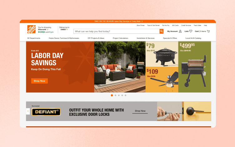
When you look at The Home Depot's website, you can see that:
Their signature orange color is used in banners, icons, and overall design.
The product images' background follows the represented category's central theme. For example, the fall colors are incorporated throughout the Labor Day Savings section.
Although it looks cluttered, you can find all the relevant information, tutorials, and recommendations on the main page.

The Home Depot Instagram page is full of images that show how customers use their products.
Short video tutorials explain how their goods are used and inspire customers to DIY activities.
What to take from The Home Depot?
Build an engaging community with your audience. You can do that by reposting their content, ask them for a feedback, and being responsive to comments.

4. Dossier
Dossier is an eCommerce brand that sells fair alternative to luxury scents.

When you look at Dossier's website, you can see that:
The minimalistic design makes the website easy to navigate.
Lots of white space, with bold, modern fonts and neutral palette makes everything look polished and clean.
Dossier uses elements from premium design to give its brand a high-end impression despite its inexpensive prices.
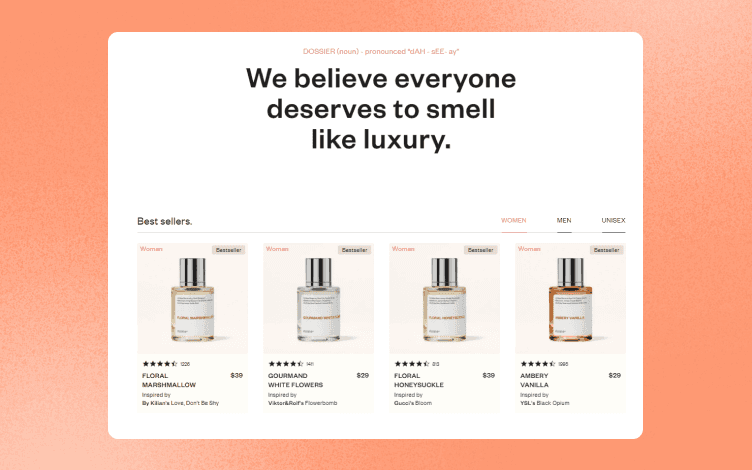
Products have simple, yet elegant packaging – white labels with red and black text.

A blog section covers variety of topics, and serves as a guide to finding the right perfume just for you.
What to take from Dossier?
Your branding should accurately represent your vision and how you want to be perceived as.
Use opulent design features, such as white space, neutral tones, and clean, contemporary fonts, to convey a high-end, luxurious vibe.
5. Taza Chocolate
Taza is a pioneer in ethical cocoa sourcing, making stone ground chocolate with bold flavor and texture.

When you look at Taza Chocolate's website, you can see that:
The colors they use are all neutral, earthy tones that correspond to their brand's vision.
The Shop section is visible without further scrolling, grabbing attention within seconds.
Customers can share every image on Facebook, Twitter, Pinterest, or email.
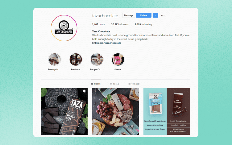
Their Instagram profile is filled with delicious recipes and how-to videos.

They collaborate with food influencers to raise brand awareness.
What to take from the Taza Chocolate?
Use vibrant and saturated colors when shooting food. Avoid blurry or low-quality images.
Share behind-the-scenes processes, recipes, tutorials, and else that can be valuable to your followers.
6. Velasca
Velasca is a footwear label famous for handcrafted Italian-made men's leather shoes.
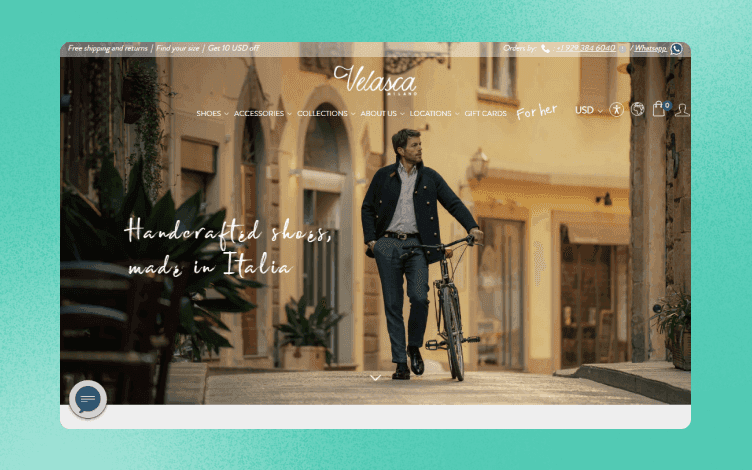
When you look at Velasca's website, you can see that:
They provide a discount in exchange for a newsletter or Google sign-up on their pop-up. It's a great idea to encourage users to sign up for your newsletter immediately.
Their homepage also features customer reviews and ratings, which aid in expressing the value of the product.

They use animated gifs to demonstrate the production process.

They offer a whole blog devoted to Italian culture, with anything from popular music to historical accounts of Italy in the 1980s.

Their Instagram profile follows the primary brand color by adding muted blue to Instagram Highlights icons and a profile picture.
A mix of product and lifestyle images, followed by reels, perfectly showcase their goods.
What to take from the Velasca?
Velasca built an entire atmosphere of the authentic Italian vibe using warm, soft colors, beautiful scenery images, and relevant blog posts.
A combination of fonts adds to the creativity of the website.
7. Airbnb
Airbnb is a company that offers vacation homes and apartment rentals around the world.
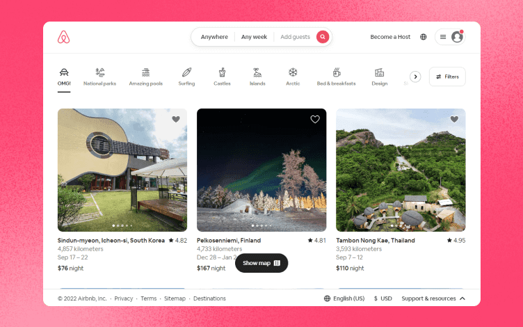
When you look at Airbnb's website, you can see that:
It has a clean layout with a lot of white space.
Icons in the header are an excellent way to differentiate categories and keep them organized.
They enable hosts to advertise their homes and tourism-related activities on their website. This way Airbnb can reach wider audience.
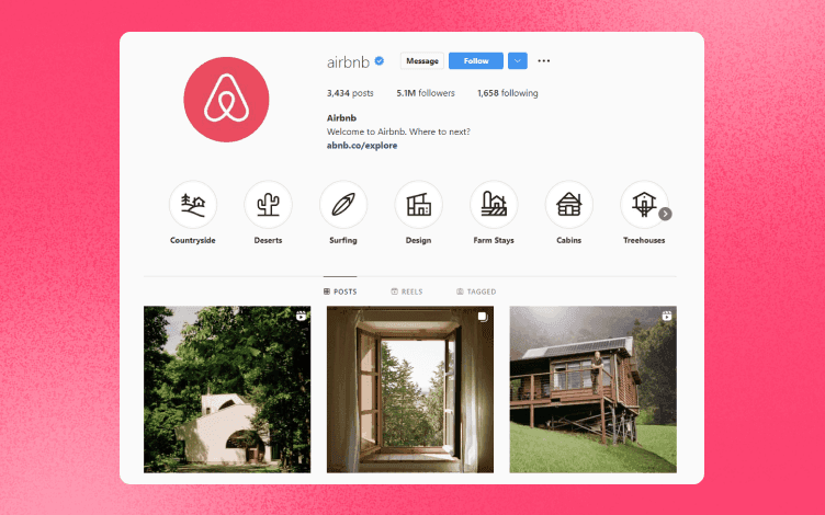
Their Instagram page matches their website design, incorporating icons for more straightforward navigation.

Utilizing user-generated content (UGC) and identifying the location, they market some of the sites advertised on their platform on Facebook, Twitter, and Instagram (and linking it on their bio).
What to take from the Airbnb?
Instagram highlights are a great way to save stories for your viewers to watch later.
It is also a convenient way of dividing information by specific categories in an organized manner. An Instagram story cover should go well with your brand's aesthetics.
8. Welly
Welly is an eCommerce brand that sells medicine, first aid kits and bandages.

When you look at Welly's website, you can see that:
It is filled with joyful and bright design making it visually attractive.
The company's philosophy is to promote adventures while making sure you're ready for them.
With vibrant, organic colors that also appear in the product packaging, its website captures the feeling of exploration while having fun.

While bandages are not a particularly fun product to promote, Welly managed to make the most of it by adding playful twist and bold colors to their design.
Creative storytellng, like promoting bandages as ‘’bravery badges’’, makes them irresistible.
What to take from Welly?
Use vibrant colors and cheerful pictures to give a serious product a fun touch.
Consider the message you're attempting to spread and utilize that as the foundation for your branding.
Conclusion
So, there you have it – top eCommerce brands you should keep your eye on!
These are excellent illustrations of how businesses may engage their audiences on social media and directly through their websites to drive traffic and conversation.
To sum it up, to maintain a successful eCommerce business and boost online presence, keep these in mind:
Set a tone of voice,
Be familiar with the design and social media trends,
Use UGC and influencers,
Know your audience,
Be relatable,
Express a personality,
Use high-quality visuals that will do your brand justice.
While on the topic of boosting your overall presence, Glorify is a tool that will help you on your way to success.
Glorify is a one-in-all tool that will help you create captivating images, infographics, mockups, and much more while saving you time and money.
It is perfect for eCommerce owners because it provides all the necessary features for creating beautiful designs within minutes.
One of the most important things in eCommerce is branding.To stand out in a fierce competition, your brand needs to catch attention, leave positive impression and deliver the right message.
But, creating a brand’s identity doesn’t have to be pricey or something that will take lot of your time.
Here are simple steps to follow:
1. Choose your color palette
A color palette should reflect your brand’s values, vision and style.
First, click the Brand kit on the dashboard.

A new panel will open, where all you have to do is click on Add palette, choose the colors you want, name your palette and click Save.
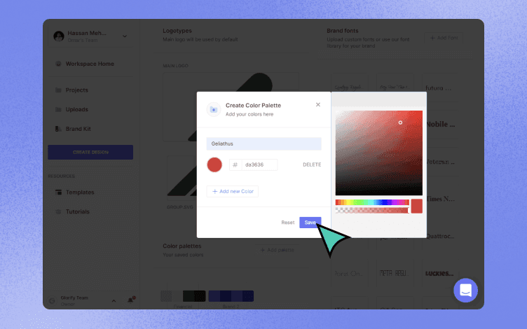
You can use this color scheme whenever you choose and incorporate it into any design in accordance with your branding colors.
2. Design your logo
The Branding kit templates allow you to easily create your logo. A well-designed logo can help you effectively communicate your brand's image, values, and story.
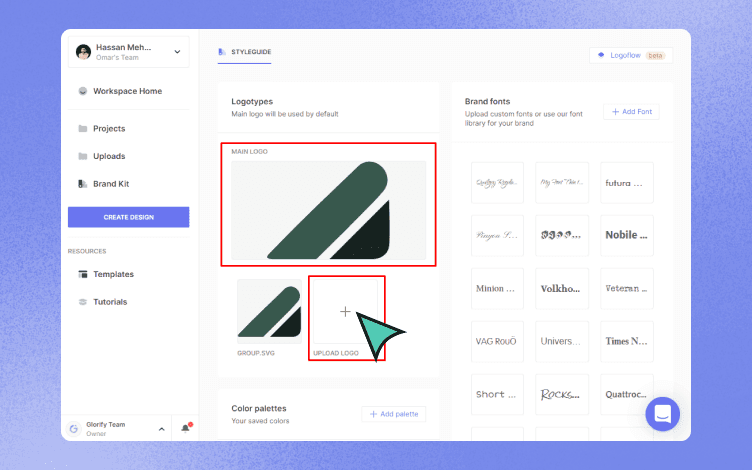
There are two sections: "Main logo," which is for a larger, default logo, like banners for a website, and "Upload logo," which is smaller, and can be used for business cards.
3. Choose or Upload a font
On the right side of the panel are options to choose a font or upload your own.
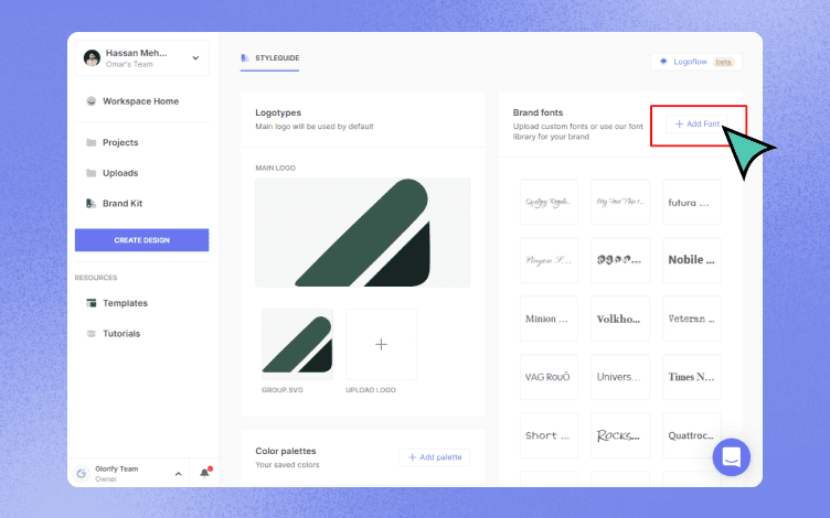
Just select "+add font" and then upload your unique font (must be a .ttf file).
Alternately, you can utilize the area below to select fonts from Glorify's font collection library.
To discover even more features, check out the new Glorify 3.0 beta version and start creating stunning designs.

Features
Alternatives
© 2019-2024 Glorify App - All rights reserved.


