We’re thrilled to announce that Glorify is officially partnering with Contra! This collaboration opens up exciting opportunities for designers, marketers, and creators in the Glorify community.
6 Event Email Design Ideas & Templates To Try

What is an Event Email?
An event email is an email you send to your subscribers to announce an upcoming event, such as a webinar, conference, presentation, etc.
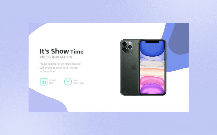
There are many types of event emails: from pre-event notifications to post-event follow-ups.
But regardless of their category, they have one thing in common: they are an essential tool for engaging with customers and driving sales.
The Benefits of Effective Event Email Design
The benefits of effective event email design are numerous.
Perhaps most importantly, an effective design can help you:
stand out in a crowded inbox
get your message across quickly and effectively
provide wider outreach
track RSVPs
manage guest lists, and
keep attendees informed before, during, and after your event.
However, to maximize the potential of your event email, you need to know what elements a good event email must have.
What are the Key Elements of an Event Email?
An effective event email design should be eye-catching and easy to read.
No one wants to have to decipher a confusing layout or hunt for the information they're looking for.
Keep your layout simple and your message clear.
Furthermore, an event email should also include all the relevant information about your event:
date
time
location, and
any special instructions.
Tips for Creating Event Email Designs
1. Keep It Short and Sweet
When it comes to event emails, less is definitely more. Keep your email design simple to the point and easy to navigate through.
In addition, your event email should ultimately encourage recipients to take action, whether registering for the event, purchasing tickets, or simply learning more about what you have to offer.
Therefore, make it easy for them to do so with prominent buttons or links throughout your email.
In other words, have a clear call to action that stands out.
2. Use Attractive Visuals
A picture is worth a thousand words, so make sure your event email design includes some high-quality images or graphics.
It will help capture recipients' attention and get them excited about attending your event.
3. Use Engaging Copy
In addition to using visually appealing elements, make sure your event email copy is also compelling and convincing.
Use persuasive language to highlight why someone should attend your event, and be sure to include all the relevant details like date, time, location, etc.
4. Incorporate Branding
Your event email design should reflect your brand's identity in some way.
Whether it's through the use of a logo, colors, or fonts, ensure that recipients will instantly recognize that the email is from your organization.
5. Test Before You Send
Always test out your event email design before you hit "send."
This way, you can catch any potential errors or issues and make sure everything looks perfect before it goes out to your entire list.
Now that we've covered the basics, let's look at some examples of well-designed event emails.
6 Event Email Design Ideas & Templates
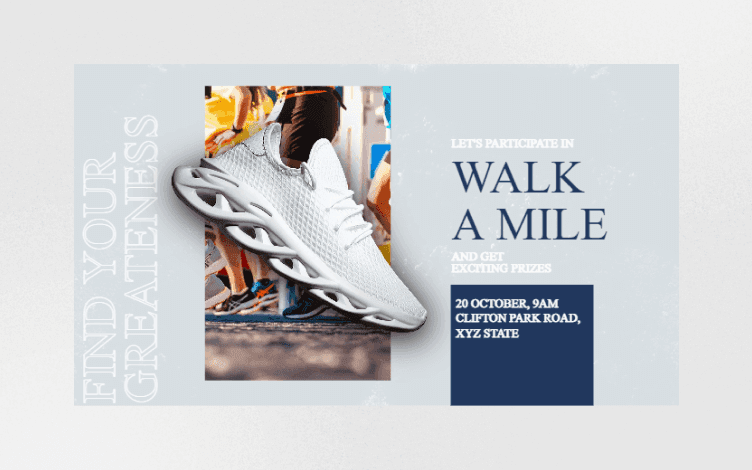
1. Giveaway Event Email Design
Giveaway events are generally popular because who doesn’t like to receive a gift or a small token of affection?
When creating a giveaway event email, pay attention to the overall vibe and color combo in order to emphasize your message.
If you look at the above design, you’ll see that the color combo in the picture, and the visual itself, are completely aligned with the overall copy.
I particularly like a very descriptive copy that helps you envision the whole event.
2. Event Email Design with UGC( User-generated Content)
A great benefit of event email design with UGC is that they provide credibility.
If people can see other people’s testimonials, comments, or feedback from your previous event, they are more likely to be interested in taking part themselves.
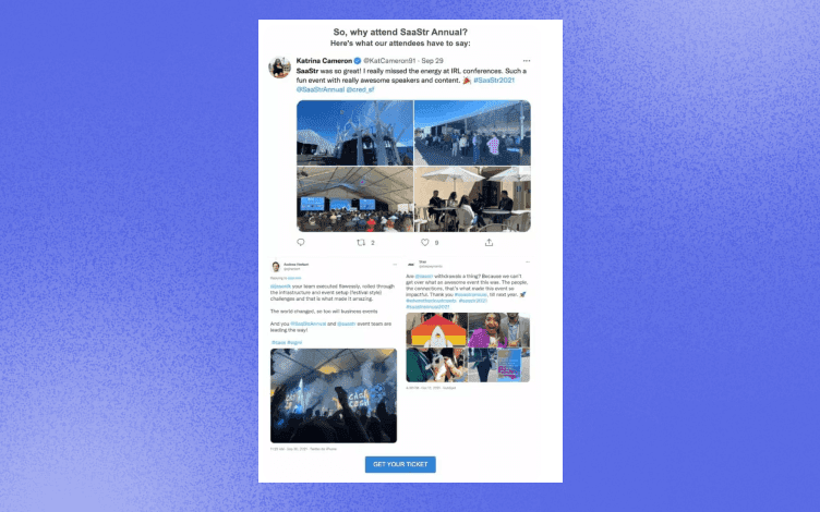
The above template is a great example of how a combo of UGC and photos can help you tell a story of the event and pique interest.
3. Limited Offer Event Email Design
What better way to create a sense of urgency than by including some limited offer or a countdown timer in your event email?
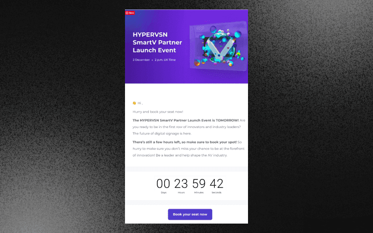
When you remind your recipients that the “clock is ticking,” they’ll make it a priority, so they don’t miss out.
This is especially true for people who are already interested in attending your event.
4. Announcement Event Email Design
Announcement event emails come in many shapes and sizes. You can announce an event, a product launch, a campaign, etc.
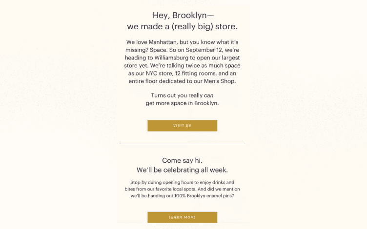
Unlike webinar invitations, for example, product launch announcements should have a bit of mystery.
You shouldn’t reveal everything but pique interest and curiosity.
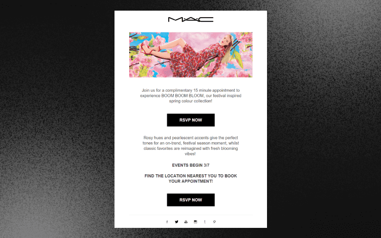
5. Event Email Design Offering a Value Proposition
Event emails offering a value proposition are a great way to show your expertise to new audiences.
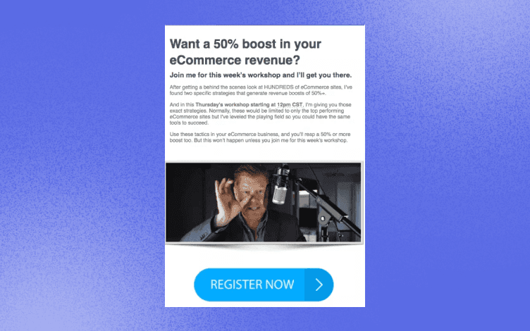
Did you notice that the above design not only offers a value proposition but also plays on an exclusive invite?
What was usually available only for eCommerce sites is also available for you now.
6. Reminder Event Email Design
Unless you organize a mega-popular event whose dates people remember by heart, it is always good to send a reminder event email.
You can automate the process and send reminders 1-3 days before the event. Nonetheless, you should also send it on the day of the event if your event is online.
If you host an offline event, make sure to send a reminder a few days before the event.
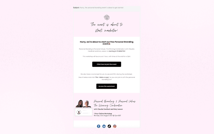
What works great for the email above is that it provides a quick summary, speakers, date, time and location, and a clear CTA.
The event email designs we’ve shared with you are just to get you started. So, here is a quick recap:
Whatever event invitation you send, keep your target audience in focus.
Your event emails should create excitement in your audience.
You should provide enough information, so participants know all the important details about the event.
Bonus Tip
We spoke about what you should include in your event emails. But let’s see what you should avoid doing.
When it comes to event email design, there are a few common mistakes that you'll want to avoid. Here are a few of the most common mistakes:
1. Not Personalizing Your Emails
Your event attendees are more likely to engage with an email that is personalized to them.
Be sure to include their name and other relevant information in the email so they feel like you're speaking directly to them.
2. Not Making Tour CTA Stand Out
Your CTA (call-to-action) should be the most prominent element in your email design. Make sure it's clear what you want your recipients to do, and make it easy for them to take action with a large, bold button or link.
3. Forgetting About Mobile Users
With more people than ever reading emails on their mobile devices, it's important to make sure your event email design is responsive and looks great on all screen sizes.
Use a simple layout with plenty of white space and large, easy-to-tap buttons or links.
4. Ignoring the Pre-header Text
The pre-header text is the brief bit of text that appears after your subject line in the inbox preview pane.
Don't leave it blank - use it as an opportunity to give recipients a sneak peek at what's inside your email or include a CTA of its own.
Final Thoughts
From copywriting tips to email design templates, there are a number of ways to create an effective and engaging message when it comes to marketing your event.
And speaking of design templates, they are your biggest aid in creating event emails.
The visual element is the first thing your recipients will see, and it will determine if they will continue reading your email.
So how can you create compelling designs for your emails smoothly? By using Glorify.
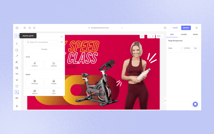
Glorify is a graphic design tool that helps eCommerce store owners and non-designers create stunning and professional-looking designs in a few easy steps.
Therefore, Glorify has a huge Template Library with thousands of templates for social media posts, ads, email marketing, etc.
In addition, you can sort the templates by niche and theme.
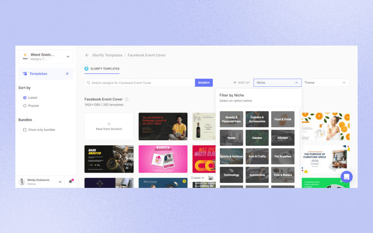
However, Glorify doesn’t only offers templates and robust photo-editing tools but also tools to boost your marketing efforts:
Brand Kits and color palettes
Logo maker
Infinite canvas, etc.
In addition, Glorify has an intuitive dashboard that gets you to your perfect design in a few clicks.
Do you want to get creative and test Glorify yourself?
Sign up today for free so you can get started on your own amazing email campaigns!
Features
Alternatives
© 2019-2024 Glorify App - All rights reserved.


