We’re thrilled to announce that Glorify is officially partnering with Contra! This collaboration opens up exciting opportunities for designers, marketers, and creators in the Glorify community.
7 Facebook Ad Creative Best Practices For Your Campaigns

What are the Benefits of Ad Creatives?
There are a number of benefits that high-quality Facebook ads can bring to a brand: such as
They can help increase brand awareness and reach a wider audience.
Can boost sales and conversions, as well as improve click-through rates.
Furthermore, high-quality Facebook ads can also help create a more positive brand image and improve customer satisfaction.
Before we get more specific, let’s see the general characteristics of Facebook ad creative best practices.
What are the Must-Haves for Facebook Ad Creatives?
When creating your ad campaign on Facebook, there are a few best practices to keep in mind to ensure maximum effectiveness:
Your ad creative should be visually appealing and relevant to your target audience. Make sure to use high-quality images and videos to grab attention and stand out.
Secondly, your ad copy should be clear, concise, and persuasive. Use strong calls to action and benefit-driven language to encourage users to take the desired action.
Lastly, test out different ad creatives and strategies to see what works best for your business and target audience. Constantly tweaking and improving your ad campaign will help you stay ahead of the competition and achieve your desired results.
Now that we’ve covered the basics, let’s get practical and see the best Facebook ad creative practices you can implement immediately for better conversions.
1. Customize Your Ads
Customization is vital when creating Facebook creative ads.
By customizing your ads to fit your brand and target audience, you can ensure that your ads are more effective and reach a larger audience.
By using creative customization, you can also create a more unique and engaging ad experience for your audience.
Additionally, customization can help you track the performance of your ads and make changes to optimize your results.
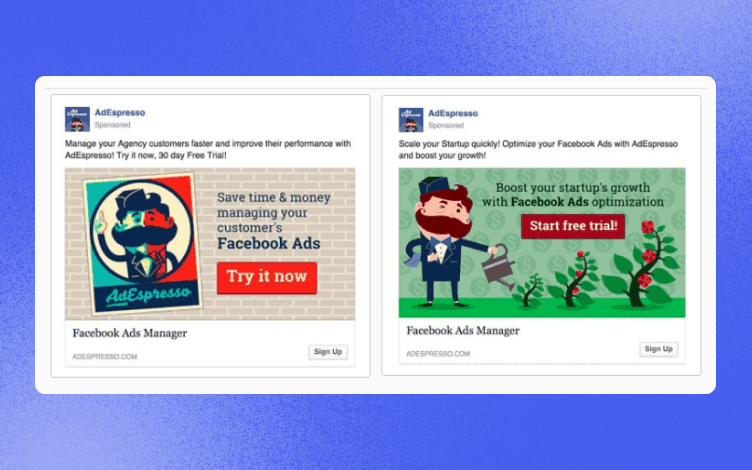
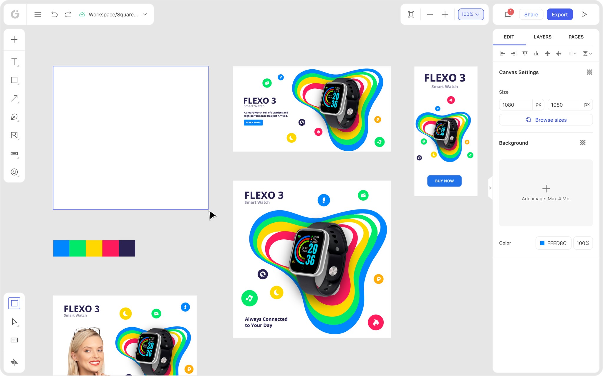
One of the ways you can achieve this is to use various templates that you can further edit and tweak to make them align with your audience.

As you can see from the image above, customization also goes hand in hand with retargeting and repurposing your campaign.
Adjusting your design to hit the different persona types relevant to your business will make you more visible.
2. Position Your Facebook Ad
There are three ways you can position your Facebook Ads:
The right-hand column
The desktop news feed, and
The mobile news feed
If you think that it doesn’t matter that much where you position your ad, well, think again.
1. The Right-Hand Column
Back in the days when Facebook ads appeared for the first time, they would be positioned in the right-hand column. Truth be told, this positioning might not get such high engagement as its other “cousins,” but you shouldn’t underestimate it.

So when does this type of positioning come in handy? When your goal is retargeting. In other words, when it refers to the people who already know and recognize your brand.
2. The Desktop News Feed
This ad positioning is the star of a show since it is the most popular out of the three. However, it does come with a price. Literally. This positioning can be much more pricey. But let’s see when it is best to use it.

Since these ads can be more on the expensive side, use them when you would actually see the benefit - when you are driving conversions.
Consequently, and if done right, your ROI should improve, too.
3. The Mobile News Feed
This positioning appears in the news feed, just like its desktop cousin. There is no doubt that this positioning is popular when you take into account the vast number of people browsing via their mobiles.

However, people still buy more from their desktops than mobile phones. Thus, if your campaign’s goal is conversion, this positioning might not be the best option. But, it is great to attract new customers and grab their attention. So try using this placement to raise brand awareness.
As you can see, depending on your campaign, each positioning can be relevant, so make sure to choose wisely to see the best results.
Moving on to more design-related Facebook ad creative best practices.
3. Show Discounted Products
It goes without saying that any eCommerce, or any business for that matter, will display discounted products from time to time.
At the end of the day, who doesn’t like a good bargain?
Still, the way you display your discount might make a difference to potential customers.
An efficient method you can use is showing your products with strikethrough prices.

There is nothing that customers love more than to see the original price and see how much money they will save by buying it at this new, reduced price.
4. Use Countdown Ads
These ads are closely related to discount ads because both emphasize the emergency factor - you only have this much time left to buy a specific product. It is primarily a psychological tool, but it does the work. People, in general, hate the idea of missing out on something. And when you add the element that reminds them of that, there is a higher chance they will pay attention to your products.
It doesn’t always have to be the exact countdown, but a very limited offer, lasting only for a day, like in the image below.

5. Choose Your Images Wisely
Again, depending on your campaign’s goal, you should be careful which images you choose. If you just want to raise your brand awareness, you can use the images where you, your employees or brand ambassadors are in, for example. Or any image that puts “a face” behind the brand’s name.
People go to social media to interact. They want to know the story behind the brand and know more about it.

The problem with the stock images that everybody uses nowadays is that they can come across as cold or impersonal. This doesn’t mean you should stop using stock photos, just don’t forget to add something that is your own, something unique and relevant to your brand.
The good thing is that these days many online design platforms provide editing tools so you can really give any stock image a completely new life.
6. Create a Copy Matching the Visuals
It is already hard enough to create a scroll-stopping visual, and now you have to think about the copy, too. But you do. Having a copy that isn’t in sync with your visual and doesn’t speak to your target audience can only damage your campaign.
Let’s just quickly check what a good copy should have:
It should be direct, straightforward and simple.
An ideal headline shouldn’t exceed 5 words.
The copy should be between 14-18 words long
A CTA should be clear and to the point.
Much more could be said about the copy, the colors, and the fonts you will use. There is a whole psychology behind it, and the choice may depend on the age, sex of your target audience, etc.
But let’s get back to matching your copy with your visuals. Many brands do it wrong, choose a nice image, add a copy, and think their job is done. You can post the most astonishing image in the world, but if there is no connection with your copy, it is entirely in vain.
The biggest damage these out-of-sync combinations can cause is a decrease in your ROI. When people don’t understand what your ad wanted to say, or if they aren’t sure if it is for them, there is a big chance they will just keep scrolling.
But let’s see an example where a copy and visuals are in match.

Since Facebook ad creative best practices in this blog are more design-orientated, there is no way we could omit Facebook video ads.
7. Use Video Ads
Although creating video ads requires more time and effort, it would be crazy not to use the many opportunities it brings. Videos are more engaging than just a copy or a still image. They can tell a story much more efficiently and in a much more engaging way.
What your videos will be about depends on your end goal, but some of the ideas could be:
promoting videos that show some behind-the-scenes footage,
product launches, or
customer stories to raise awareness about your brand.
Some other things to keep in mind when creating Facebook video ads include:
• Keep it short and sweet: It’s the fact that people have shorter attention spans than ever before, so it’s essential to keep your videos concise and to the point. Facebook recommends videos that are 15 seconds or less, but even shorter videos of 6-8 seconds can be effective.
• Use eye-catching visuals: Since people are scrolling through their Facebook feed quickly, you need to make sure your video ad catches their eye. Use bright colors, interesting graphics, and compelling visuals to grab attention and stop people in their tracks. And yes, ditch plain, white background if possible.
• Use an attention-grabbing headline: Many people tend to underestimate the importance of the copy above your video post. Just like with the still visuals, your headline needs to be straightforward and have a punch.

What is also important to mention is the sound in your videos. It is excellent if some nice tune or music accompanies your video, but remember that people often tend to scroll through Facebook in public places and might not hear it that well. Thus, don’t make music the star of your video.
Wrapping It Up
There is no doubt about the importance of Facebook ad creatives. Even more, there is no doubt about the essential role that high-quality images and visuals play in Facebook ads.
Yes, you need a compelling copy. Yes, you need a good ad placement, but it is the attention-grabbing visual that you’ll start from. If you aren’t sure where to start and are unsure of your design skills, you will definitely benefit from a design tool like Glorify.

Glorify’s main aim is to help eCommerce store owners and non-designers to create engaging and converting images in a matter of minutes and all in one dashboard. From many customizable templates, rich editing tools to logo makers, etc., Glorify has everything you need to create Facebook ads successfully.
So, what are you waiting for? Join Glorify for free and start creating Facebook ads smoothly and effortlessly.
Features
Alternatives
© 2019-2024 Glorify App - All rights reserved.


