We’re thrilled to announce that Glorify is officially partnering with Contra! This collaboration opens up exciting opportunities for designers, marketers, and creators in the Glorify community.
How To Create a Twitter Background Image [with a Step-by-Step Process]

What is a Twitter background and why it’s so important?
Twitter background is also called a Twitter banner or a header, and it takes abig part of your Twitter profile. Headers are displayed, on both desktop and mobile, above your profile photo, at the top of your profile.
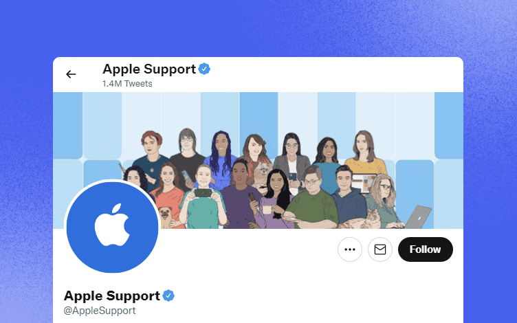
This makes it a perfect place for introducing yourself, promotions, showcasing something aesthetic, or sharing something related to your audience.
Brands, businesses, and influencers love Twitter. About 75% of all businesses are on Twitter, and about 67% of all B2B businesses use it for marketing. That's why a good header is so important and can help you get more followers, leads, and sales.
With a well-made Twitter background, you'll increase the awareness of your brand and have more successful marketing campaigns.
A Twitter background image can be changed in two ways:
Choose a theme from Twitter
Make and upload the image yourself
Most brands don’t pay much attention to their banners, which is a big mistake. But you can utilize yours to bring you more followers and customers. If you choose the right image and size for the background, it will pay off.
The Twitter background sizes are another thing that some businesses have issues with. If your header sizes are off, your profile will not look professional. So let’s look at some guidelines regarding Twitter background sizes first.
How to make a great impression with your background image?
Whether you're a business owner, a brand, or an influencer, you need to make sure your header looks professionally done. Here’s what will make your Twitter header leave a fantastic impression.
1. Keep in mind Twitter background sizes and formats
The best header size for Twitter is 1500x500 px and has an aspect ratio of 3:1. Images can be in JPG, PNG, or GIF (cannot be animated) format, and the size of your files should be a max of 2MB. But that's not where the story ends. This alone is not enough to guarantee you a great-looking background image.
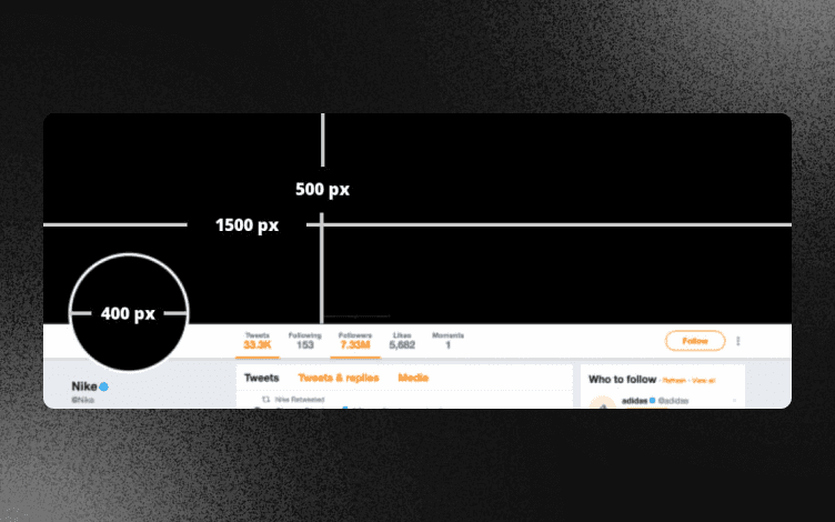
The position of your profile picture is also important. Your background image's design must be made so that your profile picture doesn’t cover anything relevant.
Depending on the type and size of the device your audience is using, your profile picture won’t always be in the exact place over the background.
2. Gather your Ideas
Gather all your ideas in one place, and sort through them until you find ones that go along with your marketing strategy. Then, from the remaining ideas, select the ones you think your target audience would like and react to. Of course, those imagery ideas must be consistent with your brand or business and its message
For example, you’re not going to choose a silly, funny, illustrated background if your brand or business is a serious, professional one. It just wouldn’t go along with your brand image.
The images you should choose should accentuate the traits you want your audience to connect to that will further connect them with your brand.
3. Make sure you maintain high-quality
Your Twitter header must be of high quality if you want it to look professional and for your audience to take your brand seriously. Like a store window, your Twitter header is what gives the first impression of your profile to your audience. If it looks confusing, unclean, not pleasant, like it was an afterthought, you might lose potential customers.
4. You should personalize it
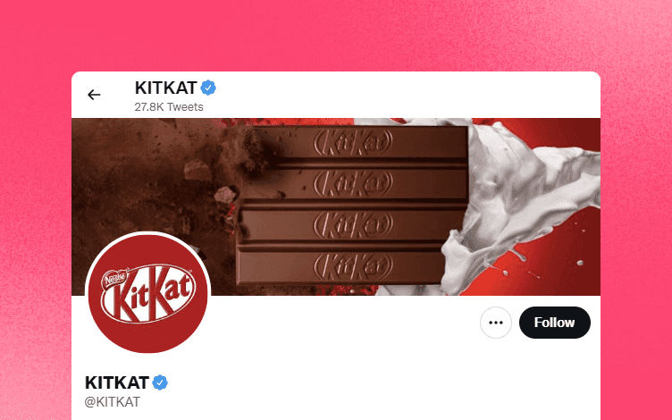
The moment your audience sees your banner, they should think of your brand. That means you shouldn’t use already given Twitter themes or stock photos at all, or at least not without personalizing them first.
Your Twitter background image should be uniquely yours, so perhaps you should forgo Twitter themes and stock photos altogether. There are some great design tools (Glorify) to help you create amazing things for your business/brand, so maybe you should try them since they’re not complicated to use, and no one knows your business better than you do.
5. Give your audience the news
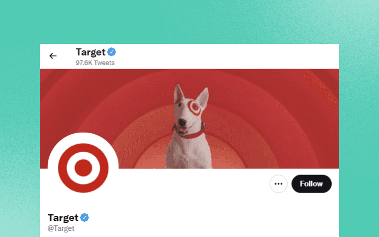
Your Twitter background is a perfect place to put some advertisements, news, offers, etc. For example, suppose you have a new product or a service, there’s no better place to mention it than your Twitter header. On it, you can also notify your audience of sales, events, courses, giveaways, contests, and so much more.
6. Use Social proof
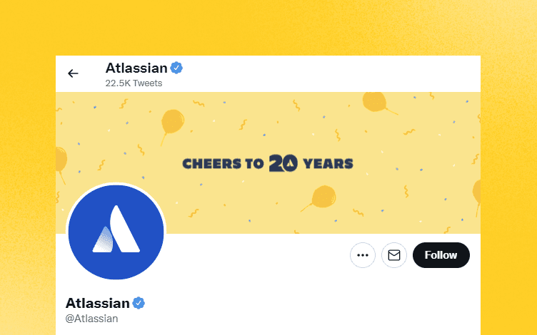
Social proof has so much power and can help a lot with your business, so putting some of it on your Twitter background might be a great idea. Especially if your brand/business is customer-oriented. For example, you can showcase some of your awards, the famous people or brands you work with, or some of your customers' testimonials.
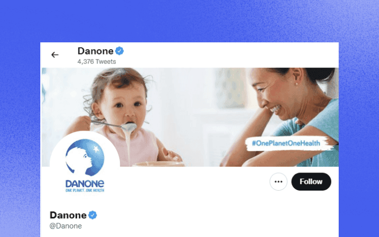
7. Include a hashtag
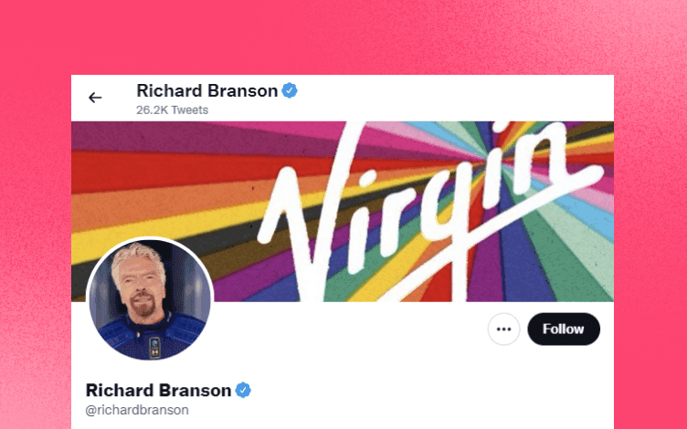
Hashtags are as popular as ever, so If your brand has a hashtag and you want to spread its awareness, you can put it on your Twitter background. This is especially helpful when trying to get more user-generated content. Of course, people sharing your hashtag from the header can only be great for marketing purposes later on.
Twitter Background Best Practices
So what else do you need to pay attention to besides making sure you have the right background image sizes and high-quality pictures? There are other things that you can do to ensure that your Twitter header is raising the attention you need.
1. Everything important goes to the middle
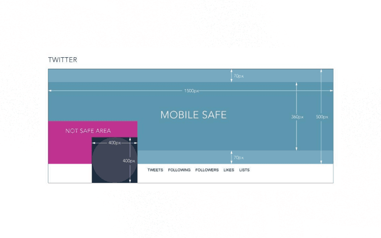
Your Twitter background will look different across devices. The image will get stretched and cropped, so to be sure, keep the most important elements of your header around the center. Also, your profile image shouldn't cover the important parts of your background image no matter what device visitors are using. Here’s all you need to know about the “safe zone” for your background image but also a profile picture:
Safe zone for Twitter background image
Considering your Twitter profile image size of 400x400 px, the "safe zone" for your Twitter header is only approximately 1500x360 px. In the picture below, you can see how your Twitter background image will look displayed on a desktop. Of course, as the screen size starts getting reduced, your profile image space gets reduced too.
2. Be direct and keep it simple
So, there’s not much text you can put on your background image, so you’ll need to be direct and not overcomplicate the message. That means you’ll need to sift through your ideas and make them as concise and clean as possible.
Your header will still need to convey your message, but keeping it simple will only generate more interest and help motivate your audience to react.
This is the reason many brands and businesses are putting only images, steering clear of text for their headers. If you decide you want to use text, it needs to be easy to read and not overcrowded.

Use fonts that are easy to read, and the color contrast must be enough, so your audience doesn’t strain their eyes trying to read your message.
Another reason you should choose a simple font, less text, and color contrast is because when your audience uses different devices, your Twitter header doesn’t look ugly. Since over 80% of Twitter visitors use mobile devices for it, your background must look flawless on mobile.
3. Give your audience an emotional moment
If you wish to give your audience an emotional lift, share something positive, or even go for deeper emotions, if done well, this can have a significant impact on your relationship with your audience. Touching peoples’ hearts have never been an easy task. Still, if you manage to do that, there’s no telling how far you can take your brand/or business.
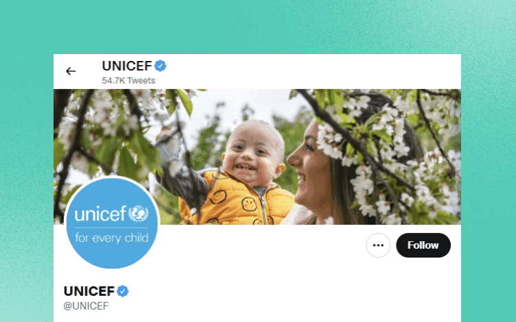
Example of Unicefs’ Twitter header, conveying deep emotions to their audience. Many charities and non-profits choose this type of images because the nature of their business is helping and connecting. So, it’s in human nature to involve emotions in these situations.
4. Be creative and visually appealing
Whether you decide to use your brand’s color palette or venture into something a bit different, a visually appealing and creatively done Twitter background image will instantly draw your audiences’ attention. And if you can do it complimenting your brand signature along the way, be it a logo, image or slogan, then that’s even better.
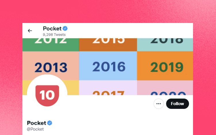
Example from “Pocket” where the design is visually stunning, but also does a great job of explaining what the brand does and showing its uplifting personality.
Whether you already have your logo, color palette, etc., or not, you can do it yourself, and it’s not that complicated. You don’t even need to hire a professional designer or a company to do that for you. Instead, you can just follow this Glorify step-by-step guidelines and get your pro-looking Twitter background image.
Create Twitter background using Glorify
1. Sign or Login to Glorify
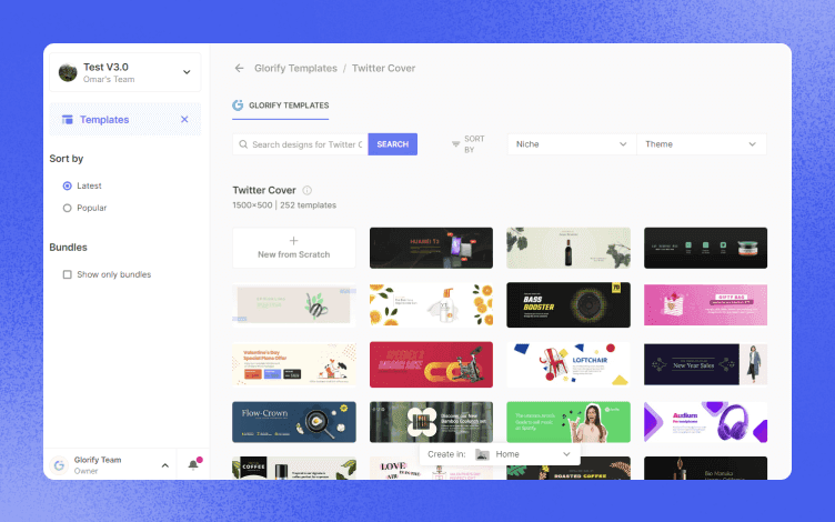
2. Here, you’ll be given a wide variety of template choices. Keep scrolling to the right until you see the “Twitter cover” option, and click on it, or you can search for it in the search box which is even easier
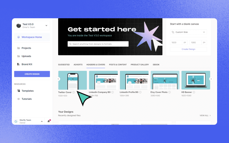
3. Choose one of the pre-made templates that goes with your type of business or create “New from scratch” design

4. When you find the right template, click on “Use this template” button to enter the editor screen
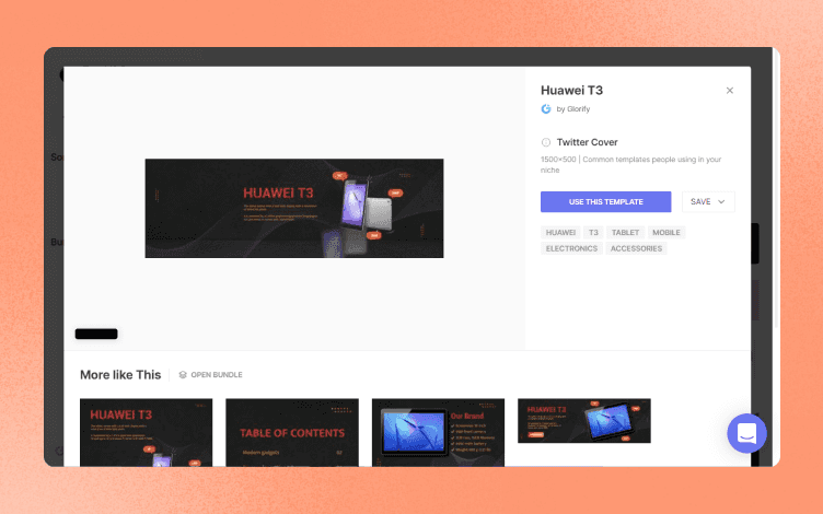
5. After you’ve chosen the template, you can change whatever you’d like on it. Images, color, text, fonts, logo, background, etc.
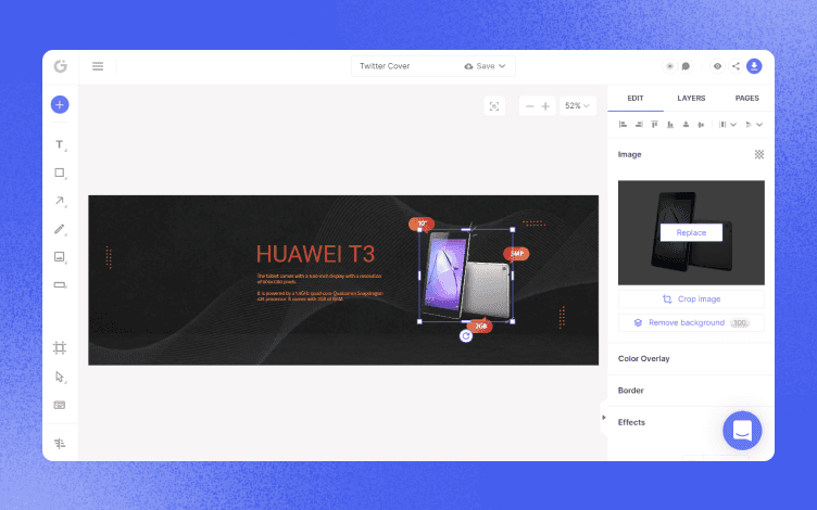
If you don’t have your logo, color palette, or anything else, you can make those on Glorify as well. Then you can upload your own elements to use on a Twitter header, or choose from Glorify list (fonts, pictures, and other elements).
6. When you’re satisfied with how your header looks, save your design by clicking on the green “Save” button in the upper-middle part and then click on the blue “Save” button
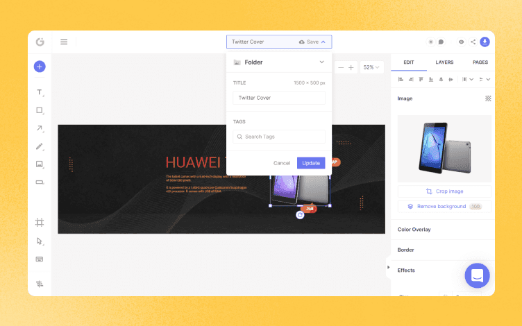
7. To download your design click on the blue “Download” button, and it’s ready to use
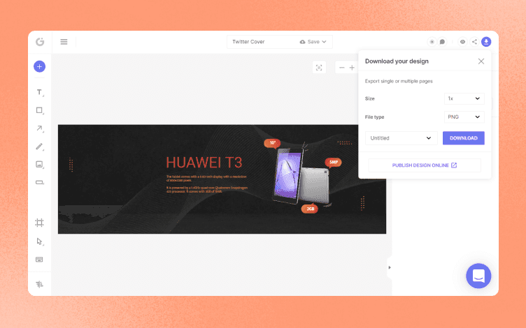
That’s it! Upload your design to Twitter, and see how it draws the attention of your audience. Great job!
Conclusion
Having the right Twitter background design with the right sizes and formats (across the devices) is very important when trying to separate yourself from the rest. The advice given here and the step-by-step process on Glorify will help you design a successful background image consistent with your brand or business. Of course, making everything according to your business recipe makes a lot of sense because, after all, you’re the one who knows your brand/business the best. So, sign up and start transforming your Twitter presence and attracting your audience at scale.

Features
Alternatives
© 2019-2024 Glorify App - All rights reserved.


