


We’re thrilled to announce that Glorify is officially partnering with Contra! This collaboration opens up exciting opportunities for designers, marketers, and creators in the Glorify community.
How To Create Graphic Design Wallpaper Backgrounds Easily Using Glorify

Why is Background Important?
An excellent graphic design always starts with a background.
The background you select can significantly alter your design and make your graphics feel complete. It can make or break the layout, take it to the next level, or make a total mess!
You may feel the need to use all of the tools and features available, effects, and creative fonts when creating a post.
But, have you ever realized how many professional designs use plain and simple backgrounds?
Simple backgrounds are an excellent path for your social media and marketing materials. They provide a blank canvas that promotes your message to your subscribers.
Starting with a blank screen can be intimidating. Fortunately this quick guide will help you along the way.
Graphic Design Wallpaper Background Trends in 2022
Since the right background carries a project, choosing the right one can be tricky.
A solid color, texture, watercolor, geometric shapes, gradients, or marble patterns?
Which one would make your project stand out?
Here are some examples of 2022 wallpaper background trends and how to create them using Glorify.
Follow these simple steps:
1. First, go to the Dashboard and find Templates. Choose the template you want among Headers & covers, Product gallery, Adverts, Posts & content, and Ebook.
2. You can filter your search by Niche or Theme

3. When you find desired Category templates, you can start New from scratch or use already made templates.

Now that you have your template let's customize it with a background!
1. Watercolor art
Watercolor is primarily used in web design and features hand-painted textures.
Design made with a watercolor effect produces very interestingly one-of-a-kind textures that you will not see in any other type of design.
The water alters the saturation of the color, how it expands throughout the page, and how it integrates with the other colors in the design.
Because of its soft appeal, this design trend has grown in popularity.
Furthermore, this design trend provides an artsy and authentic feel and makes the content more unique. It has the 'imperfect-on-purpose look,' making it look like it's been done by hand and shows off a cool and relaxed vibe.
It is popular for making logos, business cards, invitations, web designs, packaging, apparel, and book covers.
If you want to incorporate watercolor art into your designs, take the following things into consideration:
1.Choose colors that go well together – Use colors next to each other on a color wheel (like purple and blue) or different shades of the same color ( from light blue to navy blue).

2. Don't use more than three colors in your design – using more colors will create a muddy mess and overpower the message you are trying to convey.
How to find a perfect watercolor background using Glorify? Follow these steps:

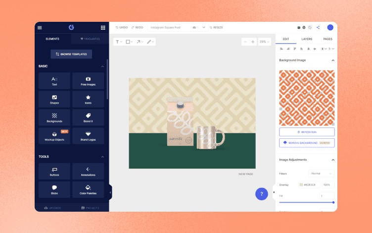
1. On the left panel, choose Background, then type in the keyword Watercolor to refine your search.

2. After choosing the background you want, you can customize it using options from the right panel.
3. Using Image adjustment, you can Fill the image, change the Brightness, Saturation, Hue or Contrast, and Image transparency. You can also Reposition or replace the background image or simply upload your own

2. The Bokeh Background
These blurry, out-of-focus designs create an ethereal effect that makes the design softer and calming.
Because they offer soft-focus and dreaminess to the images, they are great for websites, magazines, book covers, and other media types.
They are also great for showcasing beautiful typography or fashion catalogs, wedding invitations, and other content with a romantic feel.
See how these beautiful bokeh backgrounds instantly change the feel from nostalgic to dreamy.
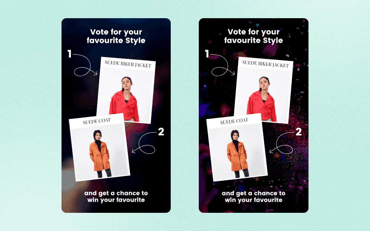
3. A Simple White and Gray Background
Basic white and gray backgrounds will undoubtedly become a go-to for your design projects. Gray gives you a pop of color without being overpowering.
If you want to give your designs a sleek and clean appearance, go with these color options. Although they are almost free of color, they are highly customizable and give your design a polished look.
Using minimal colors means focusing on essential elements within your design.
Most white and gray backgrounds have some texture to distinguish different design elements.
They can be used behind or over graphics, typography, and other textures on posters, stationery, websites, cards, and covers.
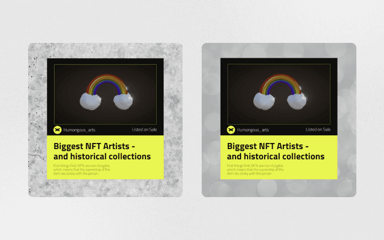
The same image with a white and gray textured design
4. Single Color Background
Optioning for a solid color is always a good choice for a background design.
Pure white is a default choice when you want to showcase a product.
But, sometimes, you need to add some color.
You can intentionally use color to create the feelings you want customers to have while interacting with your brand and goods.
It is believed that colors represent feelings, so blue creates a sense of trust and calmness but also encourages appetite. Green is for nature, freshness, growth, money, and new beginnings. Purple is for creativity and wealth, while yellow evokes hope and happiness.
Remember that your product images must complement your brand's colors if you want to get the most out of them.
If you are unsure what color to choose, Glorify will help you.

It offers color palettes of tones that go well together, so you can choose any that fits your needs.
5. Geometric Shapes
Another trend that's been strong for years is geometric shapes, such as circles, polygons, squares, triangles, pentagons, hexagons, octagons, diamonds, and stars.
One of the simplest methods to design an eye-catching background for your text is to use geometric shapes. So how can you do that?
The shape of the canvas itself is geometric.
So, as you start creating, consider whether and how much to divide that area.
Your text must compete more with the background the more complex it is.
That's okay, just consider enlarging and bolding your text or using a contrasting color to make it stand out.
Another tip is to change the transparency settings on the backdrop shapes so that they slightly blend into the canvas, letting your surface pieces stand out.
Geometrical shapes, modern colors, evergreen themes, and minimal typography are good starting points for creating a fantastic design!
These shapes are particularly suited for creating business cards or brand logos, where it's best to stick to the essentials.
Choose big geometric shapes with straight lines if you need to create contrast and a visually exciting background.
6. Wood grain
Regarding product photography and scene-style designs, woodgrain backgrounds are popular.
They offer an organic and natural environment. These backgrounds put the product in the focus of attention without being overwhelming.
How to choose the right wood grain background style?
Try to match the color of the wood to the front elements and look for wide or thin boards based on the foreground elements to make the most of wood grain designs.

The aim is to keep objects out of the spaces between the boards or "cracks."
Do’s and Don'ts For Choosing a Background
1. Less is more – Choose an element of your design you want to focus on.
Use a simple background if you have many elements, such as lots of text and products.
And vice versa – keep other elements minimal if you have a busy background.
For clean and sharp design – use simple shapes and solid colors for the background.
2. Use colors that go well together – If you are unsure, you can always consult the color wheel or simply use pre-made templates with the built-in color scheme.
3. Use Blur – If you want to use an image as a background, that could suffocate the whole design with too much going on. That's why you should use the Blur tool. It will soften the image enough to see the shape but not to be the focus of the design.

Don't over-blur the image. You should see the contours and shapes.
To Sum It Up
When designing, the role of the background is often overlooked.
But, as we said, backgrounds are the backbones of the design. Carefully selected wallpaper can enhance the whole design, enhancing the product and highlighting the important elements.
In this article, we showed you some 2022 trends and how to achieve them using Glorify.
Dive into the endless possibilities of this online graphic editor and start creating beautiful designs today!


Features
Alternatives


© 2019-2024 Glorify App - All rights reserved.