We’re thrilled to announce that Glorify is officially partnering with Contra! This collaboration opens up exciting opportunities for designers, marketers, and creators in the Glorify community.
Posted Jan 9, 2023
•
6 min read

Design, Graphic Design

Create beautiful marketing graphics at scale.
How To Design A Brochure: The Ultimate Guide For 2023

A brochure is a single sheet of paper that has been folded several times to give a multi-page marketing asset. They come in different forms such as single-fold brochures, bi-fold brochures and tri-fold brochures.
Whichever type you're going for, the creation process is the same. Here's what you need to do to create your own brochure:

How to design an effective brochure
1. Identify your target audience
Before you get carried away with the design, you need to first identify your target audience. A marketing brochure is no different from any other promotional material. It may be talking to all segments of your audience or maybe just one segment such as paying customers. You need to clarify this before getting started.
The content of the brochure including images and textual information should be customized to suit your target audience. So finding out who you’re aiming to reach should always be a priority when creating a marketing brochure. Set a specific goal in mind and decide how you are going to achieve this target in relation to your selected audience.

2. Choose your brochure type
If you thought your choices are limited, think again. There are many different types of brochures you can use to add a bit of creativity to your marketing campaign. Some examples of them are half fold, letter fold, tri fold, open gate fold, closed gate fold, accordion fold, and roll fold. The type of fold you choose depends largely on the functionality of the design.
3. Include specific messaging
This step involves the drafting of the information that will be presented on the brochure. According to the type of brochure you choose, analyze what copy is required and how your message and information will be distributed across the design.
Your brochure’s front page needs to draw the reader’s interest by keeping the message captivating and concise. The descriptions included in the brochure should be clear and informative.
It is important to make sure your text or copy is distributed evenly according to the number of sections your chosen type of brochure has. Start each section with a bold heading that immediately conveys the message you want to give.
Don't include long drawn-out text that talks too much about your company. Readers want to know how your product can help them, not the history of your business.
End your brochure by adding the contact details of your company along with the website and social media channels so that locating your brand online and getting clarifications are easy.

3. Design on-brand marketing material
Now that you know who your brochure is for and what it needs to include, it's time to get to the creative part: designing captivating visuals.
Take note that for each product or service mentioned on the brochure, there should be one or two supporting images. Don't go overboard, though. You don't want to clutter up your brochure. If you have an "About" or "Communication" page, add a bit of flair with some photos, icons, or illustrations.
Make sure all images are on brand. Use your brand colors, fonts, logos and elements so that your brochure is aesthetic and professional at the same time. An on-brand brochure also creates instant brand recognition among your customers.

4. Plan the layout
Now that you've got all your content ready, all you need to do is put it together and add it to the brochure. To do this, you have to first decide on a great layout. It's best to create a customized template that shows your brand personality and speaks to your target audience.
Here are some tips to keep in mind when deciding the layout of your brochure:
Scale and crop images to ensure uniformity.
Use solid colors and graphic elements to add extra flair.
Add depth to background images by inserting picture overlays.
Stick to two to three different colors. Don't go overboard.
Leave a border in your layout. A white border makes your content stand out more.
Evenly distribute your content across all pages of your brochure.
Make sure that no page is too text-heavy or cluttered with images.
Arrange your content to ensure maximum readability and clarity.
Once you have finalized the layout, add the content to your design.

5. Repurpose your design
You've put in a lot of time and energy into creating your brochure so don't let this go to waste. Save the initial template of your brochure and duplicate it. Reuse this template for future brochures by simply editing the images, text and colors. This allows you to create several pieces of high-quality marketing material is a short amount of time.

Final thoughts
Brochures are a great way to market your products in an aesthetic and informative way. However, if you aren't into graphic design, creating your brochure from scratch can be a challenge. Unless...
you have an easy-to-use design tool like Glorify.
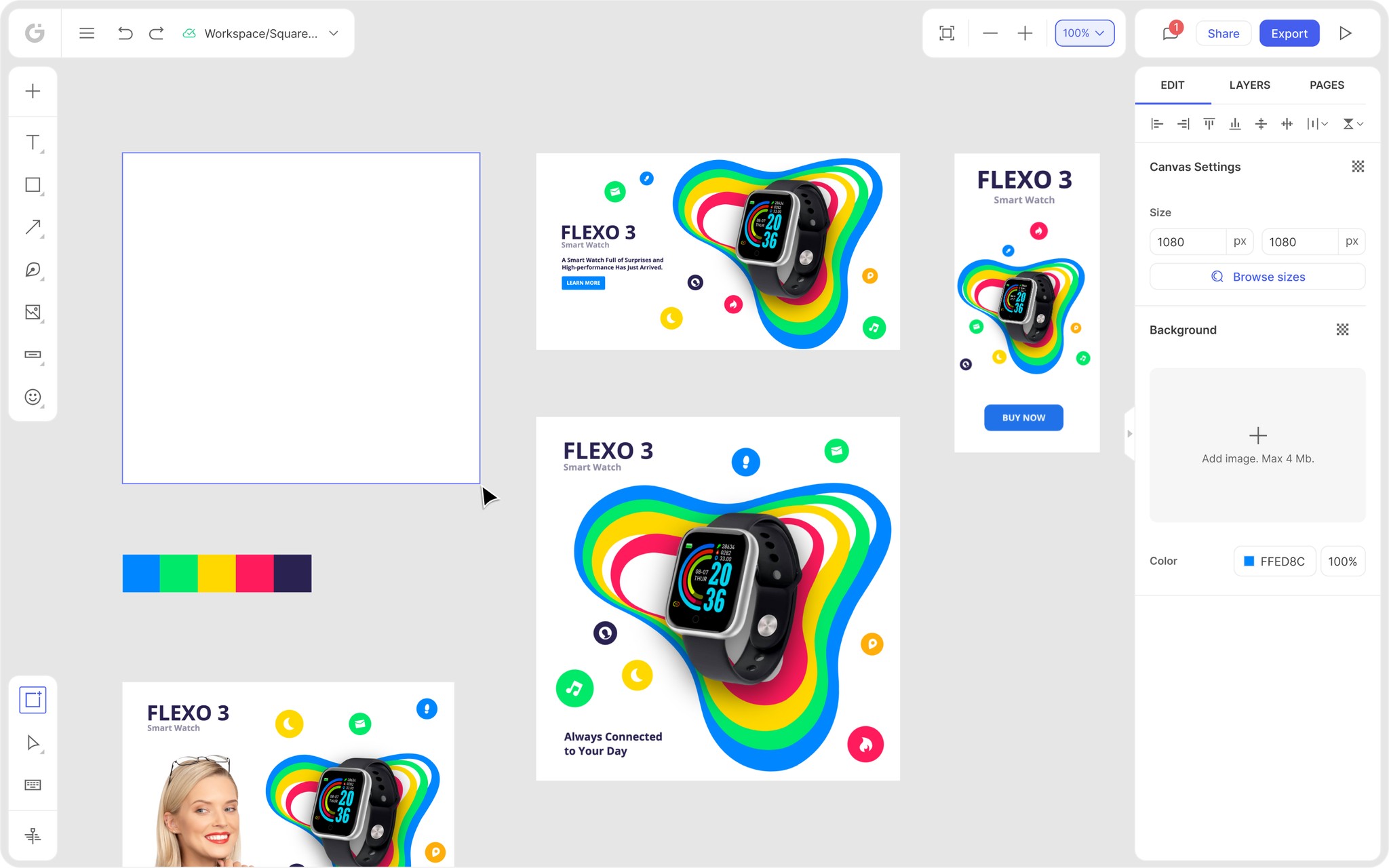
With simple tools for beginners and advanced tools for professionals, Glorify allows anyone and everyone to create beautiful designs in a few simple steps. The Infinite Canvas allows you to conveniently center all your brochure content on one limitless canvas while the balanced editor makes customization effective and easy.
Apart from these, Glorify also offers a ton of other features including an instant background remover, Brand Kits, Smart Shapes, a video editor, mockups, a logo maker, millions of icons and stock images, an advanced pen tool and more!
If you're ready to design your own brochure to promote your brand, get started with Glorify today!
FAQs
1. What is the difference between a brochure and a pamphlet?
A brochure is used as a marketing asset to sell a company's products or services. A pamphlet, on the other hand, is used for more non-commercial purposes and usually contains more textual information that a brochure.
2. What is the best way to design a brochure?
You can use an effective and easy-to-use design tool such as Glorify. With Glorify's Infinite Canvas, you can easily design all pages of your brochure on one canvas. You can further simply this process by using Brand Kits to center all your brand assets.
3. How can I create a brochure?
The first thing you need to do is identify the purpose of your brochure and the target audience you will be talking to. Next, design the layout of your brochure and prepare the text and images that will be used in it.
4. Which software is best for brochures?
Glorify is an easy-to-use design tool that can be used by both designers and non-designers alike. With the Infinite Canvas feature, you can easily design the layout and the individual pages of the brochure on one limitless canvas.
Features
Alternatives
© 2019-2024 Glorify App - All rights reserved.


