We’re thrilled to announce that Glorify is officially partnering with Contra! This collaboration opens up exciting opportunities for designers, marketers, and creators in the Glorify community.
Posted Nov 9, 2022
•
6 min

Affiliate Marketing, Design, Linkedin, Social Media

Create beautiful marketing graphics at scale.
LinkedIn Article Image Size: Best Practices for Outstanding Featured Images

LinkedIn’s features are designed to help businesses and professionals gain recognition, make connections, and enhance their overall credibility. Millions of brands around the globe have an active LinkedIn account to broaden their client base and stay connected to their already existing B2B and B2C clientele. However, using LinkedIn can be quite a waste of time and energy if you don’t take advantage of all the tools it offers. Read on to find out the ins and outs of LinkedIn article images.
LinkedIn’s Publishing Platform
A very unique tool offered by LinkedIn is their publishing platform. This platform is used by site members to write and publish blog articles. It’s a powerful tool if used right and gives professionals a chance to showcase their expertise and share information. A common mistake people make when using this feature is not paying enough attention to visuals.
Like any blog articles, LinkedIn blogs must have an article image or a featured image. This is the main image that appears at the top of a blog and acts as the thumbnail of the article.
Human beings process images thousands of times faster than text. Images also tend to be more memorable and leave a lasting impression. So you can see why images in articles shouldn’t be ignored.
However, you can't slap on the first image in your camera roll. Your LinkedIn article image should be correctly sized, attractive, appealing, and absolutely captivating. Ignoring these basic rules can cause serious disengagement and defeat the entire purpose of a featured image.
Keep reading for some basic tips to help you glorify your LinkedIn account!
What is the ideal size for LinkedIn article images?
The recommended size for LinkedIn article images is 744 x 400 pixels. Ideally, JPG and PNG formats should be used but LinkedIn also supports static GIFs. The maximum file size that can be used is 10 MB.

Why is it important to focus on LinkedIn article image size?
LinkedIn article images act as the selling point for each post. Apart from functioning as thumbnails, article images also act as the primary visual of each blog.
If the image happens to be incorrectly sized, it not only makes a bad impression but also takes away the possibility of people clicking on the article. If you do happen to choose a great image but do not adhere to the recommended size, it might end up looking stretched, cropped, cluttered or hazy. Sometimes, essential elements of the image may be cut out. Using wrongly sized images that are not optimized can reduce the overall quality of your blog.
But don’t worry – if you do make the mistake of choosing the wrong LinkedIn article image size, all is not lost. LinkedIn’s saving grace allows you to change the cover image of a published article. This means that the visuals can even be tweaked or completely replaced later on.
A high-quality, professionally designed image can do wonders for your LinkedIn article. Besides, if you are already investing time and energy into an article, why not go the extra mile to make sure you get the traffic your deserve?
Recommended best practices for your LinkedIn article images
1. Choose your color palette carefully
A tip that never fails. When choosing a featured image for your article it’s always a good idea to use contrasting colors. An eye-catching image like this will definitely stand out in an otherwise boring user feed. Something that pops out can never let you down!
Apart from aiming for contrast, go for colors that are bright. This works great for thumbnails and makes them stand out – nobody likes a dull image anyway. Attention-seeking colors for an attention-worthy blog article. It is a win-win!

2. Make the most of stock images
As a business owner or busy professional, you may not have time to actually take pictures for your blogs. Paying a huge amount for a good image isn’t such an appealing idea either. To top it all, using a random image pulled from a Google search might land you a copyright lawsuit. To avoid all this, using a stock photo is the safest way to spice up your article while going easy on your wallet as well.
If you’re wondering where you can get your hands on amazing stock images, we have an answer for you. Glorify’s vast library is equipped with thousands of stock images and we truly have something for everyone out there! You can use these stock images for commercial purposes without worrying about copyright issues.

3. Brand it!
Be subtle and make a statement but don’t go overboard. Branding is necessary to establish your presence and improve brand recognition. Aim for a design that not only features your brand colors and icons but also provides context for the article.
If you don’t want to spend a lot of time on branding, simply adding your brand logo or watermark to the image will do. The idea is to get your name out there using the article so that people don’t just read a mind-blowing piece of work, but also remember your brand as the source of it.

How to create a LinkedIn article image with Glorify
You've seen just how important LinkedIn article images are. Now it's time to create your own.
With Glorify, you can create stunning visuals for all your LinkedIn blogs in just a few steps. It doesn't matter if you've never designed an image in your life. Glorify is an easy-to-use design tool that is ideal for both beginners and professionals.
When creating your LinkedIn article image, you can start from scratch or choose a template to work with. Glorify offers thousands of professionally designed templates that can be fully customized to suit your article. You can also add icons, stock images, shapes, shadows and any other elements you like.
Here's how to easily create your own LinkedIn article images within minutes with Glorify:
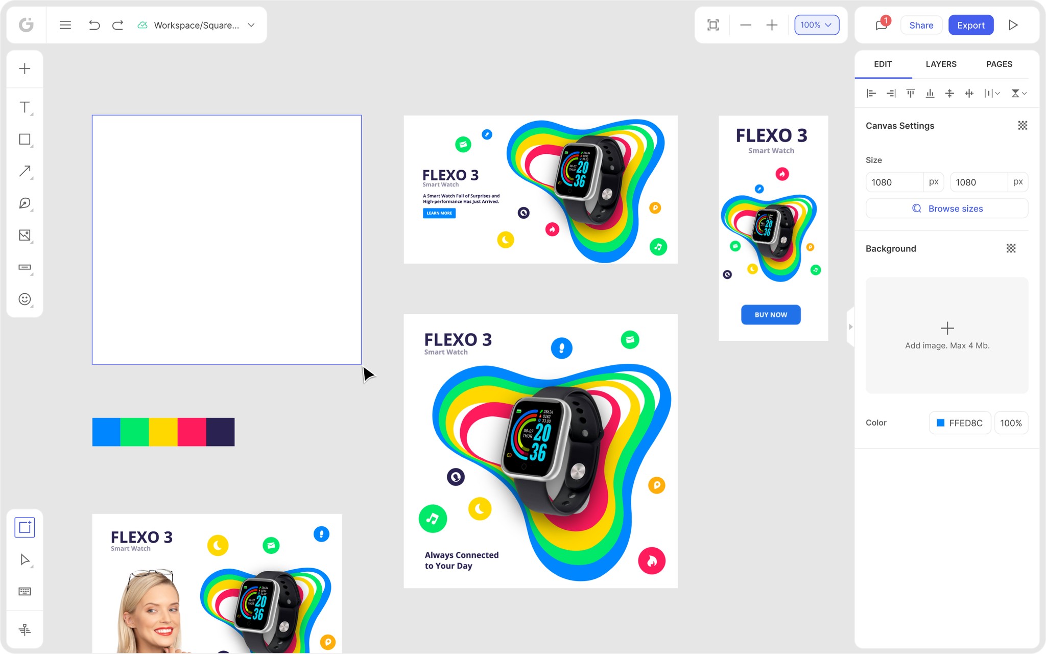
Step 1: Click the "Create Design" button on the left side of your dashboard.

Step 2: Type in the size of your LinkedIn article image, which is 744x400px, and click “Add.”

Step 3: Upload an image from your computer’s library or choose one from Glorify’s stock images.

Step 4: Add a logo or a watermark to your image by going to the Elements tab, clicking “Brand Logos” and selecting your logo.

Step 5: Use the editor to customize your image. The image adjustment section of the edit panel even lets you add a filter.

Step 6: Download your image.

Summing Up
We understand how much effort goes into crafting an article that is sensible, engaging, and relevant. It takes a lot of time and energy for a writer to develop a piece and it takes even more time for such pieces to generate credibility for the author.
As a business owner or professional on LinkedIn, consistently publishing articles isn’t the only thing you have to worry about. You also need to focus on brand recognition and visibility. Therefore, it's important that you leave no stone unturned.
But we do understand that nailing certain elements can be difficult. Images, for that matter, are the trickiest. So while you take care of your articles, let Glorify take care of all your visual and design needs!
Glorify is the ultimate one-stop solution for all your e-commerce design needs. Forget manually sizing your image or spending hours designing one from scratch. Our library is equipped with thousand of pre-designed, professionally crafted templates with a variety of themes.
And we don’t just take care of LinkedIn article images. We’ve got your back across all social media channels. Start using Glorify now and boost your online business by creating visuals that pack a punch!
LinkedIn article image size: Best practices for outstanding featured images - FAQs
What is an article banner?
In terms of LinkedIn, an article banner is the main image that appears at the top of a LinkedIn article. This is the first thing viewers see when the article opens up. Article banners are a great way to hook readers and prompt them to keep reading.
What is the best size for a LinkedIn post image?
The recommended size for a LinkedIn post is 1200 x 628 pixels.
Features
Alternatives
© 2019-2024 Glorify App - All rights reserved.


