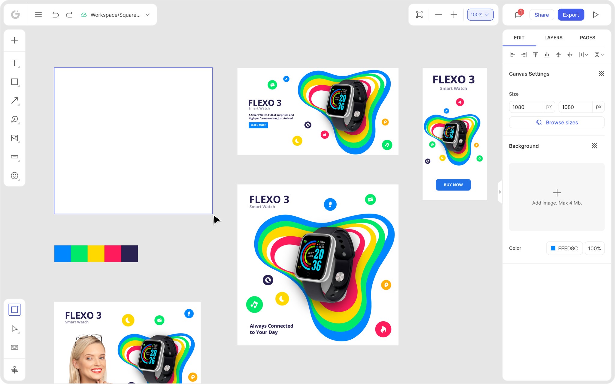
We’re thrilled to announce that Glorify is officially partnering with Contra! This collaboration opens up exciting opportunities for designers, marketers, and creators in the Glorify community.
9 Newsletter Design Best Practices To Increase Engagement

9 Newsletter Design Best Practices To Apply Instantly
1. Start with a great subject line
Getting your readers to open your email is your first challenge.
The best email subject lines spark interest, offer promotional incentives, and are tailored to the interests of each receiver.
But unfortunately, in 69% of cases, email receivers consider the subject line when reporting emails as spam. To avoid this issue:
Add the name of each recipient to the subject line. For 22% of users, personalization enhances open rates.
Keep it brief and direct, and use at most 60 characters.
Try to explain the advantages of your promos or draw attention to particular offers.
With a query or teaser, pique the reader's interest.
Newsletter design best practices from Converse

Personalized subject lines feel less generic and catch the attention of the reader.
Try to:
Create a sense of urgency, 'Starting now: 20% off everything!',
Be relevant: '8 Beauty products to try from French pharmacies',
Make an offer: 'Save with this week's flyer,' etc.
2. Use proper formatting
The logo, navigation menu, and a link to the browser should be in the header.
Include contact information in the footer, social media icons, and an unsubscribe link.
A one-column style is simple to read, keeps your design uncluttered, and easily adjusts to various screen sizes.
To ensure your newsletter is optimized for all devices, stick with a width of 600px with margins on each side.
Newsletter design best practices from Penguin Random House

In this newsletter example, Penguin Random House offered subscribers a link to a preference center where they may choose the book genres they found most intriguing.
After checking the boxes, they will receive a tailed newsletter, like in the image below.

This approach contributes to higher engagement and gives a sense of being heard and valued.
3. Keep branding consistency
Keep in mind that subscribers receive a large number of emails. So how will people tell your newsletter apart from the rest?
First, ensure it corresponds with your brand's visual identity for instant recognition.
This implies that your logo, graphics, font, colors, and CTAbuttons, must be consistent with them.
Then, use up to two complementary fonts throughout your newsletters—one for the main text, CTAs, and headlines.
Lastly, aim for simplicity, aesthetic appeal, and recognizability.
Newsletter design best practices from Allplants

This food delivery service works on readers' appetites with enticing images and in-depth descriptions.
They use a newsletter to tell customers about new dishes, ingredients, and dietary data.
Additionally, Allplants uses a promotion code as a clever method to persuade readers to respond immediately to their email.
4. Use web-proof fonts
Once again, use a font that aligns with your brand's visual guidelines.
Font sizes for headers can range from 22 to 24 pixels. You should use at most 16 px for the body copy.
The most widely used email-safe fonts are Arial, Verdana, Helvetica, Georgia, Tahoma, Lucida, Trebuchet, and Times New Roman.
Limit the amount of information you include in your newsletters. If not, you run the risk of boring your audience.
For instance, keep the text under 100 or even 50 words for optimal results.
Newsletter design best practices from DocuSign

DocuSign, a popular business tool, opted for an exciting visual that dominates the page. With an engaging headline that piques readers' interest, the page is not cluttered and is pleasing to the eye.
5. Include high-quality visuals
Visuals take up a large portion of newsletter space. You can include GIFs, icons, illustrations, infographics, memes, product images, videos, etc.
In order to significantly impact your email newsletter design's visual appeal and directly affect conversion rates:
Always include a brand logo.
Use photos of the same size and design when using product listings. To create a unified look, ensure they are not distorted, blurry, overly dark, or of different quality.
Add visuals only if they bring value to the content, not for the sake of it.
Sending emails with excessive images, infographics, or illustrations might lead to long email loading times or difficulties viewing the content.
Using stock photos or unnecessarily huge files can also encourage users to hit the unsubscribe button.
Newsletter design best practices from Crate & Barrel
Crate & Barrel is a furniture and home decor retailer that doesn't just use its email for advertising deals and specials. Instead, they extensively use high-quality pictures to provide ideas for using the product.

Their newsletter is divided into sections, such as special offers, design tips, exclusive collections, etc., and gives a feeling of flipping through a glossy magazine.
6. Choose colors wisely
Using color in a newsletter might be challenging. While you should use brand colors, you can also be creative.
As we know, different colors evoke various feelings. Therefore, correct color pairing requires some study of color psychology.

Newsletter design best practices from Brain Pickings
Subscribers receive the week's most important articles about creativity, psychology, art, science, philosophy, and design every Sunday morning. These topics are exciting to a broad readership and with the clever use of white space and careful selection of colors this newsletter really stands out.

The header in bold color catches attention and invites readers to take a peek into offered content. The rest of the newsletter is simple, with a large font and enough white space for additional readability.
7. Make your content skimmable
Even with a clear subject line and eye-catching graphics, your content must be skimmable to keep readers' interest.
Headers are used in the newsletter to identify parts. These make it easy to skim the newsletter because they also let the user know what to anticipate in that segment.
Numerous studies have demonstrated that people rarely read emails from beginning to end. Instead, they scan the text in the top left corner before stopping at the subject lines and photos.
They will only read the remaining content if the bold words or visuals catch their attention.
So, place the keywords and images on the left side because it attracts more attention than right-side content.
Newsletter design best practices from Boticca
This newsletter from Boticca uses UGC, such as reviews, to offer helpful information for readers. In addition, its layout is organized in a way that makes it simple to consume.

Boticca strategically uses red to draw attention to the worldwide shopping feature at the top of the page. Also, the Shop now button is larger than the rest of the text and cleverly positioned under every product.
8. Promote engagement with CTA
A call to action is the ideal technique to encourage readers to respond to your message. Emails with just one CTA can boost clickthrough rates by 371% and revenue by 1617%.
Instead of text links, people tend to click on buttons or graphics more frequently.
Use verbs like "Purchase now," "Start your trial now," and other active verbs.
The main call to action should be for the main message and a few more for the supporting content blocks. The first CTA button should be the first thing a client sees when opening an email.
To make CTA buttons stand out, use a different color and allow some space around them.
In the footer, repeat your CTA. Again, it is a good practice to avoid readers scrolling back to the top to engage with it.
Newsletter design best practices from Twinings
This newsletter is a fantastic illustration of excellent holiday marketing.
By offering 10% off and a promo code, Twinings provides value for their clients.

Twinings states three times the offer they have for Valentine's day, but it doesn't feel pushy due to its simplicity.
9. Make sure your content is mobile-friendly and accessible
Another aspect of newsletter design is making sure your content is accessible on all platforms and for users with impairments.
In addition, an optimized newsletter is a must since more than 60% of email campaigns people see on mobile devices.
Newsletter design best practices from Judy
Judy's newsletter seeks to establish a connection with the subscribers.
It is a fantastic example because the large text size and design highlight the header, and it cleverly uses white text to make text pop.

Conclusion
Even though newsletters are among the most frequently sent emails, they are also the most difficult to execute correctly.
We hope these newsletter design best practices inspire you to create newsletters your readers will look forward to receiving.
And with the help of Glorify, a powerful design tool, creating any visuals is like a walk in the park.
Glorify's features are easy to use and suitable for beginners and experienced users:
A massive library of templates in predefined sizes for any occasion.
Tools for editing images like resizing, cropping, erasing backgrounds, changing fonts and colors, etc.
Brand Kit that enables you to concentrate all of your branding assets in one location while maintaining consistency and uniformity across all media.
Annotation tool that draws attention to the prominent aspects of your offering and comes in handy when drawing charts and graphs.
Icons, illustrations, effects, and many more.
So, start your journey with Glorify today and create newsletters that boost engagement!
Features
Alternatives
© 2019-2024 Glorify App - All rights reserved.


