We’re thrilled to announce that Glorify is officially partnering with Contra! This collaboration opens up exciting opportunities for designers, marketers, and creators in the Glorify community.
Posted May 9, 2022
•
8 min read

Glorify Team
Design, Graphic design, Entertainment

Create beautiful marketing graphics at scale.
The Best And Worst Olympic Logos Of All Time

We at Glorify have curated this list of the best olympic logos in a rank system. The best gets the gold, next comes the silver and lastly, we have bronze. Let’s jump into the article and analyze these best olympic logos based on their design.
The most famous use of the Olympic Rings
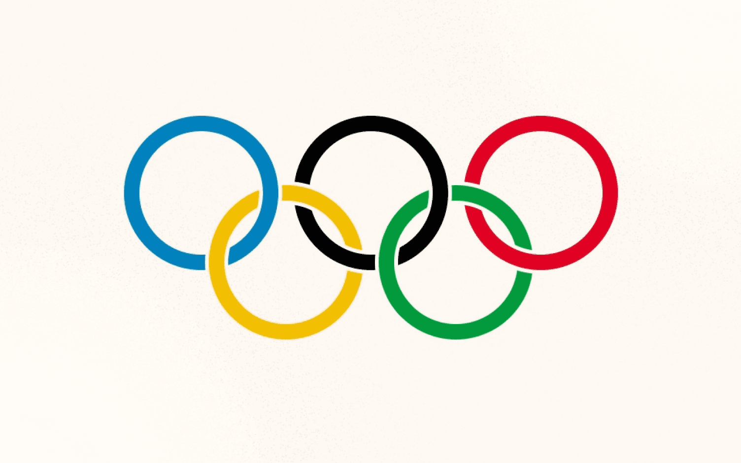
Baron Pierre de Coubertin created the original interlocking ring symbol in 1912. The five continents each represent Africa, Asia, America, Australia, and Europe.
This combination of six colors, including the white background of the flag, is an excellent reproduction of the colors. This is also an international symbol.
It is a unique, multicultural style that many host countries have implemented in their Olympic logos. It does not amaze us.
Bronze
Logo for the 1936 Summer Games.
The simplistic design has saved some part of the olympic logo but not the critical mistakes. Second, the emblem is flat, as if squashed with the eagle’s weight, with the interlocking circles. Particularly, the eagle seems to rule the rings and does not just rest.
The essence of the Olympic competition feels submissive to the host nation.

Silver
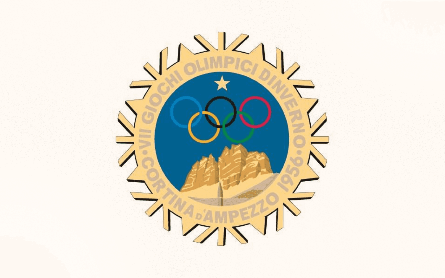
Logo for the 1956 Winter Games
This olympic logo makes the Olympic rings even clearer. They float through the Alps and blend in well to a nice framework in the circular logo. Even if you do not really know what it means, it reads simply and distinctly the text along the edge. It’s possibly a little overly abstract to the edges of the logo – perhaps to suggest a snowflake. The perfectly symmetrical olympic logo doesn’t fit well.
Gold
Logo for the 1948 Summer Games.
The emblem of the 1948 Olympics must be the easily identifiable leader in terms of the positive participation of the Olympic rings. Due to a great disaster for mankind, the Second World War. There was no Olympics in more than a generation. The Olympics were a symbol that the universe was healing in the culture of human accomplishment and multinational solidarity.

London was selected for the 1944 Olympics before the outbreak of war. The town was a victory to see (which was symbolized here by Big Ben). Notice, however, that the Olympic rings are in front of Parliament’s houses — not behind them — and over it there ridges the message “XIV Olympiad.” The host city is essential, but even more meaningful is the global community.
Best use of the Olympic flame
In the 1928 Olympics (in the new era) the Olympic flame was first created. But, after the 1936 Olympics, the idea of a fiery relay originated in Greece. It is now as part of the symbology of the tournaments.
Bronze
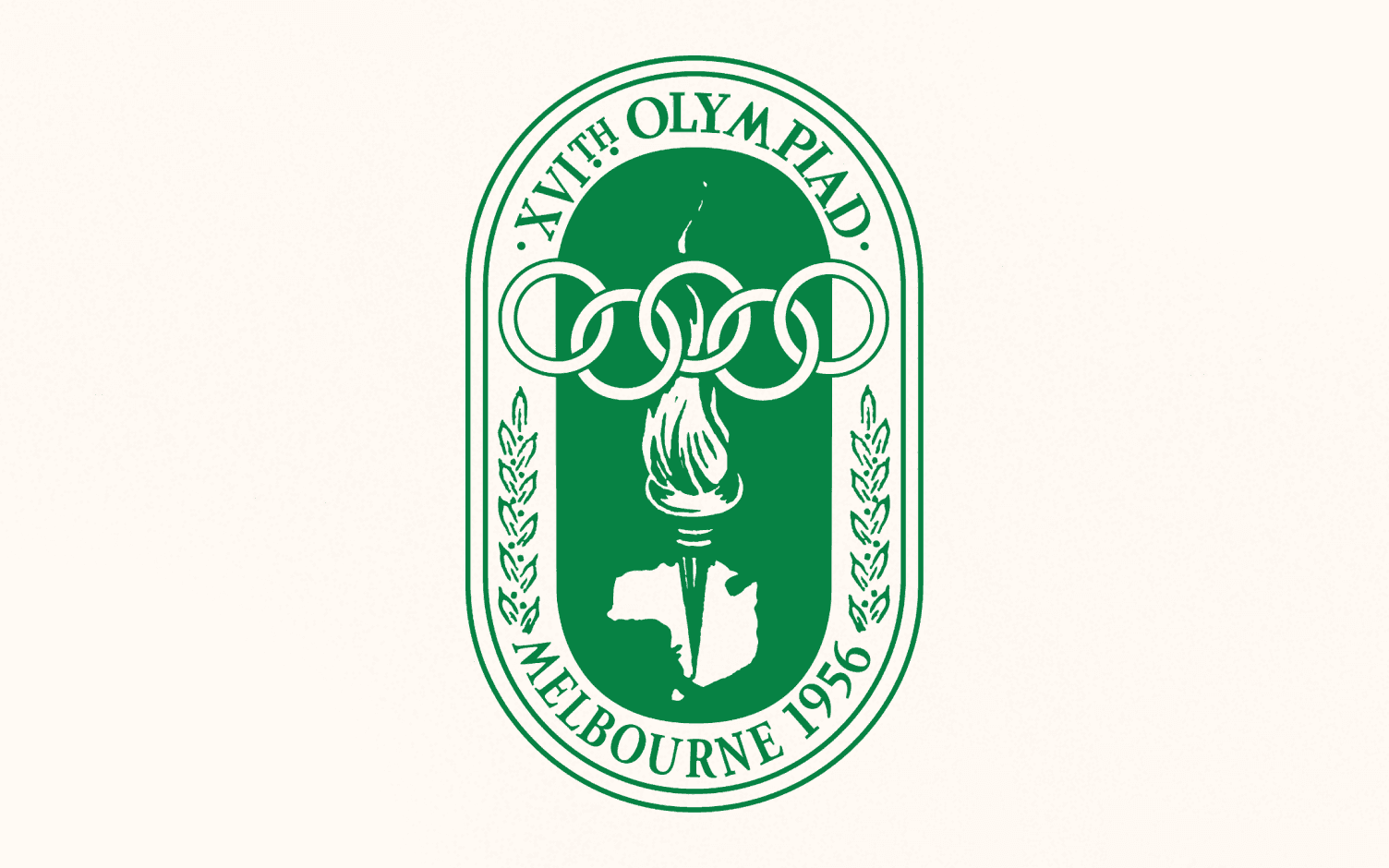
Logo for the 1956 Summer Games
It has a chic feeling — a plain boundary accompanied by friendly olive branches.
However, the Olympic torch knifing Melbourne is perhaps not the wisest option. How big is the torch? Are the rings in the air hovering? From a composition point of view, so many conflicting elements have contributed to the need to integrate the host country.
Silver
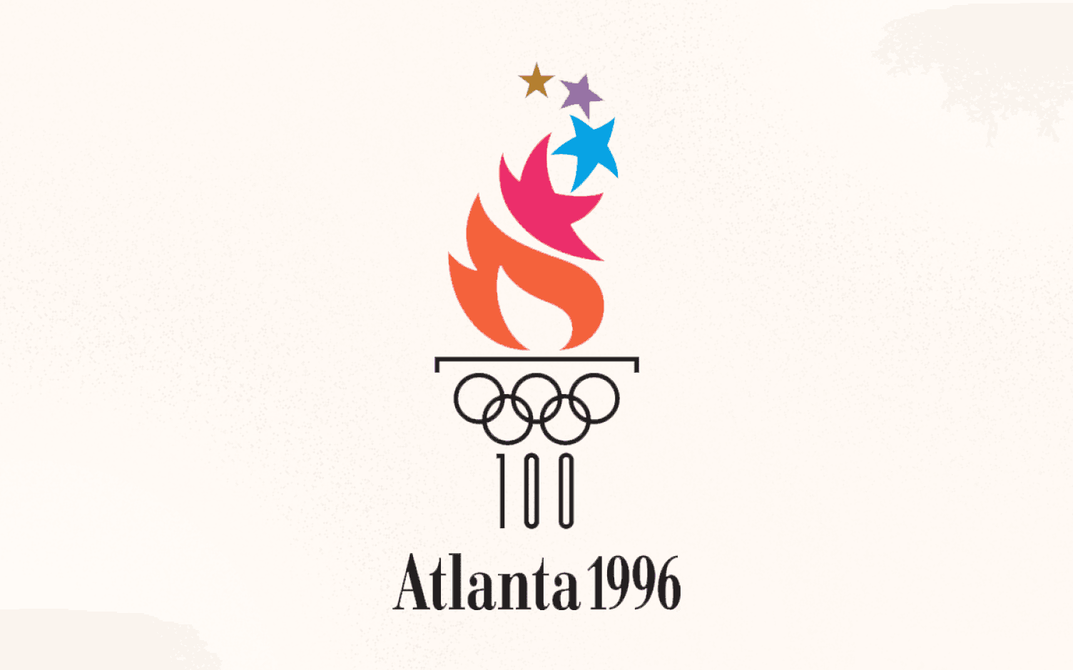
Logo for the 1996 Summer Games.
This olympic logo skillfully recalls an ancient Greek column with the Olympic rings and number 100 (for the 100th anniversary of the current games). The fire that has evolved as stars is quite misleading. Nevertheless, like gymnastics and figure skating, we’ll give them extra points for creativity.
Gold
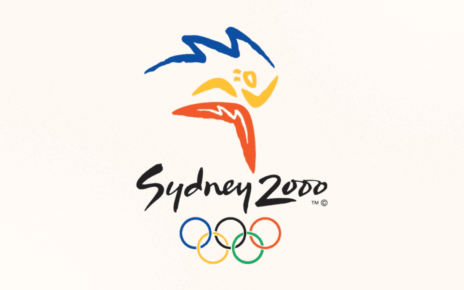
Logo for the 2000 summer Olympics
Our favorite logo in Olympic history could be Sydney’s. The daring colors and slow lines are lively and exciting. The typeface fits well and harmonizes the whole logo.
In the flames of Sydney Opera House, they were able to indirectly link the hosting country. This olympic logo has a perfect performance.
Finest use of athletic pictures
The theme for the Olympic Games is Citius, Altius, Fortius, also invented by artist Rings Coubertin. “Faster, higher, stronger” is the slogan of the Games. Coubertin said it wonderfully in his belief, “What is most essential in the Olympic Games isn’t winning, but taking part, just as the most significant thing in an individual’s life isn’t winning but battling.”
These best olympic logos aim to fulfill these values by representing the best of athletes.
Bronze
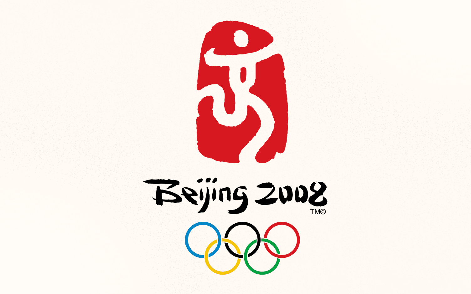
Logo for the 2008 Summer Games
This olympic logo is denoted as “Dancing Being” for some common features. It is designed in a way incorporating Chinese character jīng, 京, which means “capital” as Beijing is the capital of China. Though it may be relatable for the reasons for the Olympics happening in the capital city but there is no relation between dancing with the games. That’s why it looks a bit inappropriate.
Silver
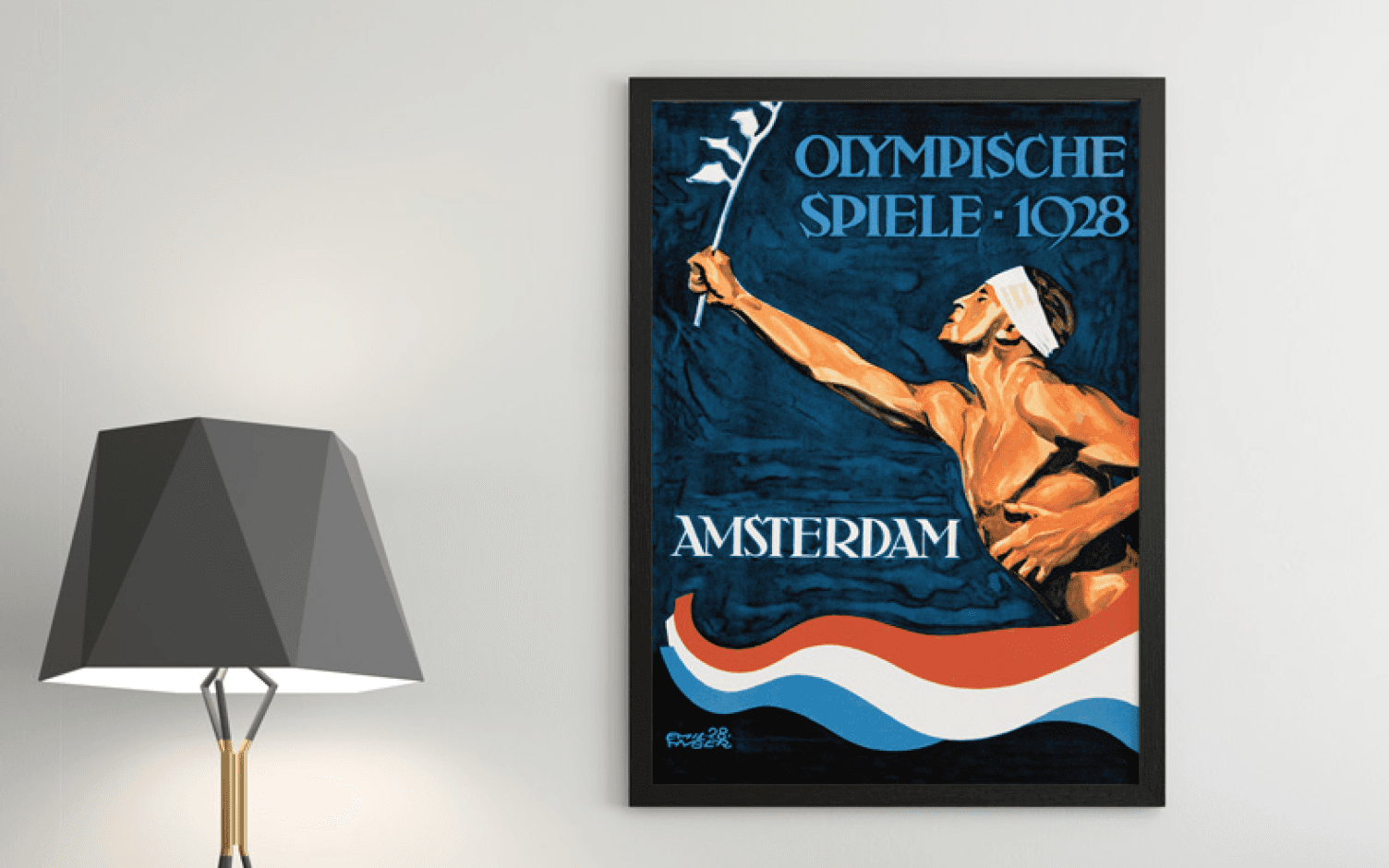
The symbol for the 1928 summer Olympics
This is a more accurate representation of an olympian match to the look of the era. (Due to the Dutch flag on the surface, you can’t likely see the Onion on his belt).
As a sign of harmony, it spreads an olive branch that is significant in the interwar periods of the Games. but we don’t know why the eyes are shut.
Gold
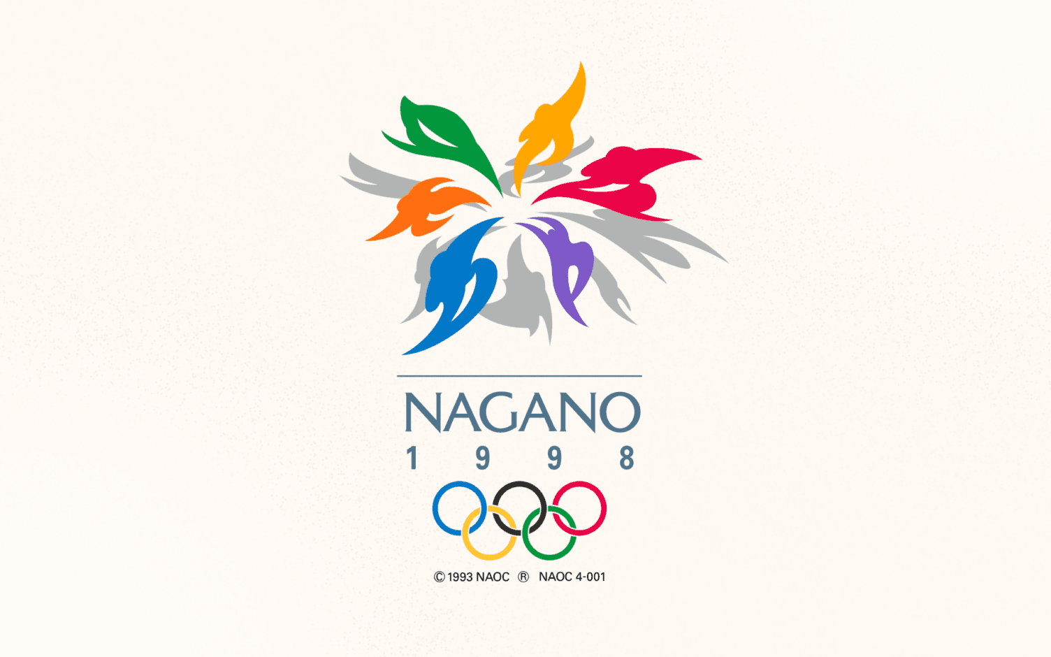
The symbol for the 1998 winter Olympics
The snowflower is called the same because it shows both a flower and snowflake which means athletes who perform different sports.
The vivid colors and fluid forms sound dynamic and enthusiastic. The lines focus on the center, as if they are all together, reflecting the social theme of the games.
Best Olympic logos of Winter
Often the winter Olympics are the overlooked signature of the Summer Games. They can be hosted by certain countries and fewer people watch the shows. But you should never underrate the underdog.
The design which is specific with the winter Games reaps the benefits of their sleek facade — logos with fantastic winter symbology. The most famous is the snowflake, of course, but creators have found various innovative ways of making you experience the chilled atmosphere.
Bronze
Logo for the 1980 Winter Games.
This olympic logo is for the conceptual style though it remains noticeable.
The pillar that supports the Olympic rings does not match perfectly, but the upward movement still looks aspiring and strong (it makes the entire structure look like a roof with an exceptionally large chimney).

Silver
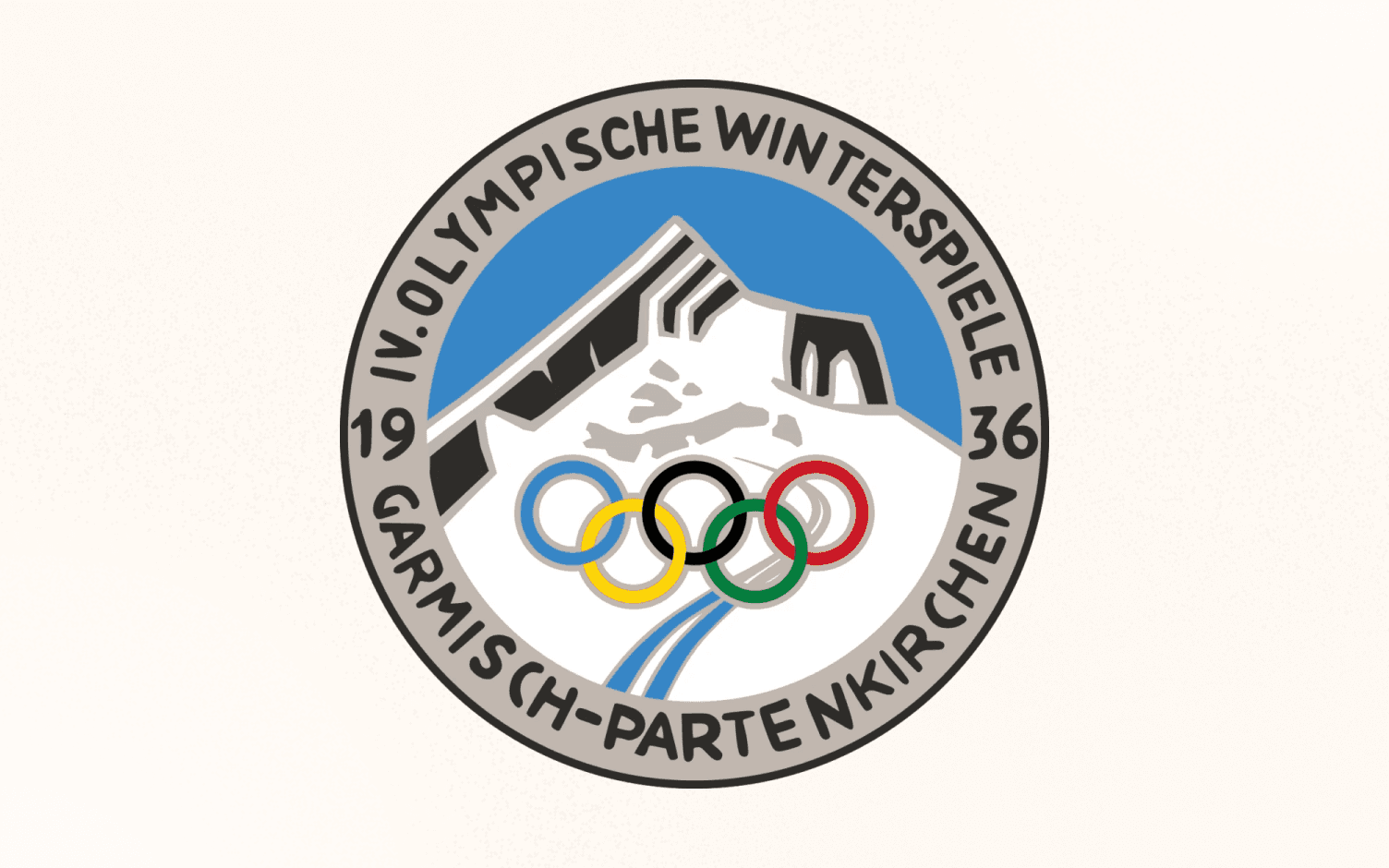
Logo for the 1936 Winter Games
This olympic games logo does not go for the easy and understandable snowflake, but rather provides us with a circular badge with an exciting, conceptual mountain.
We have to take marks off for the verging comic sans typeface, but all in all this fashionable viewpoint of the Garmisch-Partenkirchen Alps welcomes Olympic athletes to win their positions.
Gold
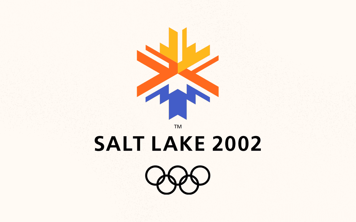
Logo for the 2002 Winter Games.
This olympic games logo depicts a conceptual geometric form of snow crystal and a sun rising over a peak.
The colors of yellow, orange and blue reflect the vibrant landscape of Utah, captured both the core of its dry and winter host town. The final result is an emblem that evokes the desert, mountains, snow, and the design of the south-west.
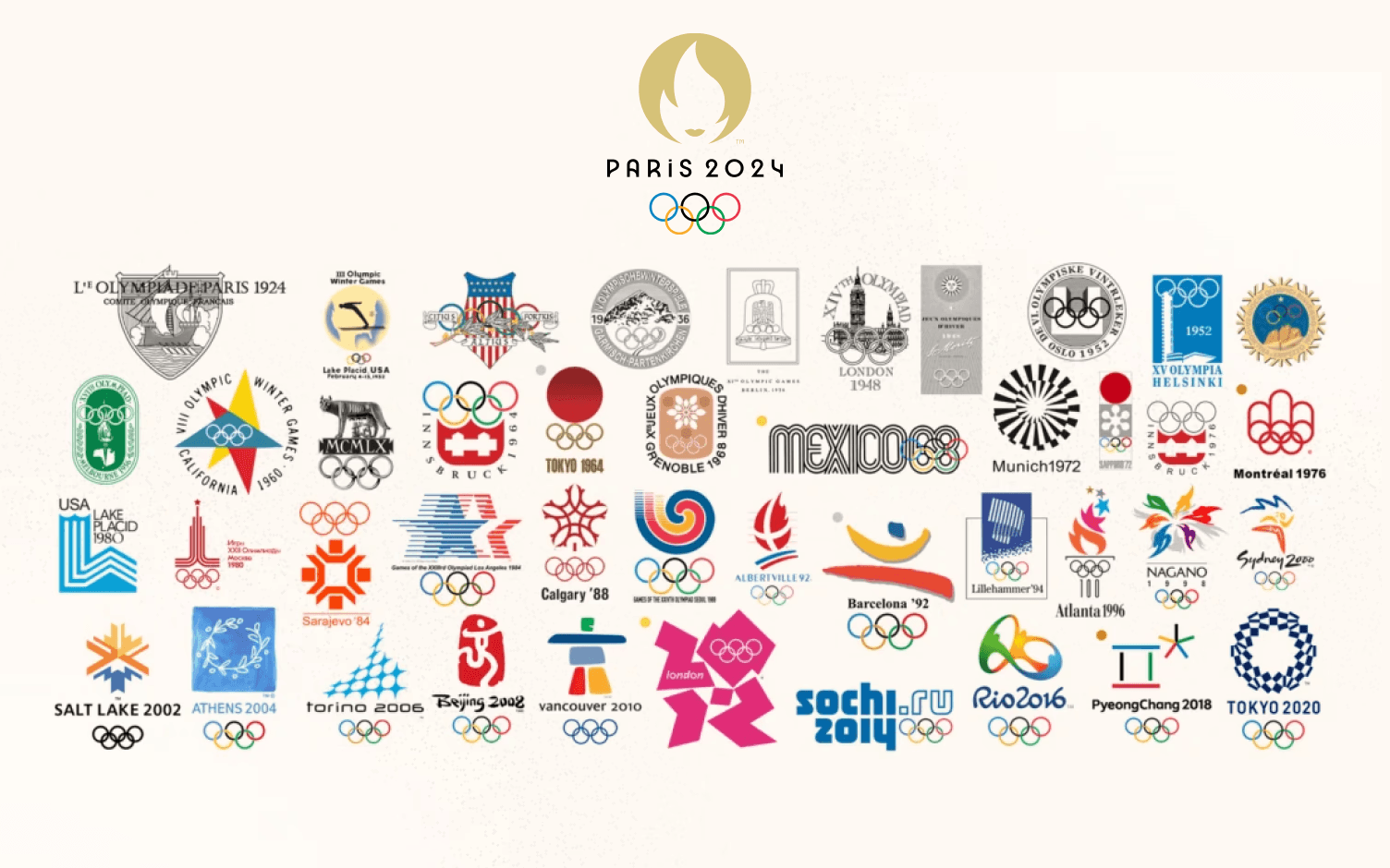
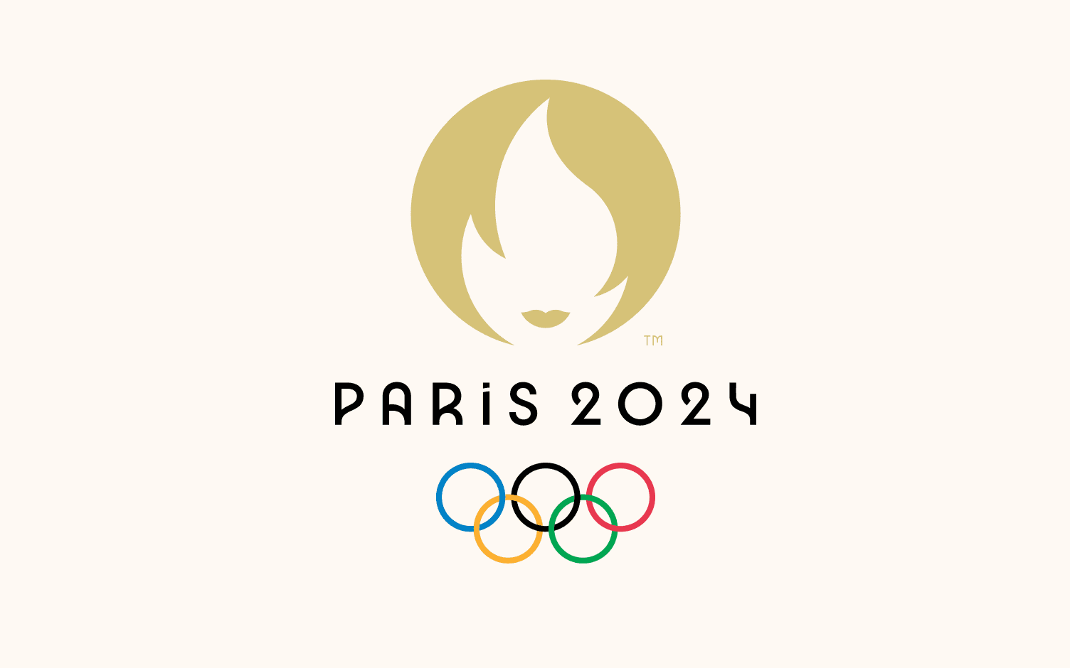
2024 Paris Olympics Logo
As we look ahead to the future of the Olympic Games, the 2024 Paris Olympics logo stands out as a modern blend of tradition and innovation. This emblem is a striking representation of France's rich cultural heritage and its forward-looking spirit.
The design features a sleek, gold-colored Marianne, a personification of the French Republic, framed within a circle that resembles a gold medal. Marianne's face is made from the negative space between a flame and the outline of a woman's face, symbolizing both the Olympic flame and the spirit of freedom and equality that France champions. The minimalist design is complemented by the inclusion of the Olympic rings at the base, grounding the logo in the enduring tradition of the Games.
The choice of gold not only represents the highest achievement in the Olympics but also reflects the luxurious, artistic, and historic character of Paris. The 2024 Paris Olympics logo is an excellent example of how contemporary design can effectively capture the essence of both the host city and the universal values of the Olympic movement.
As we award this logo, it easily earns a Gold for its ability to blend symbolism, national pride, and modern aesthetics into a cohesive and memorable design. It's a fitting emblem for a city as iconic as Paris and an Olympic Games that promises to celebrate both athletic excellence and cultural heritage.
Thoughts to complete
Now that you've explored the best and worst Olympic logos of all time, it's time to elevate your own design game with Glorify. With Glorify's AI-powered design tools, you can create stunning graphics and videos that capture the essence of your brand or message, just like the iconic Olympic logos showcased in this article.
Whether you're a digital marketer, e-commerce business owner, or simply a design enthusiast, Glorify empowers you to easily design graphics and videos fast, at scale, with minimum design skills required. Take inspiration from the timeless symbolism of these Olympic logos and unleash your creativity with Glorify today!
Ready to create designs that leave a lasting impression? Dive into the world of design with Glorify and discover what you can achieve! 🚀🎨
Got questions or need assistance? Feel free to reach out, and let's embark on your design journey together.
The Best And Worst Olympic Logos Of All Time FAQs
1. What’s the Olympic logo?
Today the Olympic committee believes that this Olympic logo depiction illustrates the desire of every country to participate. The latest version of the Olympic logo uses a plain serif, all letters are capital letters. The spectrum contains a backdrop of white and rings of colors red, yellow, black, grey, green and, blue
2. What is the symbolism of the Olympic Flag?
The Olympic Games logo or emblem consists of a white field known as “Olympic Circles” in which five intersecting, black, purple, black, green, and red circles are there. In 1912, the olympic games logo/emblem was initially designed by the co-founder of the modern Olympic Games, Baron Pierre de Coubertin.
3. Why are the rings on the Olympic flag?
The rings were selected because the flag of each nation includes at least one of these colors. The rings are on a white surface on the Olympic flag. The flag is raised in the venue at the opening ceremonies of the Olympic games.
Features
Alternatives
© 2019-2024 Glorify App - All rights reserved.


