We’re thrilled to announce that Glorify is officially partnering with Contra! This collaboration opens up exciting opportunities for designers, marketers, and creators in the Glorify community.
3 Tips To Design a LinkedIn Banner For Your Business

What is a LinkedIn Banner?
A LinkedIn banner is a large image that appears at the top of your profile, above your profile photo. It is a great way to show your personality and brand and stand out from the crowd.

Try thinking of it as a digital billboard. It is the first impression you’ll make on potential clients or customers, which is why it is essential to do it right. With right, we don’t mean just in terms of optimal dimensions. You should consider a few things before starting to design a LinkedIn banner:
Your LinkedIn banner should be unique and reflect your personal brand. Think about what you want to communicate with your banner. Do you want to show off your work? Highlight your skills? Share your contact information?

Your banner should be high quality and visually appealing. Remember, this is one of the first things people will see when they visit your profile, so make sure it makes a good impression. It's important to use high-quality images relevant to your industry, and you should also include your logo and contact information.

In a nutshell, you should design your LinkedIn banner to grab attention and give viewers a snapshot of who you are and what you do. Be creative, but also be sure to keep it professional.
Now let’s see what the proper dimensions of LinkedIn Banners should be.
Dimensions of LinkedIn Banners
There are two dimensions depending on the type of LinkedIn profile. If you are designing a banner for a personal profile, the image dimensions should be 1584 x 396 px. On the other hand, if you are designing a banner for your company’s profile, your image should have 1536 x 768 px.
When it comes to other requirements, it is worth mentioning that cover photos should always have a 129:8 aspect ratio. Moreover, their size can’t exceed 8 MB. As far as formats are concerned, you can have your banner photos in PNG, JPG, and GIF format.
Moving away from the technicalities and going straight to the practical tips on how to design a LinkedIn banner.
3 Tips on How to Design a LinkedIn Banner
As we mentioned earlier, it isn’t only about technical requirements. That is the easiest part. An effective LinkedIn banner is more about how to design it in a way that speaks volumes.
Luckily for you, there are many platforms where you can find templates to modify and edit your banners according your preferences.
We’ll get there shortly, but in the meantime, let’s provide some ideas to get your creative juices flowing.
1. Be You!
Regardless if you run your own profile or the company’s one, people love to know who is behind the picture to get a better feel of a person.
For example:
Are you involved in some charity project or volunteering? Share a photo of you in action.

Are you an outdoor person? Post a picture of your last hike, run, and the surrounding scenery.

Share a picture of your last professional achievement,

Share a picture of your workspace

And the list goes on. You can choose a picture representing your city, your hobby, or something you are passionate about. The main point is to try to help people get to know you better, and the best way to do that is to make your banner image personalized.
2. Show What Your Company is About
If we refer to the company’s Linkedin banner, adding your company’s logo and contact information is a good idea. It would also be great if the banner's colors match your brand colors. And even here, you can use some of the ideas from a personal Linkedin profile.
Some other ideas include:
Sharing a photo of you as a guest speaker at an event.

Sharing your team’s picture from a team-building event, etc.
Sharing a photo of your product or service or using some other image that indicates your line of business.

Including a CTA like Follow me (our company) on Twitter, etc.
Showing more human side of your business will make it easier for potential customers and business partners to relate to you. Furthermore, they could also get a glimpse of the core values of your company.
3. Explore, Edit and Customize
Once you choose a photo you’d like to use as a banner image, don’t be afraid to play with it. If you're not sure where to start, many online platforms offer templates, excellent photo editing tools, and tips for creating a great LinkedIn banner.
Depending on what you want your message to convey, “dress up” your image accordingly, change the logo position, merge more than one photo, etc. The options are indeed infinite.
Although LinkedIn is a platform dedicated to professionals, and in terms of its tone is more serious than other social platforms, it doesn’t mean you have to be stiff. It is very hard to produce something attention-grabbing by sticking to what everybody else does.
Speaking of platforms, we promised to show you how easily you can edit and modify templates to design a LinkedIn banner image. The time has (finally) come.
How to Design a LinkedIn Banner with Glorify?
If you haven’t got the chance yet to try Glorify, let’s give you a quick intro. Glorify is a platform that helps non-designers and people without a design background to create compelling visuals both for their personal and professional needs.
Geared towards, let’s say, beginners, Glorify offers user-friendly and hassle-free graphic design tools so you can create and design a visual in a matter of minutes. One of the best things about Glorify is that it all happens within a single dashboard, making Glorify a true all-in-one platform.
Since our topic today is LinkedIn Banners, let’s show you how smooth and easy it is to create them using Glorify.
Step 1: Choose the Template
When you create your free account, you will get access to Glorify’s Template Gallery. All the templates come in predefined sizes, so you don't have to worry about the size requirements.

So what happens when you choose a template? You land on the dashboard equipped with all the tools and features you need to edit and customize your image.
Step 2 Get Creative on the Dashboard
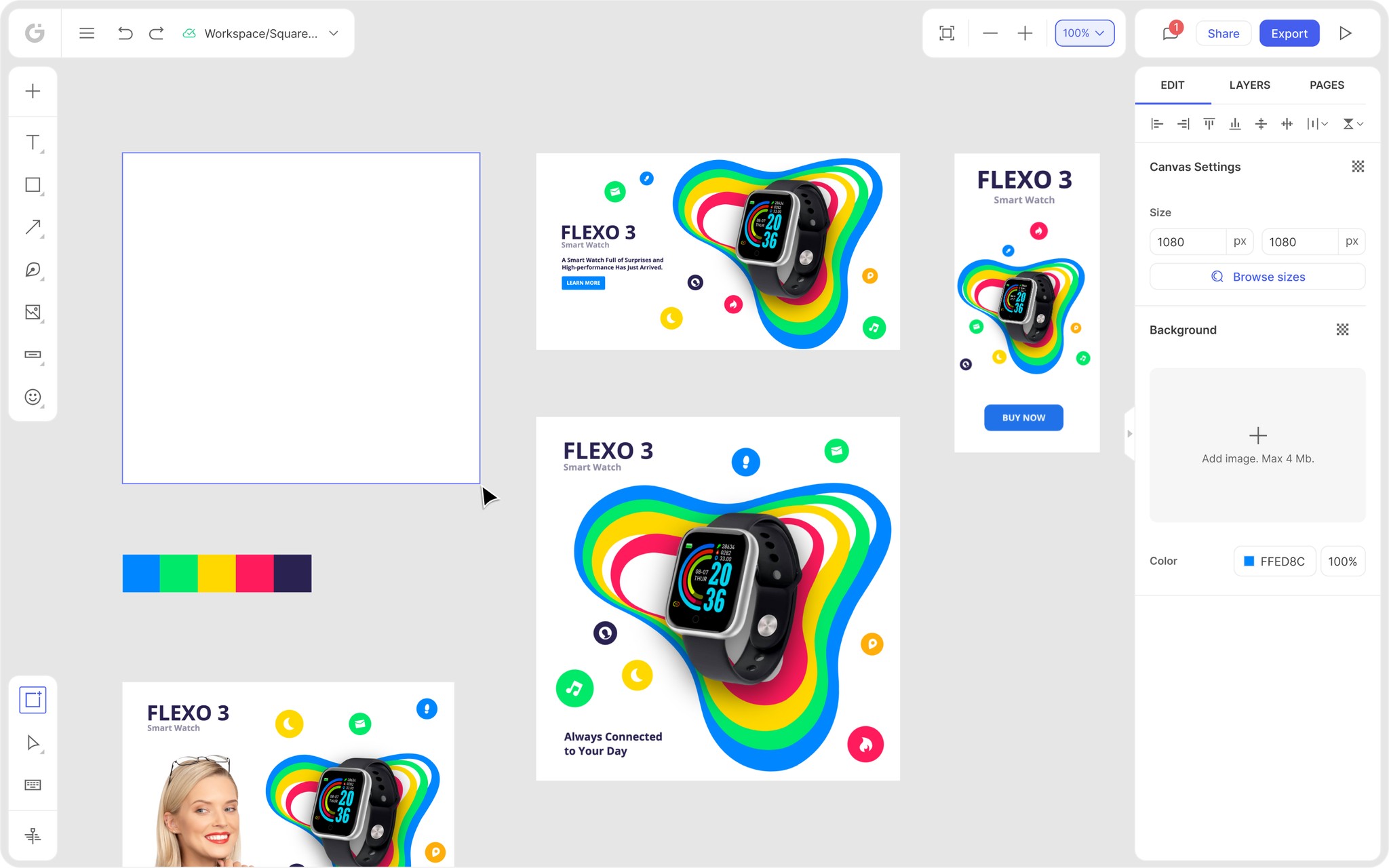
Glorify’s dashboard has left and right panels. The former deals more with elements like shapes, effects, textures, etc., whereas the latter is more about technical features like layers, color and font changes, etc.

The end result would depend on your creativity and ideas. A great thing about this dashboard is that you can do everything in a few clicks and the platform itself is very intuitive. Another little perk is that you get a tutorial once you’ve signed up.
But let’s take a quick look at how easy it is to work on Glorify’s platform. If you look at the picture below, you’ll notice that when you click on the option Layers, in the right-hand corner, you can remove, change and edit individual images and text within the main image.

And again, just by clicking on the Elements you’d like to use, you can give a complete or partial makeover to the original template.
Step 3 Keep Editing and Customizing
Once you get a hold of the platform, you can apply some of the Linkedin banner ideas we’ve mentioned earlier. For example, you can add or create your own logo and use the Brand Elements so you can fully customize the template and align it with your brand’s colors and vision.

When you think you are finished with your design, you can save it and share it with your team members. You can also download it, choose the format that suits you best, and you’re ready to go.
Some Final Thoughts
LinkedIn banners are a great way to promote your professional brand and connect with other professionals. Moreover, they can also help you find new business opportunities and customers.
Banners are a key part of LinkedIn's visual design. Thus, take the time to brainstorm your ideas so you can create a banner that accurately reflects your brand and makes a strong impression on visitors to your profile.
Instead of trying to create banners from scratch, sign up for a free trial on Glorify and start designing LinkedIn banners like a pro.
Features
Alternatives
© 2019-2024 Glorify App - All rights reserved.


